Design Elements That Communicate Luxury, Precision, and Craftsmanship
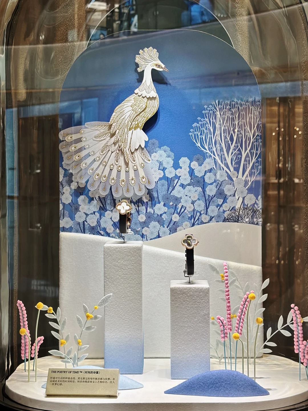
A premium watch display is more than just a holder — it’s a brand extension. A well-designed watch POP display communicates not only the luxury and craftsmanship of the timepiece but also the story of precision and prestige. Key design elements that make a watch display feel premium include:
Table of Contents
- Weight and stability = confidence
- Surface refinement = craftsmanship
- Lighting + shadow play = focus
- Strap support angle = respect for the product form
At Samtop, we engineer POP units that don’t just showcase luxury timepieces — they embody the story of time, precision, and prestige.
What Makes a Watch Display Feel Premium?
A premium watch display relies on key elements such as material mass, surface finish, lighting, and strap support to communicate the quality and prestige of the timepiece. These elements combine to evoke a sense of luxury, stability, and craftsmanship. By paying attention to every detail, from the weight of the material to the light that highlights the watch’s design, a display can transform a timepiece into a statement of prestige and value.
1. Material Mass and Perceived Weight
Heaviness = Value. A premium display base should feel substantial and grounded.
| Material Choice | Why It Feels Premium |
|---|---|
| Solid brushed metal base | Cold-to-touch, heavy feel, technical clarity |
| Stone-texture composite | Suggests timelessness, grounding |
| PU-wrapped MDF with density | Tactile + visual thickness |
| Velvet inlays | Jewelry logic — soft meets strong |
📌 Pro Tip: Display bases should feel denser than the product — never flimsy.
2. Gloss Level & Surface Finish
Gloss isn’t always premium — it’s about the right balance.
| Surface Zone | Finish Strategy |
|---|---|
| Watch rest block | Semi-matte or soft-touch PU (avoids glare) |
| Logo zone | Satin brushed or UV-raised print |
| Frame structure | Powder-coated metal or wrapped laminate |
| Backplate (optional) | Low-reflective to avoid visual noise |
✅ Tip: Combine different textures (matte + brushed + suede) to create visual layering.
3. Strap Support Angle and Watch Hold Structure
The way a watch sits tells a lot about your brand. Here’s how to display watches properly:
| Display Type | Strap Support Strategy |
|---|---|
| Cushion block | Soft wrapped + angled tilt = gift box feel |
| C-shaped rest bar | Steel insert with silicone sleeve |
| Horizontal bar | Good for bracelet-type bands |
| Floating acrylic rest | Adds elegance, works well for skeleton dials |
📌 Standard angle tilt: 15–25° is optimal for visibility without distortion.
4. Lighting: Highlight Time, Not Glare
Lighting is critical to showcase the intricate design and craftsmanship of a timepiece. The goal is to focus on the watch and not on the glare.
| Lighting Detail | Purpose |
|---|---|
| Halo LED from base | Soft, focused glow around the dial |
| Edge lighting from acrylic | Creates modern “floating” feel |
| Backlit logo panel | Adds nighttime luxury |
| No front spotlights | Avoids harsh reflections on crystal glass |
✅ Lighting color: Use neutral white (4000–5000K) for metal tone accuracy.
5. Branding Integration with Precision
The way the logo is integrated into the display matters as much as the timepiece itself. Here are branding options:
| Logo Technique | Why It Works |
|---|---|
| Metal etched plate | Tactile, refined, durable |
| UV-raised print | Great on matte or suede surfaces |
| Silkscreen on base edge | Minimalist, clean branding |
| Engraved acrylic plaque | For premium flagship lines |
📌 Tip: Avoid stickers or uneven manual placement — brand logo = trust badge.
FAQ: Your Watch Display Questions Answered
Q: Can the same display style work for all watch SKUs?
- ✅ Use modular riser blocks or interchangeable inserts to adapt for leather bands, bracelet straps, or chronograph faces.
Q: How do I make the display secure but premium?
- ✅ Use invisible magnet lock + clear acrylic shield options. Always provide locking mechanism for high-value models.
Q: What finish works best for both men’s and women’s lines?
- ✅ Brushed metallics, dark wood tones, and soft PU — gender-neutral yet upscale.
Conclusion: A Premium Watch Display is Architectural
- ✔️ Weight, angle, and material = unspoken cues of value.
- ✔️ Every touchpoint must echo precision and legacy.
- ✔️ Avoid gimmicks — use refinement, restraint, and story.
- ✔️ Invest in form factor + lighting, not just decoration.
At Samtop, we help brands tell time — through surfaces, shapes, and silence. Your display is your watch’s first impression.
Want Help Designing a Premium Watch POP Display?
We offer:
- 🧾 Material pairings for high-luxury SKU segments
- 🛠️ Engineering for lockable, modular display units
- 🔧 Lighting simulation mockups
- 📦 Knock-down & window display versions for rollout