You’ve finalized the brand color—say, champagne beige. But when the fixtures arrive, the painted risers, laminated base, and powder-coated handles all look slightly off. One is too yellow, one too pink, and one just… flat.
Table of Contents
In multi-material visual merchandising, color inconsistency breaks brand trust. Gloss level, lighting angle, material density—all affect how color appears. Without a system, your “beige” becomes five different beiges.
At Samtop Display, we help brands translate color intent across materials and vendors—so lacquer, laminate, metal, and acrylic all speak the same visual language.
✅ Summary: How to Ensure Color Consistency in Multi-Material Retail Fixtures
- Define master tone using both RAL and Pantone
- Approve colors on real substrates, not paper
- Control lighting condition during sampling and production
- Match gloss level, not just hue
- Standardize naming, documentation, and factory expectations
🎯 Read on if your beige, navy, or champagne ever came out “just slightly wrong” across different fixtures
🧠 Why Color Matching Matters in Visual Merchandising
| Risk | Impact |
|---|---|
| ❌ Hue shift between materials | Display looks inconsistent, less premium |
| ❌ Matte vs. gloss misalignment | Reflects differently, changes perception |
| ❌ Vendor interpretation | Different batches, different tones |
| ✅ Unified tone | Stronger brand recognition, photography clarity |
| ✅ Material fluency | Helps guide regional sourcing without confusion |
📌 Inconsistent color = one of the most common and avoidable failures in VM rollout
🧩 Color Standards Explained (And How to Use Them)
| System | Use Case | Best For | Notes |
|---|---|---|---|
| RAL (e.g., RAL 1013) | Industrial coating, global spec | Powder coat, laminate, vinyl | Factory standard worldwide |
| Pantone (e.g., 7527C) | Brand/print design | Painted MDF, printed films | Use for design brief + cross-reference |
| Custom Material Swatch | Direct physical reference | All materials | Most accurate if tested under lighting |
| NCS | Architecture (Europe) | Paint-heavy builds | Less common globally |
| LAB/RGB/HEX | Screen view only | Digital only | Not reliable across substrates |
✅ Strategy:Pantone for branding, RAL for production, and physical swatches for final control
🎨 How to Match Colors Across Materials
| Material | Challenge | Matching Tip |
|---|---|---|
| Lacquer paint | Color absorbs into substrate | Spray test on MDF, confirm gloss |
| Laminate | Supplier color drift | Approve brand-specific code (e.g. EGGER) |
| Acrylic / PET | Transparency shifts tone | Always test under final lighting |
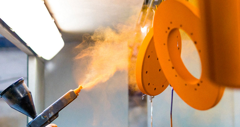
| Powder-Coated Steel | Reflective base = tone distortion | Use RAL + finish (e.g. matte 30% gloss) |
| Printed Wrap | CMYK vs. Pantone misalignments | Require Pantone + test print sample |
| Backlit Panel | Color shift under LED | Test under correct color temp (e.g. 3000K) |
📌 Don’t match hue only—match hue + gloss + lighting behavior
🛠️ Color Matching Execution Checklist
- ✅ Build a master swatch board (all real finishes)
- ✅ Standardize lighting: 3500K LED, CRI ≥ 90
- ✅ Match color on real substrate (not just fan deck)
- ✅ Match gloss level (e.g., “Matte 10%” or “Satin 30%”)
- ✅ Require factory-specific tests (e.g., RAL 1013 on MDF vs. steel)
- ✅ Photograph samples with X-Rite or ColorChecker card
- ✅ Use BOM-friendly naming: “Beige 03 – RAL 1013 – Pantone 7527C”
- ✅ Record ΔE (color deviation) if colorimeter is available
📌 Never approve based on renderings or PDF mockups—they lie under light
🧪 Case Study: Global VM System for a Skincare Brand
Challenge
One champagne beige tone needed to appear consistent across:
- PU-lacquer trays
- PET risers
- Powder-coated metal drawers
- Gloss acrylic logo blocks
Vendors from 4 countries = huge visual risk
Solution
- Created a centralized RAL/Pantone/material chip board
- Tested every finish on real substrate under warm LED (3500K)
- Built a “stack mockup” simulating real fixture (tray + riser + handle)
- Photographed in studio with color-checker
Results
✔️ ΔE < 2.0 deviation across suppliers
✔️ Zero complaints from 12-store launch
✔️ Used same color logic for next two campaigns
✔️ Saved 1–2 rounds of sample rework
📌 Need a color translation map for your vendor set? We build cross-system swatch boards
💬 FAQ
Q: What if RAL and Pantone don’t match 1:1?
✅ They rarely do. Create a custom chip (e.g., Pantone 7527C equivalent in RAL = RAL 1013 Satin) as physical truth.
Q: How can I align vendors across countries?
✅ Issue labeled master board, and require physical samples per material/substrate with photo log.
Q: Can I use matte and gloss in same color?
✅ Yes—as a contrast strategy. Just don’t expect them to look exactly the same under light.
Q: What if local vendor doesn’t have my powder code?
✅ Approve a visually-matched local version via sample testing. Add fallback codes in your spec sheet.
✅ Conclusion: Color Consistency Requires More Than Color Codes
✔️ Match across material + gloss + light—not just the Pantone name
✔️ Use physical samples on real substrate, not digital references
✔️ Build shared finish language across vendor teams
✔️ Control approval with light-simulated review and naming logic
At Samtop, we make sure your “champagne beige” looks like champagne beige—everywhere, every time, across every finish.
📩 Need Help Matching Colors Across Global Fixture Vendors?
We offer:
- RAL/Pantone/material swatch board creation
- Supplier-specific substrate color testing
- Gloss harmonization plan (satin/matte/polish levels)
- Color control SOP for VM rollout kits
📧 Email: [email protected]
🌍 Website: www.samtop.com