Can You Work with Our Approved Color Palette, Typography, and VM Guidelines?
Table of Contents
Yes — Samtop works with your approved brand color palette, typography, and visual merchandising (VM) guidelines to ensure consistent, high-quality custom displays across all retail environments.
🎯 Why Brand Guidelines Matter in Custom Display Projects
“Can you match our Pantone colors?”
“Will the fonts and logo placement follow our global VM rules?”
At Samtop, we don’t just build displays — we bring your brand to life accurately and visually aligned with your identity across every store and market.
🧠 Why Brand Consistency in Displays Drives Business Impact
| Benefit | Why It Matters |
|---|---|
| 🔍 Brand Recognition | Consistent use of fonts, colors, and logos boosts customer recall |
| 🧑💼 Professionalism | Visually cohesive displays reflect premium brand quality |
| 🔐 Customer Trust | Familiarity = reliability. Consistency reassures customers |
| ⚙️ Design Efficiency | Using set guidelines speeds up approvals and avoids costly rework |
✅ What Brand Assets to Share for Custom Displays
| Brand Element | Why It Matters | What We Need |
|---|---|---|
| 🎨 Color Palette | Keeps in-store tone matched to digital/print visuals | Pantone / CMYK / RGB values |
| ✍️ Typography | Reinforces brand tone and identity | Font files (.TTF / .OTF), type styles |
| 📐 VM Guidelines | Ensures displays follow store-level rules and layout zones | Moodboards, display placement rules |
| 🖼️ Logo Usage | Protects logo integrity + visibility | Vector logos (.AI / .SVG / .EPS) |
| 📸 Graphic Assets | Tells a visual story across retail + product launches | Print-ready artwork, lifestyle images |
🛠️ How Samtop Works With Brand Guidelines — Step-by-Step
| Stage | What We Do | Result |
|---|---|---|
| 1️⃣ Brand Review | We study your brand book + VM guides | Fully understand your visual DNA |
| 2️⃣ Design Execution | Apply fonts, color codes, logo rules in renders | Accurate visuals for stakeholder approval |
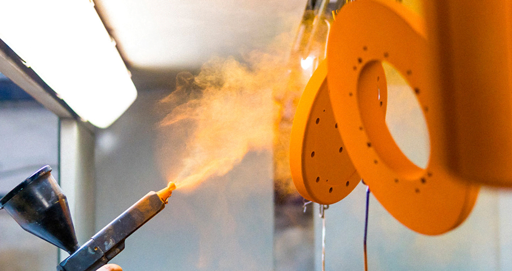
| 3️⃣ Prototyping | Create samples using real finishes & print layouts | Confirm colors, spacing, and hierarchy |
| 4️⃣ Final Production | Build final units using approved spec | Brand-perfect, retail-ready POP displays |
🧪 Case Study: Executing a Global VM System
🟨 Client: Luxury fashion label with strict global VM protocol
🟨 Requirements:
- Use of branded black (#000) and champagne Pantone
- Custom serif font for all signage
- Logo to be placed top-left on all displays with 12px margin
🟩 Samtop Delivery:
- Laser-etched branding using client’s serif font
- Matte black powder coat matching client’s Pantone
- All fixtures followed spacing guides from the VM toolkit
- Deployed across 38 stores in 3 continents — visually identical
✅ Result: The brand’s global VM team approved all units with zero revisions — rollout completed in 6 weeks.
⚠️ Common Mistakes (and How to Avoid Them)
| Mistake | Fix |
|---|---|
| 🟥 Using RGB instead of Pantone | Always request Pantone for material accuracy |
| 🟧 Missing font files | Share licensed font files in TTF or OTF format |
| 🟨 Misplaced logos or spacing errors | Provide logo use guide with minimum margin rules |
| 🟩 Low-resolution artwork | Always share vector logos + 300 DPI print files |
| 🟦 Ignoring material finishes | We test colors on real surfaces — acrylic ≠ cardboard |
❓ FAQ: Working with Brand Guidelines on Displays
Q: Can you work with our Pantone and font files directly?
A: Yes — we apply your color codes and font specs precisely in design, sample, and production stages.
Q: What if our VM guidelines include specific placement rules?
A: We follow your display zones, margin spacing, logo size, and even store-specific constraints.
Q: Do you provide test samples for approval before production?
A: Yes — we send real material swatches, print tests, and pre-production prototypes for review.
Q: Can you recommend alternatives if a material doesn’t match the brand tone?
A: Absolutely — we suggest surface or lighting adjustments to achieve the visual goal within your brand framework.
Q: Can you handle different VM kits per region while maintaining brand consistency?
A: Yes — we customize per market but ensure all displays follow your core identity rules.
🎯 Conclusion: We Translate Your Brand into Visual Experience
Your brand isn’t just a logo. It’s a visual system. And every display is a chance to reinforce that system with precision and impact.
At Samtop, we ensure:
- ✅ Accurate brand color & font matching
- ✅ Logo usage compliance across all kits
- ✅ VM rules applied from design to delivery
- ✅ Store-to-store visual consistency
📩 Need a display partner who protects your brand integrity?
Let’s build your next campaign — true to your identity.
👉 Email: [email protected]
🌍 Visit: www.samtop.com