How Perceived Mass Shapes Luxury, Exclusivity, and Customer Engagement
Table of Contents
By Yan Luo | Samtop Display
Display weight and density play a crucial role in luxury visual merchandising. Heavier structures signal exclusivity and value. Lighter ones feel accessible and modern. The right design strategy balances both — to guide emotion, logistics, and brand message.
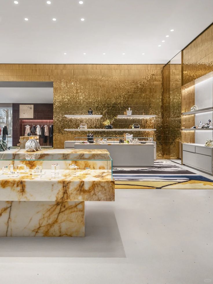
Retail displays often fail to consider how weight impacts perception. Too heavy — and customers don’t approach. Too light — and it feels cheap.
Luxury brands need to convey prestige without sacrificing install time, shipping feasibility, or customer approachability. The tension between weight and usability is real.
At Samtop, we craft displays that look weighty, feel right, and perform logistically — using layered materials, internal structures, and sensory cues to balance density and lightness.
🧠 Weight as a Visual & Emotional Language
| Weight Type | Emotional Signal | Common Materials | Use Case |
|---|---|---|---|
| Heaviness 🪨 | Timelessness, value, formality | Resin, metal, stone, concrete | Hero product, permanent fixtures |
| Lightness ☁️ | Approachability, agility, trendiness | Acrylic, foam board, PET, composite | Testers, pop-ups, secondary SKUs |
💡 Key Insight: Perceived weight doesn’t always require mass. Design illusions — like deep bases or textured finishes — do the job.
🎯 Weight Spectrum by Material
| Material | Perceived Density | Best Used For |
|---|---|---|
| Paperboard | Ultra-light | Temporary trays, folding headers |
| Acrylic / PET | Light | Skincare, fragrance, signage |
| MDF (laminated) | Mid | Everyday fixtures |
| Resin stone / Terrazzo | Heavy | Prestige plinths |
| Real stone / Cement | Very heavy | Flagship anchor zones |
🔍 Real Case: Visual Weight for High-Value SKU
🟨 Client: Swiss luxury watchmaker
🟨 Objective:
- Present a collector’s timepiece with heritage gravitas
- Simulate stone weight without full-mass logistics
- Ensure global rollout + air freight compatibility
🟩 Samtop Solution:
- Faux-stone plinth in resin composite, molded with veining
- Hollow-core with weighted steel insert for tactile mass
- Product seated in niche — evoking vault or altar feel
- Mirror bronze acrylic behind to add visual density
- Flat-pack kit with foam insert + magnetic joint assembly
✅ Result:
- Described by press as “sculptural, silent prestige”
- Raised dwell time by 21% in-store
- Safely shipped to 12 countries, reused in seasonal update
📐 When to Use Visual Weight (or Lightness)
| Goal | Weight Approach | Design Tactic |
|---|---|---|
| Prestige | Heavy | Matte stone wrap, deep base |
| Flexibility | Light | Acrylic risers, stackable panels |
| Rhythm | Mix | Heavy center + light edges |
| Reuse | Hybrid | Detachable branded elements |
| Speed | Light | Tool-free foamcore, printed vinyl |
👥 Who Should Use Weight to Shape Customer Emotion?
✅ Watch & jewelry brands needing gravitas
✅ Beauty brands balancing luxury with access
✅ Retail planners creating multi-zone visual rhythms
✅ Creative teams staging pop-ups in high-traffic locations
✅ Store VMs managing frequent resets or rollouts
🛠️ How Samtop Balances Weight, Feel & Function
1️⃣ We audit product emotional tone (heritage, innovation, sensory)
2️⃣ We build hybrid structures — faux-mass outside, light inside
3️⃣ We simulate weight with shadow lines, textured wraps, riser height
4️⃣ We validate crate weight limits + install ergonomics
5️⃣ We test how the display feels when approached, touched, moved
🎁 Bonus: For global campaigns, we provide two-tier systems — one heavy (flagship), one light (events, pop-ups).
💬 FAQ: Weight Strategy in Display Design
Q: Does heavier always mean better?
A: Not always. It depends on the emotional message. A spa skincare brand may want calm lightness. A heritage watch brand may want mass and presence.
Q: Can we make something feel heavy but still ship light?
A: Yes. Samtop uses hollow-core molding, resin wraps, and low-profile shadows to simulate mass without physical burden.
Q: Is weight important if customers don’t touch the display?
A: Yes. Even visual weight creates perception. A heavier look feels more exclusive, even without interaction.
Q: What about materials that scratch or warp when made lighter?
A: We apply UV coatings, select low-sheen PET, or reinforce light panels with internal grid to prevent deformation.
🎯 Conclusion: Weight Creates Memory
Heaviness says: “We are here to last.” Lightness says: “You are welcome to touch.”
The best display designs know when to use both — to anchor emotion, support function, and deliver a luxury presence that feels exactly right.
✔️ Use weight for heritage, ceremony, and presence
✔️ Use lightness for agility, openness, and interaction
✔️ Simulate mass where real material isn’t feasible
✔️ Build balance between logistics and visual intent
📩 Ready to Design a Display With Weight That Works?
Let’s craft a structure that feels just as important as what it holds.
👉 Email: [email protected]
🌍 Visit: www.samtop.com
