How Strategic Lighting Transforms Product Perception, Mood, and Brand Storytelling
By Yan Luo | Samtop Display
Table of Contents
Lighting isn’t just functional — it’s emotional. In visual merchandising, lighting defines focus, evokes mood, enhances color, and sets the tone for product storytelling. The right lighting system transforms a product display from “seen” to “felt.”
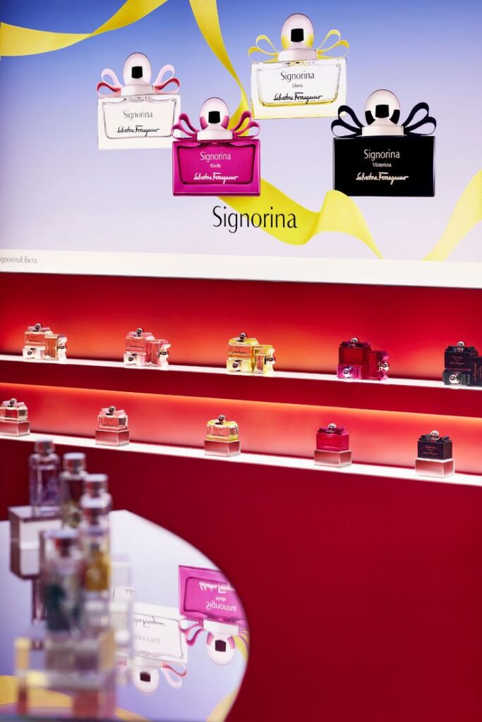
Beautiful products and premium displays often fail to stand out due to poor lighting.
Without controlled light, details blur, emotions flatten, and the customer walks past.
At Samtop, we integrate lighting at the structural level — designing for visual rhythm, emotional response, and product brilliance.
💡 Why Lighting Is Critical in Visual Merchandising
| Purpose | What It Does |
|---|---|
| Focus Control | Directs customer gaze and hierarchy |
| Mood Creation | Sets tone: calm, dramatic, natural, or high-tech |
| Color Correction | Enhances product + packaging true tone |
| Texture Reveal | Highlights velvet, stone, gloss, or metallic finish |
| Brand Consistency | Aligns with tone (e.g., warm = natural, cool = tech) |
🔍 Key Insight: Lighting defines how customers feel — and remember — your display.
🔦 Lighting Types in Product Displays
| Type | Visual Effect | Best Used For |
|---|---|---|
| Spotlight (Top) | Direct focus, sharp highlight | Hero products, jewelry, skincare |
| Backlight (Panel) | Glow from behind, soft silhouette | Logos, brand graphics, layered storytelling |
| Edge Light (Side) | Halo or rim effect | Frames, logos, tester trays |
| Uplight (Base) | Drama from below | Window sculptures, plinth installations |
| Diffused Panel | Even, soft lighting, no glare | Clean beauty, wellness, gentle storytelling |
| RGB / Smart LED | Color shifting, reactive light | Pop-ups, events, limited-edition capsule kits |
📐 Positioning Strategy by Emotional Goal
| Objective | Lighting Tip |
|---|---|
| Highlight hero product | Combine top spotlight with soft underglow riser |
| Convey softness or calm | Use warm tone (2700–3000K), even beam, low contrast |
| Enhance luxury drama | Use high-CRI spotlight (CRI>90) on matte surface |
| Promote skincare / wellness | Use soft panel light with low-shadow diffusion |
| Suggest innovation / tech | Use cool white (4000–5000K) + edge lighting with metal trims |
🔍 Real Case: Lighting-Driven Display for Fine Jewelry Launch
🟨 Client: Italian fine jewelry brand entering global airport retail
🟨 Challenge:
- Products were small and shadowed in normal mall lighting
- Needed sparkle without glare
- Limited display footprint (80cm max depth)
🟩 Samtop Solution:
- Suspended acrylic riser lit from below and above
- Narrow-beam 3000K LED (CRI>90) for sparkle and warm tone
- Frosted logo plate backlit with soft panel glow
- Plug-and-play wiring hidden in base with international voltage adapter
✅ Result:
- 3× increase in social media shares vs. previous window
- 14% sales lift during 3-week campaign
- Reused for winter season with only visual panel swap
🛠️ How We Integrate Lighting at Samtop
- Tone Planning – We define Kelvin, CRI, and visual goal
- Prototyping – Full-scale light mockups with product samples
- Built-in Wiring – Concealed cabling, universal plugs, clean structure
- Safe Materials – Anti-hotspot diffusion, no yellowing, fire-rated
- Shipping-Ready – Tested for repack, travel shock, and long-hour lighting
🎁 Bonus: All kits include dimmer/zone control and regional adapter kits.
💬 FAQ: Lighting in Display Design
Q: Should I use warm or cool light?
A: For skin, wood, or earth-toned packaging — warm (2700–3000K).
For tech, jewelry, or clean branding — cool (4000–5000K).
Q: What’s CRI and why does it matter?
A: CRI = Color Rendering Index. A CRI 90+ light shows true product color — vital for cosmetics, fashion, and jewelry.
Q: Can lighting be updated later without replacing the display?
A: Yes! We use magnetized or snap-fit modules — lighting is modular and replaceable.
Q: What’s the biggest mistake in lighting displays?
A: Flat, shadowless lighting that kills contrast. Displays need depth — use lighting layers and directional beams.
🎯 Conclusion: Light = Emotion = Memory
When thoughtfully placed, light doesn’t just illuminate — it persuades. It says “look here,” “touch this,” “remember this.”
Make it part of the design — not the afterthought.
✔️ Choose light with contrast, not just brightness
✔️ Let material and product inform lighting design
✔️ Structure your display to feel lit, not just be lit
✔️ Tell stories with light — not just structure
📩 Ready to Light Up Your Brand Story?
Let’s create displays where light leads your product narrative — beautifully.
👉 Email: [email protected]
🌍 Visit: www.samtop.com
- Materials → — Explore finishes that enhance lighting effects
- Solutions → — See how Samtop builds light-integrated displays
- Contact → — Get help with lighting strategy for your next launch
- Blog → — Browse visual hierarchy, window display, and modular design tips

