How to Strategically Place Brand Elements for Maximum Impact Without Visual Clutter
By Yan Luo | Samtop Display
Table of Contents
Messaging in product displays drives more than recognition — it builds connection. Thoughtfully placed logos, claims, and taglines reinforce brand identity and product benefits, without creating visual noise. At Samtop, we embed messaging zones into the structure — not just stickers, but story elements.
Effective retail display messaging starts with knowing where and why each word or logo appears.
Poorly placed logos, overloaded copy, or clunky messaging zones can reduce brand clarity and product appeal.
At Samtop, we integrate messaging as part of the structure — with materials, lighting, and layout that speak as clearly as the product itself.
🧠 Why Messaging Placement Matters in Retail Displays
| Element | Function | Emotional Effect |
|---|---|---|
| Logo | Brand recognition, trust | “I know who made this.” |
| Tagline/Slogan | Voice, positioning | “Why it matters to me.” |
| Product Claims | Education, selling point | “Why I should care or buy.” |
| Limited Edition Note | Scarcity, exclusivity | “This feels rare and special.” |
| Material/Craft Story | Authenticity, pricing rationale | “This justifies its value.” |
💡 Key Insight: Strong messaging doesn’t shout — it whispers in the right places.
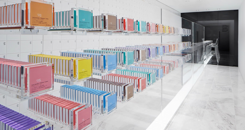
📐 Common Messaging Zones in Display Design
| Zone | Ideal Content Type | Why It Works |
|---|---|---|
| Front of base/platform | Logo or product name | Eye-level, photo-friendly |
| Back panel / vertical zone | Tagline or campaign story | Creates emotional background |
| Shelf edge / riser front | Ingredients, claims, callouts | Near product, supports conversation |
| Lighting-integrated area | Backlit or laser-engraved logo | High contrast, premium visual cue |
| Swappable panels/cards | Seasonal, regional, bilingual text | Easy update without new structure |
🔍 Real Case: Global Fragrance Messaging Integration
🟨 Client: Premium fragrance brand launching across Asia + Europe
🟨 Challenge:
- Must include brand + scent name, dual-language story
- Enable reuse of structure, local variation in messaging
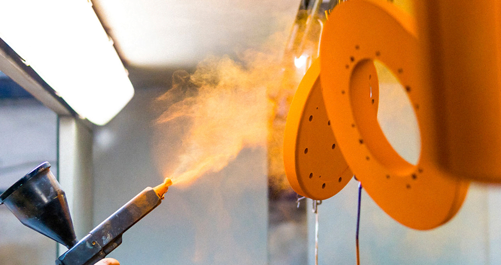
🟩 Samtop Solution:
- Back panel: frosted acrylic with magnetic dual-language card slots
- Velvet riser base: inset metal logo plate
- Swappable side message panels for seasonal updates
- All zones tested under ambient + spotlight lighting for contrast
✅ Result:
- VM teams customized messaging locally in minutes
- No new fixtures needed across 10+ markets
- Unified structure with layered, elegant storytelling
💬 FAQ: Messaging in Retail Displays
Q: Is a bigger logo always better?
A: Not for luxury. We recommend subtle techniques — laser-cut logos, metal inlay, or backlighting — to signal prestige and intentionality.
Q: How should we manage bilingual messaging?
A: Design modular: fixed areas for core brand messaging, and swappable elements (e.g., cards, magnets) for regional or seasonal text.
Q: Is printed text or engraved messaging better?
A: For long-term displays, engraving or embossing adds value. For rotating campaigns or seasonal content, use printed overlays or cards.
Q: What if we have a lot of product claims?
A: Prioritize 1–2 main messages visually. Add layered stories on side panels or encourage QR code engagement for deeper content.
🎯 Conclusion: Structure Speaks — Let It Say the Right Thing
Display fixtures are silent brand ambassadors. When messaging is built into their bones — not slapped on — they convey trust, story, and value effortlessly.
✔️ Make your message part of the material
✔️ Use light, texture, and layout for brand voice
✔️ Prioritize message hierarchy and zone clarity
✔️ Plan messaging updates without structural rebuilds
📩 Want to Integrate Messaging Elegantly Into Your Display?
Let Samtop help you build messaging zones that scale — from flagship to pop-up, across markets and languages.
👉 Email: [email protected]
🌍 Visit: www.samtop.com