How to Design Product Displays That Look Intentional — Whether in a Flagship or Small Countertop
By Yan Luo | Samtop Display
Table of Contents
Scale defines how your retail display fits a space; proportion defines how the elements relate visually. When used together, they create structure, flow, and a visual story — from luxury flagship to a travel-size counter.
A well-balanced retail display relies on two core principles: scale and proportion. Scale ensures a structure fits its space; proportion determines how elements relate visually. From flagship stores to travel retail counters, displays should guide the eye, highlight hero SKUs, and feel architecturally “right” — not oversized or underwhelming.
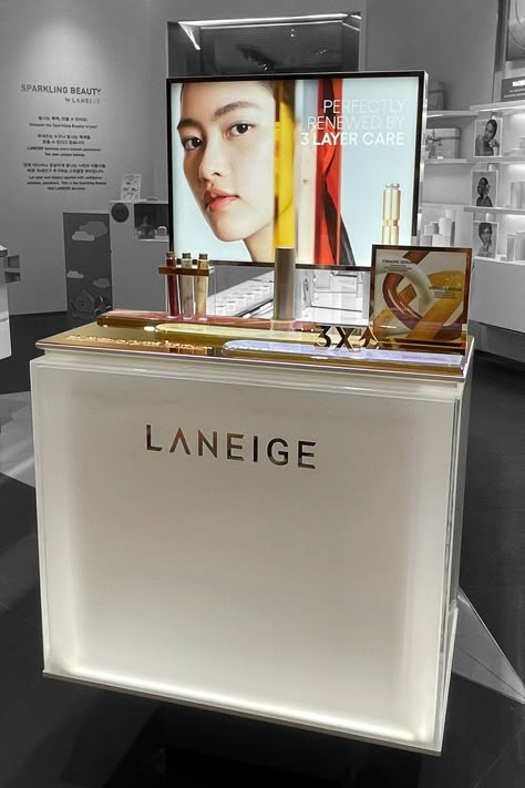
Many displays look great in design files but feel awkward in-store.
If your glorifier is too small, your product disappears. If your risers are too tall, they block views. These scale mismatches silently weaken customer perception.
At Samtop, we design displays that visually “belong” — tuned to the space, the product, and the shopper’s perspective, using proportion as a powerful tool of brand storytelling.
🎯 Why Scale & Proportion Matter in VM
| Principle | What It Affects | Why It Matters |
|---|---|---|
| Scale | Overall display size | Ensures presence without overwhelming the store zone |
| Proportion | Internal relationship of elements | Creates hierarchy, harmony, and natural eye movement |
| Balance | Visual & weight symmetry | Establishes stability — even in asymmetrical compositions |
💡 Key Insight: Customers subconsciously “feel” bad proportion before they consciously see it. Proportion isn’t cosmetic — it’s emotional.
📏 Samtop Proportion Guidelines by Display Type
| Display Type | Suggested Scale Tip | Proportion Best Practice |
|---|---|---|
| Counter Glorifier | Height = 1.5–2× product height | Base width = 1.2–1.5× product width |
| Window Plinth | At least 1/3 of total window height | Group in odd numbers: 1, 3, 5 |
| Shelf Display | Leave 10–15% whitespace around product zone | Use tiered height steps (e.g. 3–5cm difference) |
| Multi-product Tray | Anchor with central item for focus | Edge spacing = internal spacing × 1.5 |
✅ Samtop Tip: Always test your layout in full-scale mockups — real height, real spacing. Digital renders alone distort scale.
🔍 Real Case Study: Travel Retail Rebalancing
Client: Global skincare brand
Location: Airport duty-free, multiple Asia markets
Challenge:
- Original glorifier from flagship store shrank poorly
- Hero product lost focus; side SKUs looked crammed
- Setup staff were adjusting spacing manually
Samtop Solution:
- Lowered glorifier height from 12cm → 8cm to reveal products
- Resized risers using golden ratio (1:1.6) for visual harmony
- Added vertical acrylic panel to anchor eye-level sightline
- Standardized product spacing to create intentional rhythm
✅ Result:
- Product visibility improved dramatically
- Setup became faster with no post-install tweaks
- System scaled to 14+ duty-free stores with ease
⚙️ Scalable Modular System Application
| Scenario | Samtop Display Module Recommendation |
|---|---|
| Global rollout (flagship + SIS) | Core system with fixed height-to-width ratios |
| Pop-up kit reuse | Stackable risers with removable top plates |
| Travel counter SKU push | Glorifier tray + adjustable plinth risers |
| Multi-language campaigns | Magnetic message panels with fixed logo zone |
👥 Who Should Think in Scale & Proportion?
- ✅ VM Directors planning cross-format execution
- ✅ Brand Designers aligning flagship & pop-up fixtures
- ✅ Procurement Leads building scalable retail systems
- ✅ Creative Agencies pitching modular formats
- ✅ Store Teams installing fixed-size countertop displays
💬 FAQ: Display Scale & Layout Planning
Q: How do I know if a prop is too big or small?
A: Use the eye-height test — stand 2–3m away. If you see the whole display and the product sits in the center of attention, it’s the right size.
Q: Should my layout always be symmetrical?
A: No. Asymmetry often feels more dynamic — but you must balance height, color, and visual weight carefully.
Q: How do I make a small display feel more premium?
A: Add height through vertical frames, lighting, or reflective elements. Layer depth with textures and color contrast.
Q: How do I resize displays across store tiers?
A: Create a modular template with fixed proportion logic — then scale up/down the container, not the product logic.
✅ Conclusion: Use Scale to Build Confidence — and Proportion to Build Story
Designing displays that feel just right is part engineering, part storytelling.
When scale fits the space and proportion fits the product, the result is effortless impact — and elevated perception.
✔️ Think proportion first, scale second
✔️ Use tiering, spacing, and balance to guide the eye
✔️ Keep visuals powerful — but never overpowering
✔️ Let your display speak fluently in every store format
📩 Want Help With Multi-Format Scaling?
Let’s design a modular system that scales confidently — and sells beautifully.
👉 Email: [email protected]
🌍 Visit: www.samtop.com
