Maximizing Visual Impact When Every Centimeter Counts
By Yan Luo | Samtop Display
Table of Contents
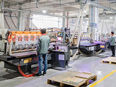
Creating an effective small retail display layout is essential in today’s compact store formats. From pop-ups to pharmacy counters, maximizing limited space while keeping visual impact high is a key retail challenge. At Samtop, we design compact, vertical, and multi-functional display systems with lighting and modularity—ensuring strong brand visibility even in under 1 square meter.
You only have 1–2 square meters to tell your brand story in-store.
Poor display layout overwhelms the space, hides your hero SKUs, and creates visual clutter. Customers rush past without engaging, and your high-value SKUs go unnoticed.
At Samtop, we engineer display layouts specifically for space-limited environments. From vertical risers to halo lighting and flat-pack design, we help brands make a bold visual impact—without needing extra square meters.
In small-format stores, displays need to work smarter — not bigger. By optimizing layout and integrating visual hierarchy, lighting, and multi-functional props, brands can maximize the impact of every square meter.
Are you struggling to make a big impact in a small retail space? When space is limited, it’s essential to design displays that make the most of every inch. In this article, we’ll show you how to transform even the smallest footprint into a powerful, attention-grabbing display with the help of smart layouts, modular systems, and integrated lighting. Continue reading to discover how to maximize your retail space’s potential!
🧠 Small Space ≠ Small Brand Impact
| Challenge | Strategic Solution |
|---|---|
| 🧱 Tight footprint | Use vertical layering, not horizontal sprawl. |
| 👁️ Limited visibility | Add light, mirror, or movement to attract eyes. |
| 🏷️ SKU overload | Guide focus with tiering and visual hierarchy. |
| 🚶 Fast-paced traffic | Design for <3-second recognition and interaction. |
| 💼 No storage/backroom | Use fold-flat, double-function components. |
🧠 Space is limited — attention span is shorter. Design accordingly.
📐 5 Layout Strategies for High-Impact in Small Spaces
✅ 1. Vertical Hierarchy
Maximize height by stacking risers or shelving to create “visual zoning.”
Use the top zone for hero products or key campaign items, and the base level for trial products or purchase conversion triggers.
This layout principle is perfect for optimizing a small retail display layout.
📦 Example:
30cm wide × 60cm tall glorifier with header + 2 trays.
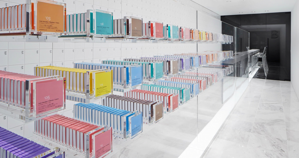
✅ 2. Integrated Lighting
Use under-tray or halo LEDs to highlight key products. Lighting adds visual focus and depth, especially in low-light counters (like duty-free or cosmetics kiosks).
📦 Example:
Backlit acrylic panels for tester trays.
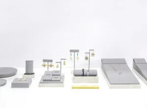
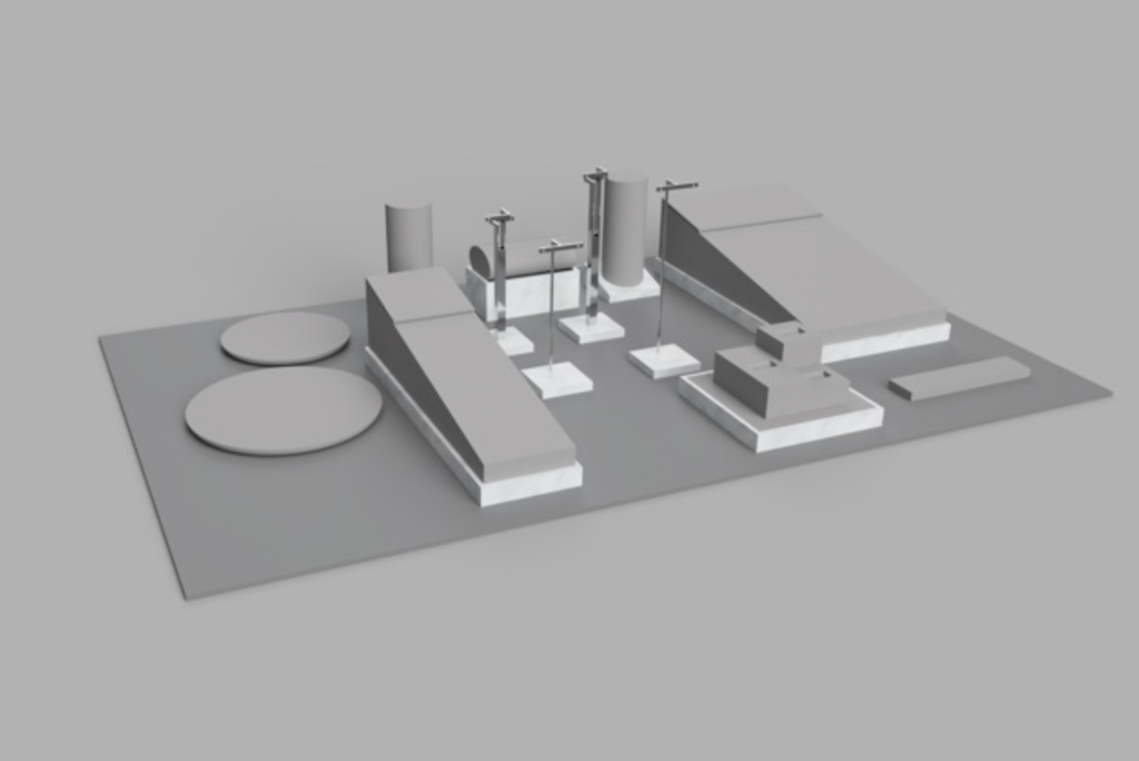
✅ 3. Multi-Function Props
Design props with multiple functions:
- A tray that doubles as a tester, mirror, and brochure holder.
- A riser that serves as a product plinth with storage underneath.
📦 Example:
Drawer-style MDF base with sliding cover.
✅ 4. Modular Kits for Tiered Store Formats
Create a core design that can be adapted for various store sizes. Use the same design in Flagship, Mid, and Mini versions to maintain visual consistency across all store formats.
📦 Example:
Same PET sleeve wrap, different base size.
✅ 5. Flat-Pack + Easy Setup
No backroom? Use collapsible, tool-free structures that can be easily set up on-site for pop-ups, kiosks, or in-store events.
📦 Example:
Magnetic back panel + fold-in PET tray shipped flat.
🧩 Real Case: Beauty Brand at Micro-Kiosk
Space Limit:
70cm counter width × 50cm depth × 60cm max height.
Solution by Samtop:
- 3-tier vertical tray (white acrylic).
- Halo LED around hero SKU.
- Clip-on tester mirror.
- Drawer base for 10-unit refill stock.
- Flat-packed in 1 box with QR setup.
✅ Results:
- Visibility from 5m away.
- 12% uplift in impulse purchases.
- 30-second install time.
💬 FAQ
Q: Can I keep branding strong in a small layout?
A: Yes — we use silk-screened logos, magnetic headers, and lighting accents to ensure brand tone stays premium.
Q: What if I have multiple SKUs but minimal space?
A: Prioritize SKUs visually using height, lighting, and tray placement. Feature the hero SKU at eye level and place supporting SKUs underneath or behind.
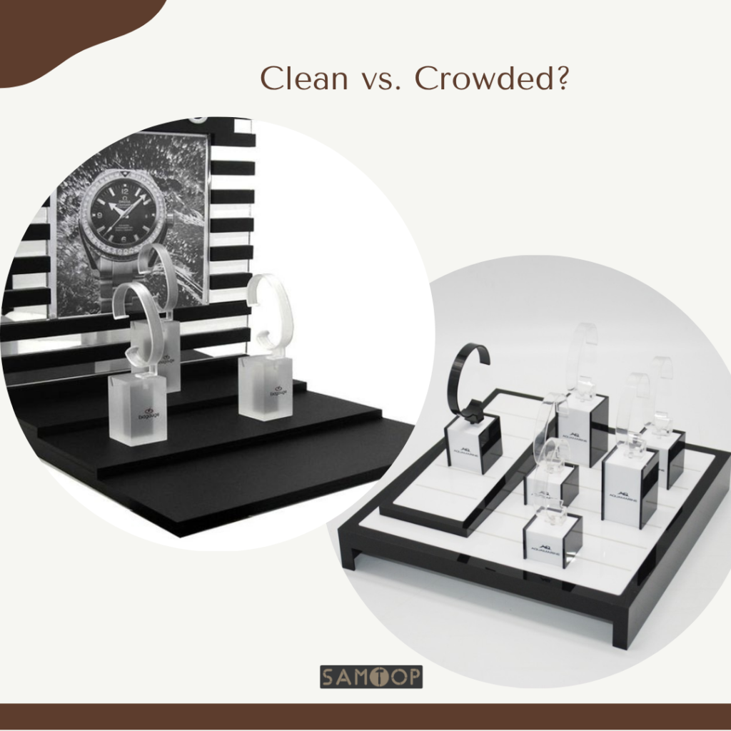
Q: How do I avoid visual clutter?
A: Limit to 2–3 color tones, incorporate hidden storage, and allow clear negative space between elements to keep the design clean and organized.
✅ Conclusion: Max Space. Max Impact.
- Think vertical, not wide: Use risers and shelving to maximize the height of the display.
- Combine functions in each component: Make props multi-functional to save space and increase utility.
- Light it well, keep it clean: Lighting is crucial in small spaces to attract attention and highlight key products.
- Design modular systems for every tier of store size: Create flexible designs that can be adapted for larger or smaller spaces.
🌟 The right display layout turns even 1 square meter into a brand story.
A successful small retail display layout isn’t just space-saving—it drives ROI.
📩 Want a Custom Space-Conscious Display System?
We help brands:
• Create modular, small-format display kits
• Integrate lighting, storage, and fold-flat functions
• Customize for airport counters, kiosks, boutiques, and more
📧 Email: [email protected]
🌍 Visit: www.samtop.com