How to Use Color to Build a Seamless Brand Experience from Product to Retail
Table of Contents
By Yan Luo | Samtop Display
Yes — a carefully matched color strategy from product to display strengthens your brand’s visual identity. Samtop helps translate packaging color into retail displays, ensuring continuity, elegance, and emotional impact.
You’ve invested in beautiful, distinctive product packaging — but when it hits the store window, the display feels disconnected or diluted.
This visual mismatch weakens customer perception. The emotional impact of your product color gets lost in translation, leading to a less cohesive, less memorable brand experience.
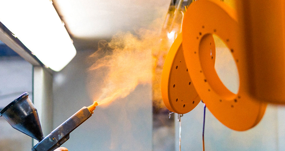
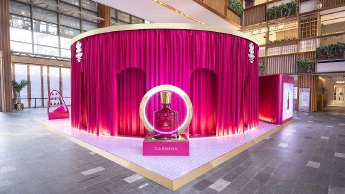
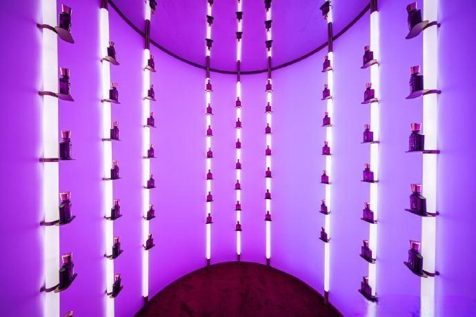
At Samtop, we use strategic color pairing to align your display materials with your packaging — from lighting temperature to riser tones and backdrop hues. We ensure the transition from bottle to window feels intentional, premium, and seamless
🎯 Why Color Pairing Matters in Luxury Displays
1. Color Evokes Emotion
Color is processed emotionally before rationally. Cool tones can soothe. Warm tones energize. Strategic pairing amplifies your product’s emotional cues, deepening customer connection.
2. Consistency Builds Trust
Your brand already has an intentional color system. Extending that palette into your display architecture strengthens recognition and aligns touchpoints from packaging to physical environment.
3. Color Directs the Eye
Color isn’t just beautiful — it’s directional. In a display, it can frame hero products, guide gaze, highlight texture, and create hierarchy without a single word.
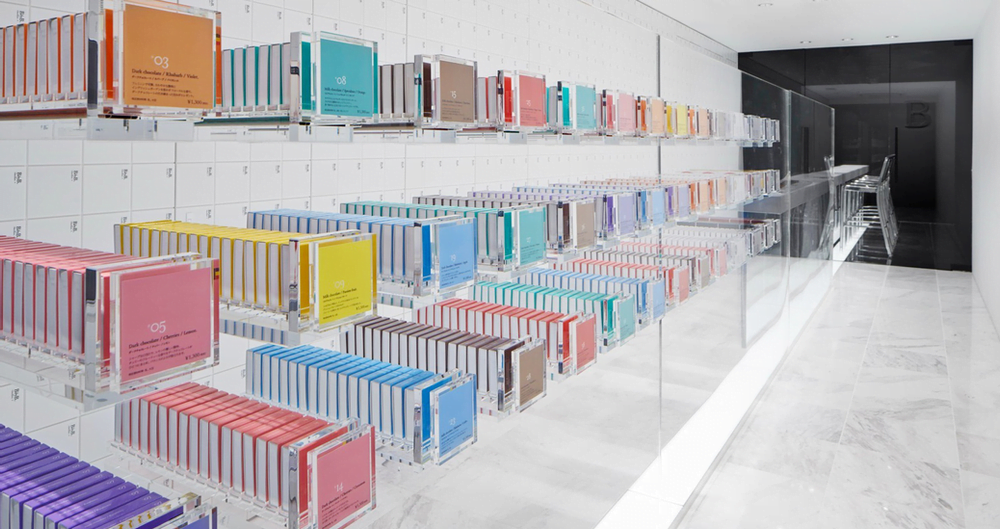
🎨 Color Pairing Guide: Packaging to Display
| Packaging Color | Display Strategy | Best Used For |
|---|---|---|
| 🟥 Bold (e.g., deep red, black) | Use neutral matte backgrounds, brushed metallics to balance intensity | Fragrance, fine watches, statement collections |
| 🟩 Pastels | Pair with soft woods, white acrylic, fabric textures | Skincare, wellness, natural beauty |
| 🟦 Cool tones (blue, teal) | Add warmth through brass, walnut, or warm backlighting | Heritage lines, science-backed skincare |
| 🟨 Bright/vibrant hues | Ground with darker neutrals (charcoal, slate) to anchor energy | Summer campaigns, capsule drops, limited editions |
| 🟪 Earth tones | Highlight with organic textures like stone, cork, linen | Eco-conscious, botanical collections |
| 🟢 Botanical greens | Combine with whitewashed wood, matte ceramics, greenery lighting | Holistic health, spa lines, minimalist luxury |
💡 Pro Tip: A harmonious display color palette increases product attention span and encourages in-store trial.
🔍 Case Study: Color Alignment for Skincare Brand
🟨 Client: Premium clean beauty brand launching an essential oils line
🟨 Packaging: Cream-toned bottles with soft sage green caps and gold foil branding
🟩 Samtop Display Strategy:
- Light cream acrylic as base for tone continuity
- Gold detailing on risers reflecting packaging foil
- Soft green backlighting to enhance product mood
- Natural wood risers to support an organic, sensory environment
✅ Results:
- In-store coherence between packaging and retail presence
- Improved customer perception of brand elegance and natural positioning
- Display scaled globally with regional lighting adjustments
👥 Ideal For:
✅ Beauty, skincare, and fragrance brands with signature packaging tones
✅ High fashion accessories using color to reinforce identity
✅ Tech and lifestyle brands balancing multiple SKUs in unified displays
✅ Retail teams seeking consistent visual systems across global rollouts
🛠️ How Samtop Creates Cohesive Color-Aligned Displays
1️⃣ You share packaging specs, color codes, product lines
2️⃣ We assess and map a compatible display palette using Pantone and material guides
3️⃣ We prototype color elements: lighting tone, riser material, backdrops
4️⃣ You receive full renders + sample panels for review and QC
5️⃣ We build and install with color-matched finishes, lighting simulations, and global scalability in mind
🎁 Bonus: We provide seasonal color adaptations or regional variants to fit your global campaigns.
💬 FAQ: Color Strategy for Retail Displays
Q: Can you match our exact packaging colors in displays?
A: Yes — we use Pantone-matched paints, vinyls, and backlighting calibrated for both daylight and indoor conditions.
Q: We have 5 product colors. Can you unify the display?
A: Absolutely. We use neutral framing, color-block zoning, or tiered layouts to balance diversity with cohesion.
Q: Our brand uses gradients. Can this be replicated?
A: We can simulate gradients using layered materials, colored lighting, or gradient printing across backdrop elements.
Q: Is this adaptable across different store sizes?
A: Yes — our display modules are scalable and can be resized or split without losing color harmony.
Q: How do you handle color temperature in lighting?
A: We test lighting scenarios to ensure product tones stay true under different environments — warm light, daylight, and ambient conditions.
🎯 Conclusion: Color Isn’t Decoration — It’s Direction
Color is your brand’s silent storyteller. When your retail displays reflect your product’s palette, you create emotional alignment, strategic clarity, and visual coherence that customers feel and remember.
✔️ Boost in-store recognition through cohesive color storytelling
✔️ Align global brand experiences across retail formats
✔️ Strengthen product recall with seamless color continuity
✔️ Communicate luxury through tonal precision and detail
📩 Ready to Transform Your Product Colors into In-Store Strategy?
Let’s bring your packaging palette to life — in every store, every window, every region.
👉 Email: [email protected]
🌍 Visit: www.samtop.com
🧠 Explore Custom Display Solutions
📰 More Retail Display Insights