Using Color to Influence Consumer Behavior in Retail
By Yan Luo | Samtop Display
Table of Contents
Color is one of the most powerful emotional tools in luxury window display design. The right palette influences perception, evokes desire, and aligns perfectly with brand identity.
Most retail windows rely on visual appeal — but overlook the emotional science of color. Random color choices risk misalignment with brand values or missed customer impact.
In luxury, perception is everything. A mismatched color tone can dilute the sense of exclusivity or alienate your core customer. Without strategy, even beautiful displays may fail to convert attention into emotion.
At Samtop, we use color psychology to create emotionally strategic, brand-aligned displays. From tonal harmony to light coordination, we design immersive color moments that reflect your story and spark connection
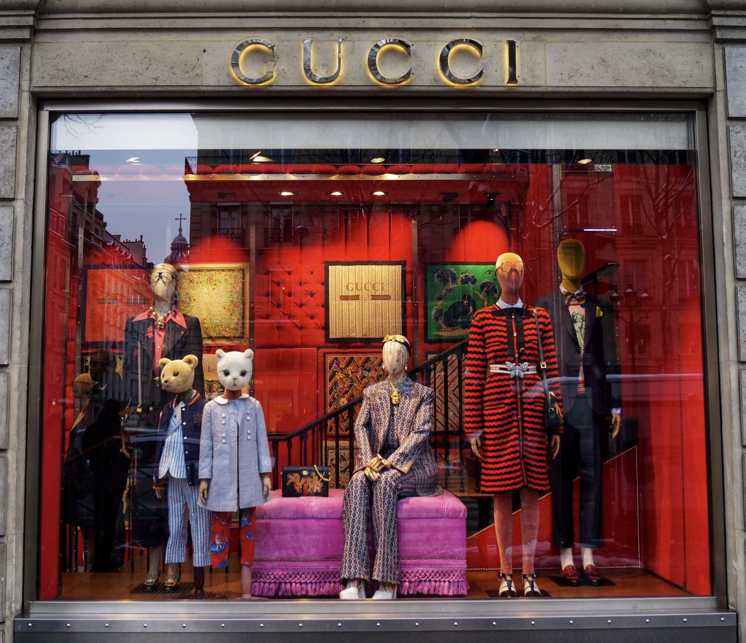
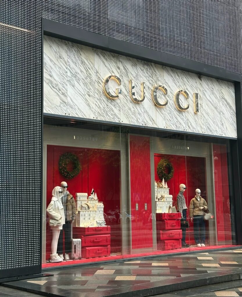
🧠 Why Color Matters in Luxury Retail Displays
- Color Evokes Emotion Instantly
Color triggers subconscious reactions. Whether calm, confidence, or desire — emotions shape whether customers approach or ignore your storefront. - Color Reinforces Brand Identity
From Hermès Orange to Tiffany Blue, color builds recognizability. Strategically echoing brand palettes across displays deepens recall and loyalty. - Color Affects Perceived Value
Matte black, deep jewel tones, golds — these tones suggest luxury. Poor color pairings can unintentionally signal mass-market or reduce premium cues.
🎨 Color Psychology Cheat Sheet for Luxury Displays
| Color | Emotional Effect | Best Use in Luxury Displays |
|---|---|---|
| ⚫ Black | Power, elegance, mystery | Framing products, contrast, evening campaigns |
| 🤍 White | Purity, minimalism, calm | Clean backdrops, modern skincare |
| 💛 Gold | Wealth, celebration, prestige | Accents, limited edition framing |
| 🔴 Red | Passion, urgency, sensuality | Holiday windows, impulse-driven products |
| 🔵 Navy / Blue | Trust, sophistication | Men’s fashion, heritage luxury |
| 💚 Emerald / Green | Balance, nature, renewal | Eco-lines, botanical fragrances |
| 💜 Purple | Creativity, regality | Artistic launches, romantic collections |
| 🩶 Silver / Chrome | Innovation, clarity | Watches, accessories, modern tech-based luxury |
| 🌸 Pastels | Femininity, softness | Skincare, spring capsule campaigns |
🔍 Real Case: Spring Fragrance Campaign with Blush Palette
Client: Global luxury beauty brand launching a new spring fragrance
Goal: Capture emotion of spring rebirth + reinforce approachability
Samtop Solution:
- Built a palette of blush pink, pale lavender, and warm nude tones
- Used white silk drapes to convey softness and motion
- Integrated rose-gold elements to elevate femininity with metallic luxury
- Lighting adjusted to shift ambiance from day to night
- Sculpture inspired by fragrance notes completed the story
Result:
- 300+ organic social media shares in 2 weeks
- 18% increase in walk-ins during campaign period
- High conversion on featured product line
👥 Who Should Focus on Color Psychology?
✅ Fashion brands syncing palette with seasonal runway tones
✅ Skincare and beauty brands promoting emotion-based products
✅ Jewelry brands looking to elevate perceived luxury
✅ Fragrance lines targeting mood, memory, or seasonal scent stories
✅ Eco-luxury or wellness lines needing nature-inspired trust signals
📐 How Samtop Designs Color-Driven Displays
- Review brand colors, packaging, and customer tone preferences
- Choose a psychological goal (e.g. serenity, sensuality, joy)
- Create a palette map: base tone + highlight + accent + neutrals
- Build mockups and lighting tests for visual accuracy
- Deliver custom-colored props, fabrics, and finishes
🎁 Bonus: We provide Pantone-match panels and color samples for final approvals
💬 FAQ: Color Psychology in Display Design
Q: Can color actually affect foot traffic?
A: Yes — color is often the first thing noticed and felt. Emotional response drives interest.
Q: How do we make color feel luxurious — not loud?
A: By controlling texture and finish: think satin, matte, silk — and balancing bold with grounding neutrals.
Q: Do we always use our core brand color?
A: Not necessarily. We evolve the palette based on season or product mood, while anchoring it to your base tones.
Q: Does lighting change the color’s emotional tone?
A: Absolutely. Warm light can soften intensity; cool light can sharpen bold hues. We calibrate both.
Q: Can display colors match packaging?
A: Yes — and they should. A consistent visual thread from window to product deepens brand experience.
📩 Need help designing a color-forward display?
Let’s shape emotion, elegance, and value — one shade at a time.
👉 Email: [email protected]
🌍 Visit: www.samtop.com