When to Use Words, When to Use Icons — And How to Balance Them Elegantly
By Yan Luo | Samtop Display
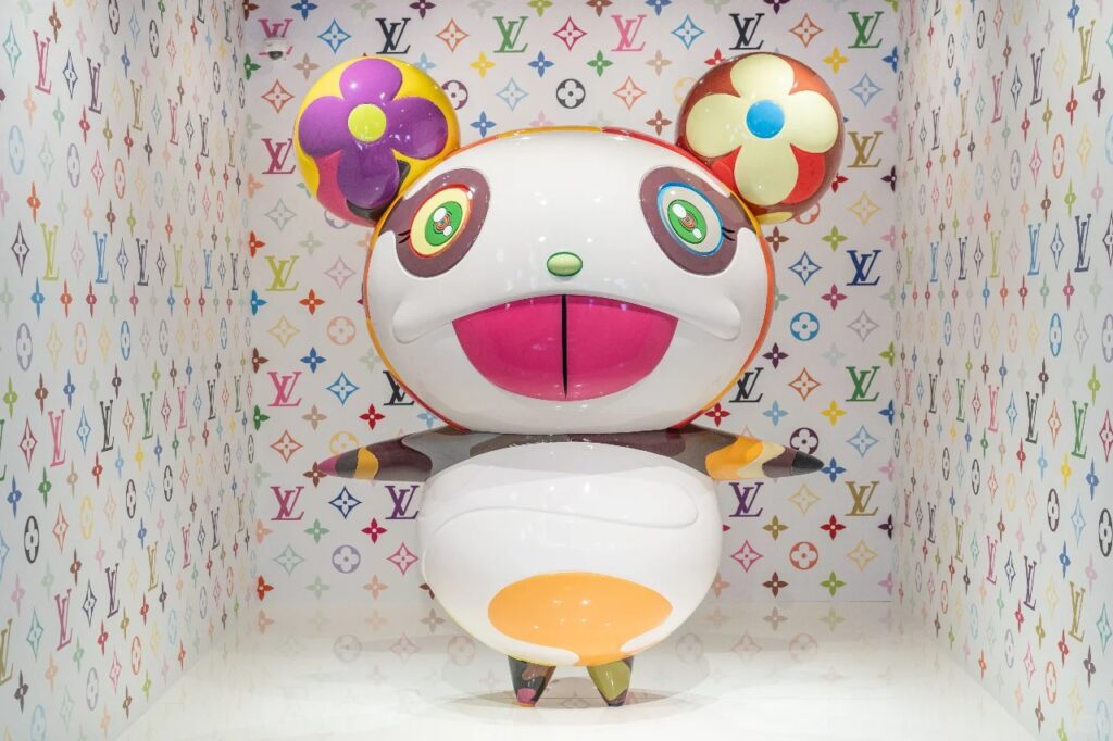
In high-end windows, font vs symbol is no longer a question of aesthetics, but storytelling strategy.
Smart luxury brands combine both — using type to guide and icons to connect. The art is in the balance.

Too much literal messaging can flatten the brand mood. Symbols alone may feel vague without direction.
Designers often struggle to decide: “Should we use our slogan or icon? How do we avoid visual overload while staying expressive?”
Samtop helps luxury brands structure display hierarchies where fonts, symbols, and space co-exist — delivering emotional impact and brand clarity.
🧩Font vs Symbol — Which Messaging Works Best in Luxury Visual Merchandising
| Aspect | Font-Based Messaging | Symbolic Messaging |
|---|---|---|
| 🔤 Function | Precise communication, storytelling, titles | Emotional resonance, cultural shorthand |
| 🎯 Strength | Campaign language, slogans, guidance | Mood, identity, immediate recognition |
| 🌐 Usage | Needs translation, culturally dependent | Universal, transcends language |
| 🎨 Expression | Controlled tone via typography (serif, sans-serif) | Evocative tone via motif, emblem, iconography |
Key Insight: Use fonts to inform. Use symbols to evoke. Use both to create a lasting visual conversation.
🪄 How Luxury Brands Balance Text and Symbol
| Application Area | Font-Based Approach | Symbolic Expression |
|---|---|---|
| 🧾 Campaign Titles | “The Art of Time” in serif | Abstract seasonal motifs (leaves, clocks, textures) |
| 🖋️ Brand Storytelling | Taglines beneath product with curated fonts | Historical crests, monograms in background relief |
| 🌍 International Display | Multilingual typography layers | Shared symbols like moon, sun, star motifs |
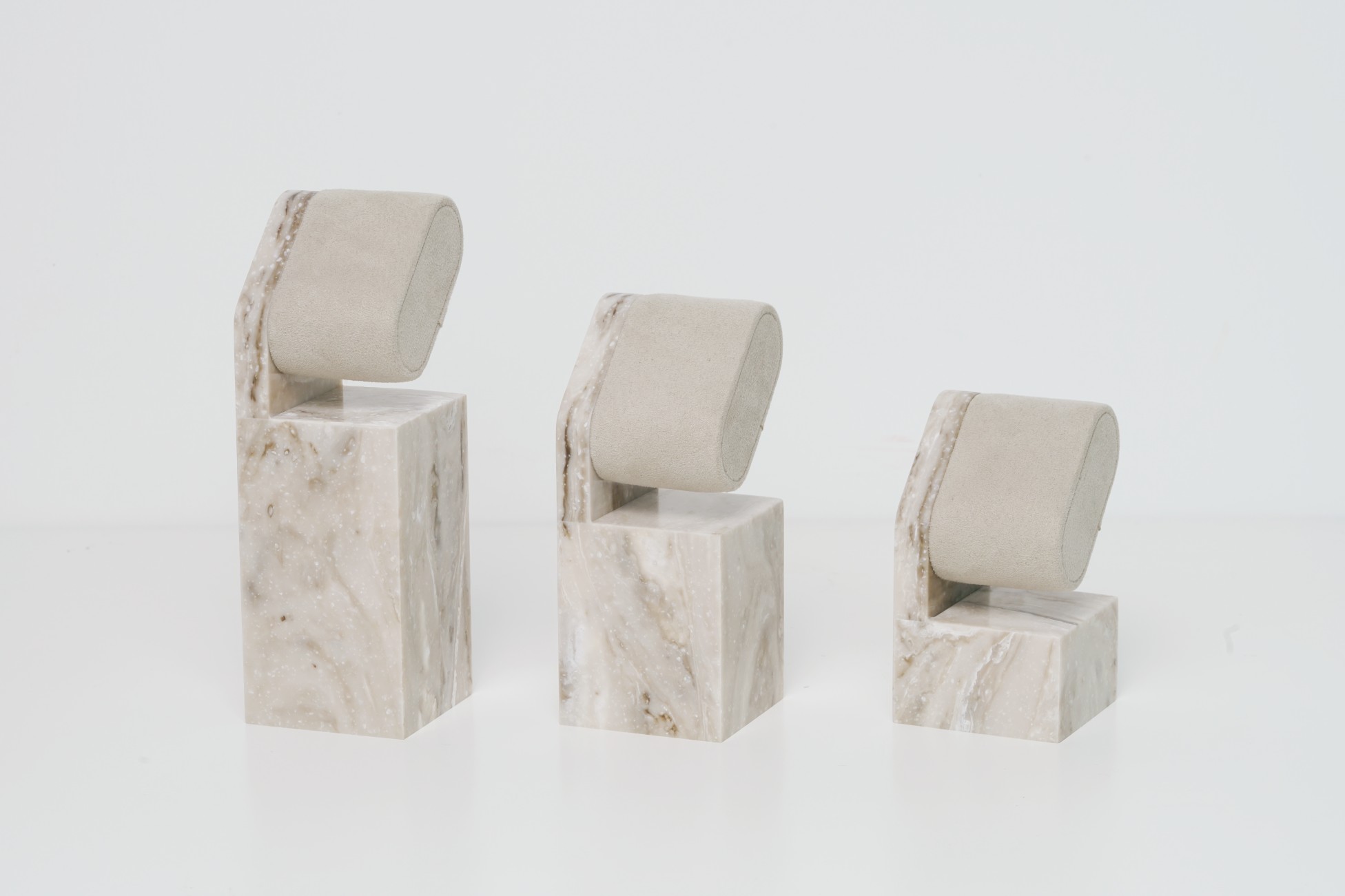
| 🖼️ Sculptural Elements | 3D floating laser-cut text | Emblem fixtures, icon-shaped pedestals |
| ✉️ Packaging-Inspired | Fonts from print/dielines in window frames | Closure shapes or icons scaled up as props |
🟨 Real Case Study: Font & Symbol Harmony in Fashion Display
Client: French luxury fashion house launching capsule collection
Campaign Goal: Highlight archive-based theme in a modern museum-like display
Samtop’s Solution:
- “Edition No. 6” in 3D serif type above eye level
- Archival crest embossed on neutral velvet backdrop
- Visual hierarchy: text as headline, crest as anchor
Result: - Praised by press as “editorial and timeless.”
- Replicated across Tokyo and Milan with local type, but universal crest symbol retained
👥 Ideal Clients for Font + Symbol Messaging
✅ Heritage brands with crests, monograms, historical symbols
✅ Minimalist luxury brands seeking balanced visual codes
✅ Fashion, fragrance & skincare campaigns needing clarity & mood
✅ Beauty brands desiring softer or more sensual storytelling
✅ Pop-ups/global rollouts with cross-lingual consistency needs
📐 Samtop’s 5-Step Messaging Hierarchy Service
- Review your campaign assets, brand font, icon system
- Identify areas for verbal vs. visual communication by region/display zone
- Build tiered messaging (headline font, supporting symbol, whitespace)
- Prototype material applications — font in brass, symbols in matte vinyl or frosted glass
- Manufacture consistent display components: 3D signage, emblem props, icon-based pedestals
🎁 Bonus: Symbol-only displays, custom serif/sans signage, tactile crests for seasonal reuse


