Visual Merchandising for Product Families: Harmonizing Multiple SKUs in One Display

layered display window

How to Create Unified, Shoppable Displays That Celebrate Product Diversity

By Yan Luo | Samtop Display

A great product range can fall flat if the display lacks clarity. Samtop helps luxury brands design modular, harmonious retail displays that celebrate SKU diversity while maintaining a cohesive, premium look — across fragrances, skincare sets, makeup collections, and more.

Your brand has a family of products — beautiful bottles, color-coded SKUs, or seasonal variants — but your display makes them look disjointed or cluttered.

If everything blends, customers get bored. If everything clashes, they get confused. And when it’s unclear how the SKUs relate, they stop exploring — or worse, don’t buy.

At Samtop, we help you find the visual rhythm — a balance between unity and variety — so your display feels clear, elevated, and shoppable.

🧠 Why Multi-SKU Display Design Needs Strategy

1. Balance of Contrast and Consistency

The goal isn’t “same-same” or “standalone” — it’s orchestrated variety. We use height, color, spacing, and materials to create a rhythm that guides the eye and invites comparison.

2. Clarity = Conversion

Displays should help customers understand the differences and relationships between SKUs — whether by scent, skin type, routine step, or mood. When the logic is visible, shoppers buy more confidently.

3. Structure = Perceived Value

When product families are beautifully grouped with matching risers, trays, or dividers, the brand feels thoughtful, curated, and premium — even with variant packaging.


🧩 Common SKU Display Challenges — and How Samtop Solves Them

ChallengeSamtop Solution
Different bottle sizes / heightsTiered risers, leveling pads, or symmetrical step layouts
Strong color differencesNeutral materials, gradient arrangement, or soft backlighting
SKU crowding in small areasModular trays, slot dividers, switchable acrylic cards
Inconsistent lightingBuilt-in LED strips with diffusion panels
Hero SKU needs spotlightElevated riser, mirror base, or LED halo behind product

💡 Our philosophy: “Organized diversity.” Show differences — but make them feel like a family.


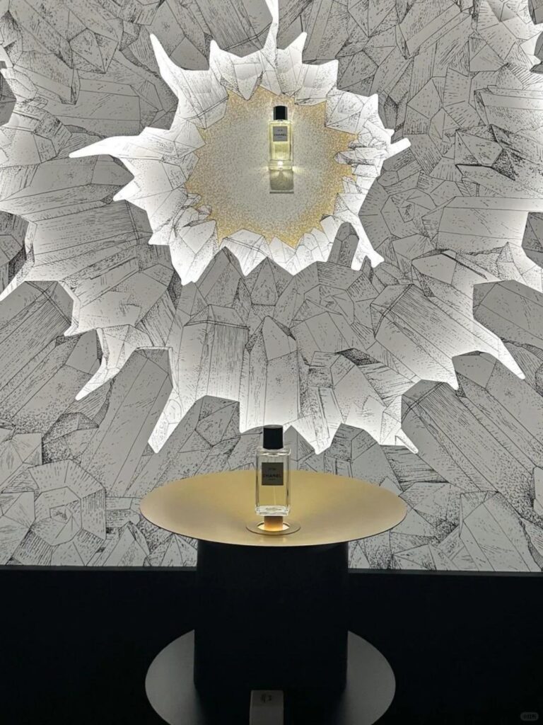
🔍 Real Case: Unifying a Boutique Fragrance Trio

🟨 Client: Niche perfume house with three new SKUs
🟨 SKU Traits:

  • Gold, silver, and rose gold caps
  • Slight height variance
  • Distinct scent identities: Citrus, Musk, Floral

🟩 Samtop Solution:

  • Built a soft ivory acrylic base to unify the range visually
  • Introduced a 3-tier step system with printed name plaques for each SKU
  • Placed the hero scent (Musk) on a mirror pedestal with subtle LED backlighting
  • Used transparent dividers to separate while maintaining flow

Result:

  • Clearer scent differentiation and guided exploration
  • Buyers appreciated “elegant symmetry without rigidity”
  • Display successfully rolled out in EU and Asia with only localized language swaps

👥 Who Needs Multi-SKU Visual Merchandising?

Beauty & skincare brands with multi-step or seasonal collections
Fragrance labels managing launches of 3–6+ scents
Color cosmetics brands organizing lipsticks, shadows, or foundations by tone
Tech accessories or personal care brands differentiating function or finish
Retail teams looking for modular VM systems that adapt to future drops


📐 How Samtop Designs for SKU Harmony

1️⃣ You share SKU list, sizes, colorways, campaign tiering
2️⃣ We map the differences: height, tone, finish, label style
3️⃣ We propose layouts: linear, curved, pyramid, clustered — with riser ideas
4️⃣ You review renders and layout logic for visual storytelling
5️⃣ We produce and deliver retail-ready displays with elegance + modularity

🎁 Bonus: We design expansion-ready trays and slot modules — so new SKUs can join the family, without a full redesign.


💬 FAQ: Visual Merchandising for Multi-SKU Displays

Q: How many SKUs can we group in one display?
A: We typically design for 3–8 SKUs. Beyond that, we recommend separating into sub-groups or rotating highlight slots.

Q: Can we highlight a hero product without breaking the balance?
A: Yes — with elevation, lighting, or framing. It draws attention without disconnecting it from the group.

Q: What if one bottle is taller or wider than the rest?
A: We use leveling risers or tray inserts so all products feel aligned while retaining their proportions.

Q: Can we scale this from counter to gondola?
A: Absolutely. Our systems scale from tester trays to pop-ups and wall units with consistent SKU logic.

Q: Can we color code the SKUs without looking messy?
A: Yes — we use light-colored trays, backlighting, and clean labeling to group colors while keeping the look premium.

🎯 Conclusion: One Family. One Display. Many Stories.

Great brands don’t just make great products — they present them beautifully.
A well-designed multi-SKU display makes complexity look effortless, and variety feel intentional.

✔️ Harmonize SKUs with modular, elegant structures
✔️ Guide customer exploration with visual logic
✔️ Reinforce brand storytelling from first glance to checkout
✔️ Prepare for growth with expansion-friendly systems

📩 Want a display that makes your product family sing?
Let us design a modular layout that celebrates your range — with clarity and beauty.

👉 Email: [email protected]
🌍 Visit: www.samtop.com

Subscribe to our news

Don't miss new updates on your email

Let’s make your concept a reality!

Get an instant quote from our most experienced engineers.
We’d love to hear from you

brochure.pdf

Get Our Latest Projects and Connect with Engineer Bob Chow

Bob Chow Engineer