What Buyers and Creative Teams Need to Know About Color Matching in Custom Displays
Table of Contents
Pantone color matching across different materials is essential for brand consistency in custom displays. Whether you’re using acrylic, MDF, or metal, achieving accurate and visually aligned colors is crucial — especially when your POP display is designed to reflect your brand identity.
🎯 Color Consistency Isn’t Optional — It’s Brand Protection
You’ve finalized your POP display concept.
Your brand color — bold, iconic, exact — is at the heart of it.
But then the question arises:
👉 “Can you match Pantone 186C across acrylic, resin, metal, wood, and fabric?”
Color inconsistency can ruin even the best-designed display. For premium brands in beauty, fashion, and fragrance, Pantone accuracy is not just a design detail — it’s brand protection.
The good news?
👉 At Samtop, we’ve helped hundreds of global brands achieve visually accurate Pantone matching across materials — here’s how.
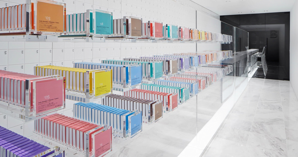
🎨 Why Pantone Color Matching Matters in Displays
Avoids mismatched campaigns across markets
Ensures brand consistency across materials
Creates visual harmony in store environments
Increases consumer trust and recognition
📊 Pantone Matching Accuracy by Material
| Material | Accuracy Level | Matching Method | Notes |
|---|---|---|---|
| Acrylic / Resin / MDF | ★★★★★ | Spray-painted with colorimeter control | Gloss vs. matte affects tone — approval required |
| Powder-Coated Metal | ★★★★☆ | UV spray or powder coating | Color shift possible if plated (e.g., chrome + red) |
| Laminated MDF / Veneer | ★★★★☆ | Pre-matched laminates | Some Pantone shades unavailable |
| Fabric / Paperboard | ★★★☆☆ | Pantone TCX / CMYK conversion printing | Ink absorption changes output; needs printed sample |
| Injection Molded Plastic | ★★☆☆☆ | Pigmented pellets | Requires new mold compound — not ideal for small batch |
| Plated Metal / Chrome | ★☆☆☆☆ | Not color-matched by Pantone | Reflected light distorts visual tone; visual-only match possible |
👉 Pro Tip: Always confirm color under your actual retail lighting — not neutral studio light.
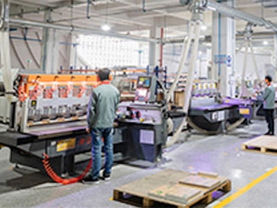
🛠️ Samtop’s Color Matching Process for Custom Displays
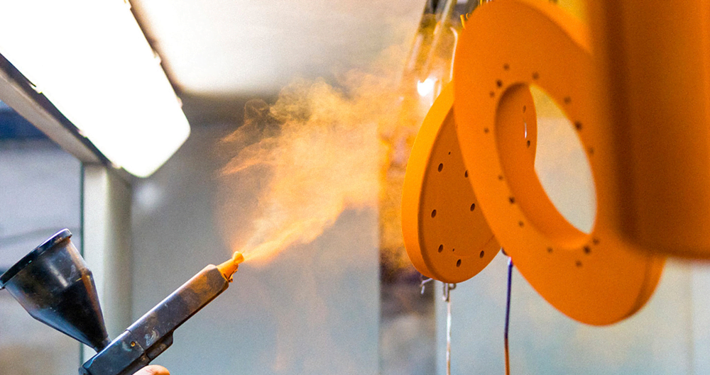
✅ Step 1: Digital + Physical Color Control
- Colorimeter scan of Pantone chip
- Spray test on actual material samples (e.g. acrylic panel, MDF block)
✅ Step 2: Swatch Sample Creation for Each Material
We send you physical sprayed swatches across:
- Resin
- Acrylic
- Painted wood / MDF
- Powder-coated aluminum
✅ Step 3: Recipe Logging for Repeat Orders
We archive:
- Paint supplier + code
- Spray booth temperature / gun pressure
- Technician and material batch
✅ Step 4: Client Final Visual Approval
We only proceed after your team confirms via photo or physical swatch sign-off.
Even if the spectrometer says “match,” we always defer to brand eye.
🧪 What Affects Pantone Color Accuracy?
| Factor | Effect |
|---|---|
| Surface texture | Matte diffuses color; gloss enhances saturation |
| Material absorption | Paper/fabric absorbs ink = desaturated appearance |
| Light temperature | Warm light vs. cold light affects visual tone |
| Coating layer thickness | Spray depth changes tone on curved surfaces |
| Substrate undertone | Clear acrylic, beige MDF, silver base shifts outcome |
| Batch inconsistency | Uncontrolled suppliers = visual differences |
💡 Pro Tip: Always confirm color in your actual display lighting condition — not just under neutral light.
🧪 Real Project Example: 3 Materials, 1 Brand Red
Client: Global fragrance brand
Pantone: 186C
Displays: Counter glorifier (resin), tester tray (acrylic), side panel (MDF)
Results:
- Resin sprayed with semi-gloss finish
- Acrylic base painted reverse side with matte coating
- MDF topcoat with matching gloss lacquer
✅ Visual match passed both HQ and in-store light tests
🎯 Client ordered 500 units in 3 regions
📚 Application Scenarios Recommendation (Structured Table)
| Scenario | Recommended Approach | Recommended Materials |
|---|---|---|
| High-End Beauty Displays | Prioritize visual consistency | Spray on acrylic, MDF, resin |
| Fashion Pop-Up Stores | Fast prototyping with color alignment | Laminated MDF + color wrap |
| Home/Furniture Displays | Balance texture and cost | Powder-coated metal |
| Print & Packaging | Multi-batch color consistency | CMYK printing + preprint proof |
| Displays Under Lighting | Test color under actual light conditions | Use store lighting for approval |
Let me know if you’d like this formatted in Markdown, HTML, or embedded in your blog template.
💬 FAQs: Pantone in Acrylic, Resin, Metal, and More
Q1: Can you match Pantone metallics (like 877C)?
A: Metallic Pantone colors cannot be perfectly reproduced on most substrates. We simulate with silver spray or mirror acrylic instead.
Q2: Can we use one sample across all materials?
A: No — we create samples for each material because texture, gloss, and absorption affect color appearance.
Q3: Can transparent red acrylic match a Pantone?
A: Not exactly. Transparent colors work differently. We can simulate the look, but a perfect match may not be achievable.
Q4: Can we skip color samples to save time?
A: You can — but we don’t recommend it. Without physical confirmation, final products may vary across stores or markets.
🎯 Want to Ensure Perfect Brand Color on Your Next Display?
Just send us:
- Your Pantone code
- Material preference (e.g. acrylic, resin, wood)
- Visual references or past campaign materials
📧 Email your brief to [email protected]
🌍 Explore our color-matched projects at www.samtop.com
Let’s make your display pop — in the exact shade your brand deserves.