The Art of Minimal Words: Silent Storytelling in Luxury Displays
How High-End Brands Communicate Emotion Without Saying Too Much
By Yan Luo | Samtop Display
Table of Contents
In the realm of luxury displays, silent storytelling is becoming a signature emotional language. This “silent storytelling” creates a memorable, immersive experience that resonates with luxury consumers.
In premium retail environments, excessive messaging can dilute brand perception and overwhelm the viewer.
Today’s luxury consumers are more discerning. They value emotion, space, and ambiance — not sales copy. Over-explaining ruins mystique.
At Samtop, we help luxury brands craft message-light, material-forward displays. Using form, texture, and space, we allow the product to narrate its own story — elegantly and effortlessly.
🎯 When Words Retreat, Emotion Advances
Imagine a store window without a tagline — just light, texture, and silence. It stops people. Not with noise, but with nuance.
🎨 Materials as Emotion: How Texture Becomes Language
In silent storytelling, the material is the message. Each surface carries an emotional tone, an unspoken code your audience instantly reads.
| Material | Emotional Code | Best Use Case |
|---|---|---|
| Brushed Brass | Warmth, vintage elegance | Fragrance base, watch mounts |
| Velvet | Sensuality, softness, intimacy | Jewelry pads, seasonal window accents |
| Matte Acrylic | Modernity, restraint, confidence | Backdrops, fragrance or skincare supports |
| Frosted Glass | Mystery, memory, fragility | Perfume display, limited editions |
| Natural Stone | Timelessness, groundedness | Pedestals, heritage product launches |
| Mirror or Gloss | Light play, glamor, tension | Contrast zones, festive appeal |
When paired with silence, the right material can whisper, seduce, or awe — without a single word.
🧱Why Silent Storytelling Works in Luxury Visual Merchandising
| Element | Emotional Function | Example |
|---|---|---|
| Color Blocking | Elicits mood: warmth, stillness, contrast | All-ivory with subtle gold accents |
| Material Contrast | Suggests craft, luxury, tactility | Velvet + brushed brass + rippled glass |
| Negative Space | Conveys calm, exclusivity, confidence | Central product framed by intentional void |
| Directional Light | Focuses attention, builds visual drama | Halo-lit spotlight with softened edges |
| One-Word Copy | Acts as emotional anchor | “ORIGIN”, “BREATHE” — or no word at all |
| Architectural Form | Shape as metaphor (arches, curves) | Arched backdrop to symbolize timeless beauty |
🧪 Modular Execution: How Samtop Crafts Emotion Without Words
- Brand Tone Audit — Understanding your brand’s visual language and emotional target
- Visual Rhythm Planning — Mapping color > texture > light > space > focus
- Copy Strategy — From zero copy to one-word slogans, depending on message depth
- Space Prototyping — Calibrating shadow, focal height, spacing for pause effect
- Sensory Material Production — Matte, brushed, soft-touch finishes that convey meaning through form
✅ We solve real client pain points:
- “We need more emotion, but less clutter.” → Samtop’s visual rhythm approach delivers clarity without chaos
- “Our global stores can’t execute complex setups.” → We provide plug-and-play visual kits with guides
- “Our props lack material richness.” → We match textures to tone using curated mixed materials
- “Our display doesn’t match the campaign mood.” → Our design team reverse-maps concept to material + light story
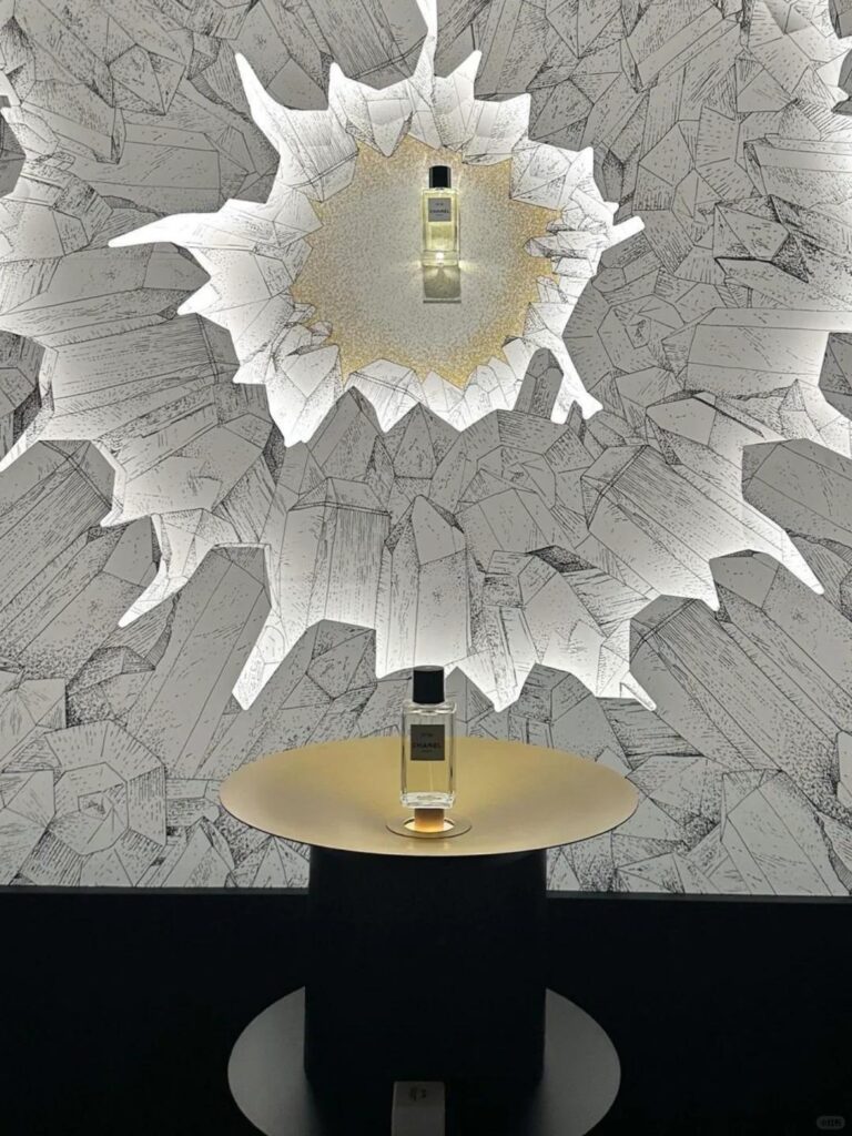
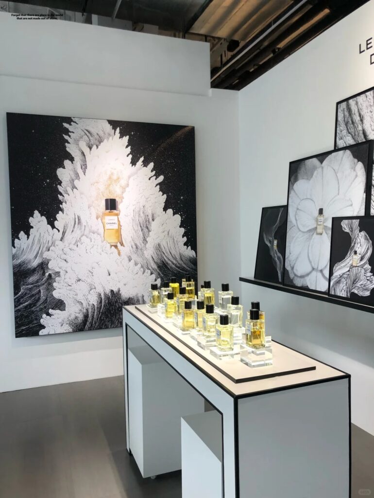
🟨 Real Case Study: Wordless Fragrance Launch Window
This is a prime example of luxury visual merchandising without reliance on copy.
| Item | Description |
|---|---|
| Client | European heritage fragrance brand (relaunching 1920s archival scent) |
| Challenge | Avoid cliché “vintage” copy while evoking historical elegance |
| Samtop’s Solution | Ribbed matte acrylic backdrop + limestone base + no text. Visual metaphors (dried rose spheres, smoky glass) to suggest scent. Center-lit with soft gradient shadows. |
| Result | Most photographed window in 5 European cities. Customers reported feeling “drawn in emotionally.” Inspired a new aesthetic across print & digital. |
👥 Best Fit: Who Should Use Minimal Messaging Displays?
✅ Perfume and skincare brands → sensual, memory-driven storytelling
✅ Couture fashion houses → silence = elegance
✅ Watchmakers and jewelers → materials speak for themselves
✅ Concept-driven retail or gallery-style stores → design as language
✅ Seasonal campaigns → where mystery, stillness, or heritage play key roles
💬 FAQ: How to Execute Message-Light Window Displays
Keywords: minimal display, silent storytelling, luxury visual merchandising
Q: Isn’t text necessary to explain the product?
A: Not always. In luxury, the product, materials, and ambiance often say more than words. It’s about emotion — not information.
Q: Can we include our logo or campaign title?
A: Yes, but subtly — embossed on props, etched in glass, or as a light projection. The brand should linger, not dominate.
Q: What if customers don’t get the message right away?
A: That’s intentional. Curiosity drives engagement. A minimal window sparks reflection — not instant decoding.
Q: Is minimal messaging effective for social media visuals?
A: Very much so. On platforms like Instagram and Pinterest, minimal, wordless windows often outperform busier visuals in saves and shares.
Q: How do we train stores globally to execute this display properly?
A: Samtop provides visual setup guides, lighting maps, and installation instructions for consistent, high-precision execution across regions.