
How Material Transparency Shapes Emotion, Trust, and Luxury Codes in Retail Design
✅ Transparent vs opaque display design is no longer just an aesthetic choice — it’s a strategic decision that shapes luxury brand emotion and perception. The right material balance can shape how your brand feels — honest, seductive, or elevated — within seconds.
Transparent displays suggest lightness and honesty, while opaque displays evoke exclusivity and depth. Combining both creates emotional rhythm and layered storytelling in luxury visual merchandising.
Too much transparency can feel cheap. Too much opacity can feel cold. How do you create the right emotional tone through surface?
Luxury brands must balance visibility with intimacy. Transparency can build trust, but also expose. Opacity can feel sculptural — or isolating.
At Samtop, we engineer layered transparency into displays — combining clear, frosted, and solid materials to mirror your brand’s rhythm of reveal.
Why Transparent vs Opaque Display Design Matters in Luxury Retail
💡 Transparent vs opaque display design allows us to tell layered stories, balancing openness and exclusivity.
| Material Type | Emotion Conveyed | Best For |
|---|---|---|
| Clear Acrylic / Glass | Purity, honesty, lightness | Skincare, minimalist perfume |
| Frosted Acrylic / Sandblasted Glass | Softness, privacy, atmosphere | Jewelry, lingerie, niche fragrance |
| Mirrored Acrylic / Tinted PMMA | Ego, identity, luxury reflection | Watches, cosmetics, installations |
| Matte Opaque Panel | Silence, grounding, legacy | Couture, art object displays |
| Stone / Wood Blocking | Authority, rarity, craftsmanship | Heritage launches, watches, timepieces |
💡 Key Insight: Transparency isn't just about visibility — it's about emotional access.
🔍 Real Case: Multi-Layer Transparency for a Fragrance Launch
🟨 Client: Japanese luxury fragrance house
🟨 Objective: Communicate “rain” through emotional lightness and layered opacity
🟩 Solution by Samtop:
- Outer frame: frosted acrylic (evoking soft mist)
- Mid-layer: corrugated semi-clear film (textured visual blur)
- Inner shelf: clear base with floating product
- Backlighting: 4000K soft blue LED for atmosphere
- Text element: only one word — Ame (rain) — engraved subtly
✅ Result:
- +43% longer dwell time vs. prior campaign
- Social sharing spiked due to “poetic fog” effect
- Customer described as “light, refined, sensory”
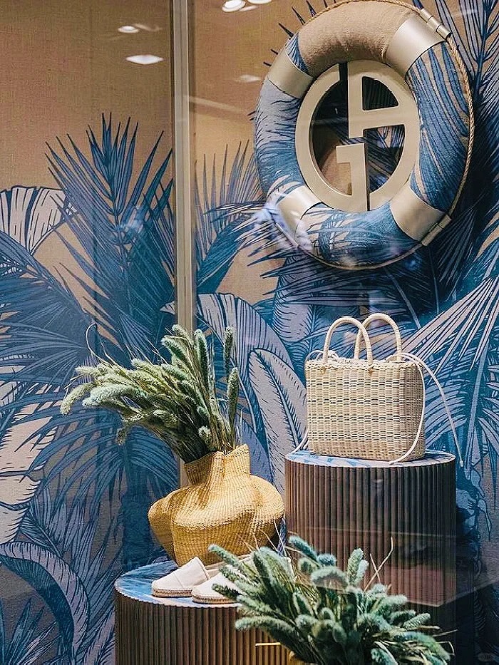
🎨 Application Contexts: When to Use Transparency or Opacity
| Display Zone | Transparent Strategy | Opaque Strategy |
|---|---|---|
| Counter Display | Clear riser, visible branding tray | Velvet plinth or lacquered base |
| Window Display | Layered acrylic frames with light passes | Stone-wrapped wall, monolith plinths |
| Tester Station | Frosted trays with recessed touch points | Matte compartments for tactile mystery |
| Pop-Up Activation | Mirror-wrapped core with transparent dome | Hidden compartments, glowing voids |
👥 Who Needs Transparency/Opacity Design Control?
✅ Brands with skincare, fragrance, or sensory-rich products
✅ Retailers that shift seasonally (light → shadow, warm → cool)
✅ VM teams designing modular, multi-material display kits
✅ Concept stores creating photo-driven storytelling
✅ Labels targeting Gen Z + Gen X differently across markets
📐 How Samtop Designs with Transparency & Opacity
- Map your emotional intent: open, poetic, intimate, sculptural
- Select materials by transmission: 0%, 40%, 70%, or 100% clear
- Layer visual zones: product → semi-frost → soft frame → hard edge
- Light with intent: edge-lit, back-glow, or reflection diffusion
- Prototype touch zones with embedded opacity — what do we show vs. imply?
🎁 Bonus: We can integrate logo engraving into transparent surfaces using laser or UV texture for sensory branding.
