
How Luxury Brands Can Use Font to Reinforce Their Identity
By Yan Luo | Samtop Display
Typography in luxury window displays is more than design — it’s emotional branding at first glance. From materials and lighting to scale and tone, type carries emotion and brand identity. With the right execution, letters become art.
Typography is often treated as an afterthought in retail windows, reducing its branding potential.
Poorly chosen fonts, unreadable sizes, or generic placement can diminish the impact of even the most well-designed display.
At Samtop, we craft typography with the same care as physical props — turning fonts into design assets that communicate tone, identity, and emotion at first glance.
🔍 Why Typography Matters in High-End Visual Merchandising
- Fonts Reflect Brand Personality Instantly
Serif = heritage & gravitas; Sans-serif = modern & sleek; Script = romantic or artistic. Typography sets expectations. - Typography Can Be a Design Focal Point
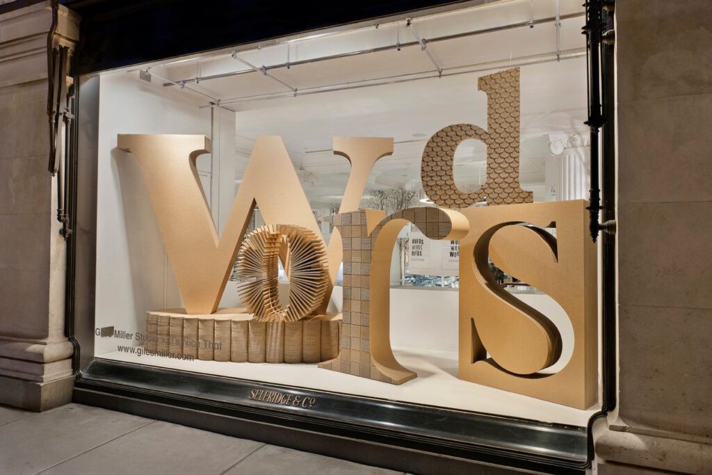
Used at scale or in 3D, type becomes sculpture — adding rhythm, space, and storytelling power. - It Guides Visual Hierarchy
Type hierarchy leads the eye: brand → campaign name → tagline → product focus.
✨ Typography Techniques in Luxury Displays
| Technique | Description | Best For |
|---|---|---|
| 🖋️ Cut-Out Lettering | CNC-cut letters that cast elegant shadows | Architectural displays, minimal brands |
| ✨ Floating Text | Suspended lettering via rods or wire for mid-air effect | Conceptual fashion, fragrance brands |
| 🌫️ Etched/Frosted Font | Subtle letters on glass using film or engraving | Skincare, jewelry, romantic storytelling |
| 💡 Backlit Typography | Halo-glow letters using internal LED or back panels | Night displays, bold seasonal launches |
| 🖼️ Typography as Sculpture | Large 3D type used as props or platforms | Holiday campaigns, poetic slogans |
🟨 Real Case Study: Typography as Centerpiece in a Fragrance Display
Client: European luxury fragrance brand (Spring limited edition)
Campaign Goal: Visualize fragrance story through poetic typography
Samtop Solution:
- Oversized laser-cut serif letters in matte white acrylic
- Suspended mid-air using rods, appearing to float
- Soft LED halo lighting for twilight glow
- Paired with sheer fabric and floral props
Result: - Display became most photographed visual across boutiques
- Typography shared across campaign visuals and social media
- Regional versions adapted in multiple languages
👥 Best Use Cases for Typography-Centric Displays
✅ Perfume and skincare brands emphasizing poetic storytelling
✅ Fashion houses using scale to express bold messages
✅ Jewelry brands needing clean, minimal message design
✅ Design-led stores positioning type as art
✅ Heritage brands reinforcing brand equity via signature fonts
📐 Samtop’s Process: Crafting High-End Typography for Displays
- Evaluate brand font assets and messaging tone
- Select materials (brass, acrylic, frosted vinyl, wood) by emotion & season
- Prototype placements: test distance, legibility, and contrast
- Produce letters with high-precision cuts and premium finishing
- Install on site or ship modular kits with rigging & mount instructions
🎁 Bonus: 3D rendered type previews + Pantone-matched samples available pre-approval
💬 FAQ — Typography in Luxury Window Displays
Q: Should we always use our brand font?
A: Ideally yes — but for campaigns, complementary fonts can add flexibility while maintaining tone.
