
Ensuring Consistency in Color for Retail Displays
By Yan Luo | Samtop Display
With standardized systems and the right supplier, color matching across multiple display materials becomes simple, accurate, and repeatable. At Samtop, we ensure your brand colors look perfect—on acrylic, wood, cardboard, and metal—every time.
At Samtop, we specialize in managing color precision across mixed-media retail displays—ensuring every detail reflects your brand identity flawlessly.
You’ve chosen your brand’s perfect red or gold—but when your final retail display arrives, the acrylic is too shiny, the wood looks dull, and the metal seems like a completely different shade.
Color inconsistencies across different materials can break visual cohesion, weaken brand impact, and disappoint both your customers and stakeholders.
With proper planning, color system usage, environmental testing, and expert production partners, you can achieve consistent color matching across every surface in your display—from matte-coated MDF to high-gloss ABS.
📊 Color Matching Challenges Across Materials
| Aspect | Glossy Acrylic | Matte Wood | Metal | Cardboard |
|---|---|---|---|---|
| Light Reflection | High reflectivity → looks brighter | Absorbs light → appears darker | Can reflect lighting tints (cool/warm) | Matte, absorbs ink inconsistently |
| Finish Variability | Uniform factory finish | Wood grain may affect tone | Can oxidize over time | Print-based → requires color proof |
| Color Stability | Stable if UV protected | May yellow or fade over time | Very stable, prone to scratches | Highly sensitive to ink + light |
🧠 What Causes Color Variations?
🎨 1. Material Properties Affect Color
- Glossy materials reflect more light → color appears brighter
- Matte surfaces absorb light → color appears duller or warmer
- Natural grains or textures (like wood or fabric) can distort color application
Tip: Always test the same color on each intended material before full production.
🌞 2. Lighting Conditions Distort Perception
- Store Lighting: LED vs. fluorescent = cooler or warmer tones
- Natural Light: Changes throughout the day
- Color Temperature: Even “white light” varies by source (3000K vs. 6500K)
Tip: Test your samples under the lighting used in your final store environment.
🔧 Best Practices for Color Matching Across Multiple Display Materials
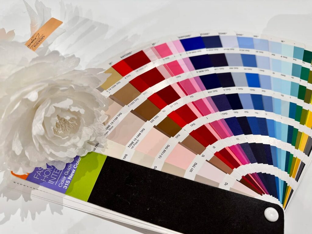
1. Use a Standardized Color System
- ✅ Use Pantone, RAL, or NCS color codes for all materials
- ✅ Specify both code and finish (e.g., Pantone 186C, matte)
Why It Matters:
- Enables precise communication with suppliers
- Ensures global consistency across vendors
- Prevents subjective interpretation of color terms
Tip: Always provide Pantone + a physical swatch.
2. Request Real-World Samples
Before mass production:
- ✅ Request sample pieces of every material + color
- ✅ Match each to Pantone swatches under your store lighting
What to Check:
- Color accuracy
- Finish type (matte, gloss, satin)
- Surface texture’s impact on appearance
Tip: Build a color board with all materials aligned for stakeholder sign-off.
3. Conduct Color QC Throughout Production
Set checkpoints at:
