In retail displays using MDF paint, PET/acrylic panels, powder-coated metal, and printed laminates, brand color inconsistency is one of the most common—and costly—errors. Even if all vendors use “Pantone 7542 C,” what you see on a matte-painted MDF may look totally different on acrylic under LED light.
Table of Contents
These mismatches can dilute brand credibility, reduce visual cohesion across global markets, and require expensive rework. That’s why multi-material color matching must go beyond the Pantone book.
At Samtop, we help global brands maintain color harmony across materials and suppliers—from drawdown testing to batch control documentation.
✅ Featured Summary: How to Ensure Multi-Material Color Match
To keep brand color consistent across retail fixture surfaces:
- Don’t rely solely on Pantone codes
- Approve color-matched spray samples on each material
- Match gloss level, primer tone, and opacity
- Validate results under D65 light using a visual lightbox or Delta E (<2.5)
- Document swatches, photos, and production settings for future orders
🔍 Why Read This? Fix the #1 Invisible Error in Global Rollouts
You can’t afford to have your brand blue look vibrant on painted wood, washed-out on metal, and greenish on PET just because “everyone followed the Pantone.” Read on to discover how to manage color across materials like a global fixture lead.
🧩 Why Pantone ≠ Color Match on All Surfaces
| Material | Color Behavior | Influencing Factors |
|---|---|---|
| Painted MDF / Metal | Opaque, absorbs light | Primer, gloss, curing method |
| PET / Acrylic Sheet | Semi-translucent, reflective | Light source, LED temp, transparency |
| Powder-Coated Metal | Reflective, textured | Bake temp, powder density |
| Laminate / Vinyl | Digitally printed | Emboss texture, base layer color |
🎨 Pantone Is Just the Starting Point
| Reference Type | What It Gives | What It Lacks |
|---|---|---|
| Pantone Formula Guide | Universal color target | Doesn’t account for reflectivity or gloss |
| RAL/NCS Codes | Useful for paint formulas | Not reliable for plastics or PET |
| Material Swatch Books | Real finish samples | May not match your exact brand tone |
| Spray / Drawdown Panel | Real color on real substrate | Most accurate for factory alignment ✅ |
📌 Tip: Always ask for a drawdown sample on the actual surface (MDF, metal, PET) to simulate final color behavior.
🛠️ Recommended Color Matching Workflow
- Select a Pantone or CMYK brand target (e.g., Pantone 549 C)
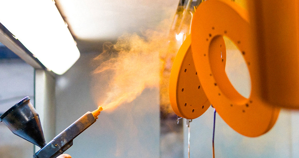
- Spray a reference panel on MDF or metal at intended gloss (PU or NC system)
- Request matching samples from suppliers:
- Painted MDF
- Powder-coated metal
- PET sheet with blue tint (or silk print underlay)
- Laminate swatch (digital print with matte texture)
- Evaluate under D65 showroom lighting using a grey lightbox
- Use Delta E meter to quantify deviation (target <2.5)
- Archive: photo, swatch, gloss %, primer color, and production batch ID
💡 Material-Specific Pro Tips
- MDF Paint: Use light gray primer, adjust for gloss curve distortion
- Acrylic / PET: Prefer colored base sheets over printed top layers; control for LED reflection
- Powder-Coated Metal: Approve only baked finish; test gloss at 20%, 30%, 40% to compare
- Laminate: Choose matte or satin texture to hide minor deviation; embossing darkens tone
📌 Avoid combining matte and high-gloss versions of the same color—it often results in visible mismatch under store lights.
🧪 Real-World Case: Skincare Display Color Alignment
Scenario: A global skincare brand needed to use Pantone 549 C across PET, MDF, and steel for consistency in 14 markets.
Issue: PET panel appeared greenish next to MDF under 4000K LED.
Fix:
- Switched to PETG with blue-tinted diffuser
- Reduced paint gloss from 35% to 25%
- Standardized white primer across vendors
Result:
- Delta E across substrates = 1.4
- Visual match approved for global rollout
💬 FAQ
Q: Can I use Pantone for all fixture materials?
No. Use Pantone to define the goal, but approve matched samples on each material type.
Q: What gloss level works best for color matching?
Matte to satin (10–40 GU) offers visual stability and less light distortion.
Q: What if two suppliers use different primers?
Standardize a white or light gray primer and note it in your BOM and QC docs.
Q: How to match LED-lit PET to painted surfaces?
Use PET with integrated color diffusion + test LED temperature (3000K–4000K) to avoid hue shifts.
✅ Final Takeaway: Color = System, Not Code
✔️ Pantone is a guide—not a finish
✔️ Match by surface + gloss + lighting
✔️ Always test in real materials
✔️ Document and control every batch
At Samtop, we engineer cross-material retail systems with accurate color matching that holds true across continents, campaigns, and lighting environments.
📩 Need help specifying or managing color consistency across display materials?
We offer:
- Color-adjusted spray panels for MDF, metal, acrylic
- Lightbox review workflow + Delta E reporting
- Global supplier communication kits
- BOM-integrated color documentation systems
📧 Email: [email protected]
🌍 Website: www.samtop.com


