How to Structure POP Displays to Spotlight Key SKUs and Drive Sales
By Yan Luo | Samtop Display
Table of Contents
To drive sales and focus shopper attention, POP displays must visually prioritize hero SKUs through elevation, centering, lighting, framing, and spacing. Effective hierarchy ensures the product that matters most — gets noticed first.
Even the best-performing product can get lost in a cluttered shelf. Without visual hierarchy, the most important SKU becomes just another option.
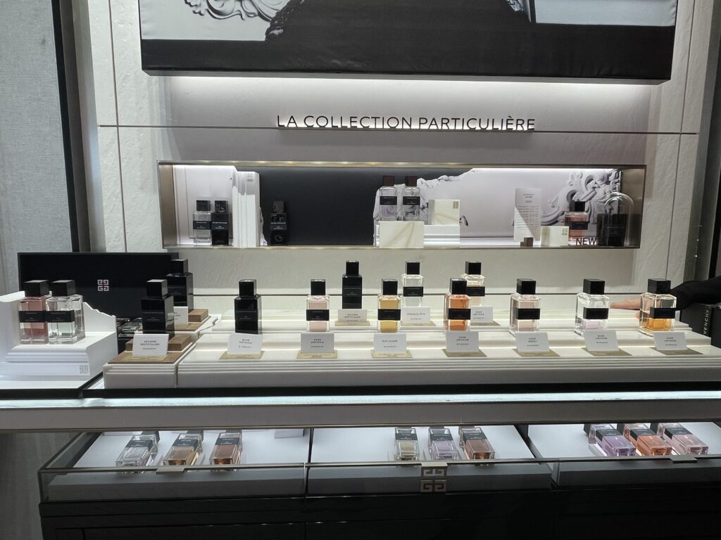
“All the bottles looked the same.”
“No one noticed the new serum.”
“The GWP was hidden behind everything else.”
Samtop structures POP displays with intentional hierarchy — using layout, lighting, typography, and materials to direct the eye to the hero. Let’s break down how to make sure your most valuable product gets the attention it deserves.
🧱 Why Display Hierarchy Matters
In-store, customers spend 2–4 seconds scanning before making a decision. Your display must answer three things at a glance:
- Which product is the focus?
- What should I touch, test, or take first?
- Why is it special?
🧠 Hierarchy = visual logic that drives action.
🎯 6 Display Tactics to Elevate Hero SKUs
✅ 1. Elevate the Hero
- Raise the hero product 2–4 cm above others
- Use risers, glossy plinths, or a halo-lit base
📌 Tip: Even slight elevation creates subconscious priority.
✅ 2. Center It in the Layout
- Use the middle or direct eye-line zone
- In windows, slightly off-center adds interest
📌 Tip: Eye-level ≈ 125–135 cm from floor for countertop displays
✅ 3. Frame It with Light or Structure
- Add LED glow, backlighting, or an arched frame
- Use different finishes — e.g., gloss for hero, matte for others
📌 Tip: Use light sparingly — contrast matters more than intensity.
✅ 4. Use Typography or Color Accents
- Add short, high-impact labels:
“Hero SKU,” “#1 Bestseller,” “NEW SCENT” - Feature product claims:
“24H Glow,” “5x Hydration”
📌 Tip: Keep copy under 5 words to let product shine.
✅ 5. Give It Its Own Tester Area
- Standalone tray, mirror, or sample station
- Positioned accessibly and distinct in shape or finish
📌 Tip: Differentiate tester area through height, texture, or lighting.
✅ 6. Clear Visual Space Around It
- Remove clutter or similar SKUs nearby
- Use vertical dividers, clean white space, or risers
📌 Tip: Let the hero “breathe” — minimalism amplifies focus.
🧩 Real Display Example: Elevating the Hero
Brand: Boutique Fragrance Brand
Challenge: Hero SKU wasn’t standing out in a trio display
Samtop Solution:
- Gave the hero bottle an elevated glossy platform
- Integrated a ring-lit LED base under the hero only
- Added acrylic “NEW SCENT” tag
- Moved older SKUs to symmetrical, lower trays
✅ Result:
- Hero SKU sales ↑ 41% over previous launch
- 3:1 sell-through ratio vs. other SKUs
- Used same prop format in 4 regional markets
💬 FAQ
Q: What if I have more than one focus product?
Use a tiered system: Hero → Support → Discovery. Not everything needs equal visibility.
Q: Does visual hierarchy apply to window props too?
Yes — prop size, lighting, and position should reflect product priority just like shelf units.
Q: How do I explain this to retailers?
We include visual logic maps in rollout kits — diagrams showing elevation, centering, and lighting by SKU priority.
✅ Conclusion: Lead the Shopper’s Eye
- ✔️ Prioritize your top product visually
- ✔️ Use elevation, light, and spacing strategically
- ✔️ Reduce visual noise — amplify key message
- ✔️ Design hierarchy into every rollout
🌟 In POP design, hierarchy turns attention into conversion.
📩 Want Help Structuring Hero-First Displays?
At Samtop, we:
- Design modular layouts built around hero SKUs
- Prototype elevation, lighting, and tester zones
- Include install logic in rollout kits for global teams
- Build hierarchy into both floor and counter units
📧 Email: [email protected]
🌍 Website: www.samtop.com