How to strategically place brand elements for clarity, impact, and premium storytelling.
By Yan Luo | Samtop Display
Messaging zones in product displays guide where logos, taglines, claims, and story elements should live to maximize brand impact. Front bases are ideal for logos, back panels for storytelling, riser fronts for claims, and swappable panels for regional or seasonal content. Smart placement builds clarity — not clutter.
Messaging zones in product displays influence how quickly customers understand your brand and why your product matters. When logos, taglines, and claims are placed with intention — not randomly — they strengthen recognition, emotion, and sales.
Poor placement leads to visual clutter. Strong placement creates brand confidence.
At Samtop, we design messaging zones as structural elements — not stickers, but integrated storytelling.

Why Messaging Placement Matters in Retail Displays
Clear messaging increases:
-
Instant brand recognition
-
Perceived product value
-
Emotional connection
-
Ease of understanding benefits
| Messaging Element | Function | Emotional Effect |
|---|---|---|
| Logo | Brand trust | “I know who made this.” |
| Tagline | Positioning | “Why it matters.” |
| Product Claims | Proof | “Why should I care?” |
| Limited Edition Note | Scarcity | “This feels special.” |
| Craft/Material Story | Authenticity | “This is worth the price.” |
💡 Key insight: Messaging shouldn’t shout — it should guide.
📐 Common Messaging Zones in Product Displays
1. Front of Base / Platform — Logo Zone
Best for: brand logo or product name
Why it works: eye-level, photo-friendly, strong brand anchor
2. Back Panel / Vertical Zone — Story & Tagline Zone
Best for: campaign story, tagline, scent name, series message
Why it works: creates emotional background & hierarchy
3. Shelf Edge / Riser Front — Claims Zone
Best for: ingredients, benefits, product claims
Why it works: closest to product → supports selling conversation
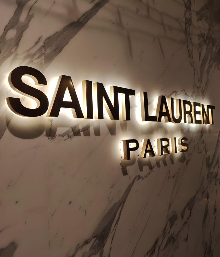
4. Lighting-Integrated Area — Premium Identity Zone
Best for: backlit logo, halo-lit brand mark, laser engraving
Why it works: high contrast + premium finish = luxury signal
5. Swappable Side Panels — Flexible Messaging Zone
Best for: seasonal, bilingual, or regional variations
Why it works: update content without rebuilding structure
🔍 Case Study: Global Fragrance Messaging Integration
🟨 Client
Premium fragrance brand launching across Asia + Europe
🟨 Challenges
-
Dual-language storytelling
-
Consistent structure across markets
-
Seasonal update requirement
🟩 Samtop Solution
-
Frosted acrylic back panel with magnetic dual-language card slots


