How to Layer Texture, Light, and Touch for Premium Brand Impact
By Yan Luo | Samtop Display
Table of Contents
Luxury POP displays often fail not due to poor structure, but because the wrong materials were paired. When textures clash or light behaves unpredictably, it undermines even the best design. For premium brands, material pairing isn’t a style choice — it’s a storytelling device.
At Samtop, we help brands build displays that not only look luxurious, but feel intentional, tactile, and tailored to the shopper’s emotional expectations.
The right material combinations — such as acrylic + brass or suede + PU — elevate brand tone, attract attention, and improve perceived value. Great pairings balance durability, lighting behavior, and retail practicality.
Let’s break down the most effective material pairings and how to apply them in real-world visual merchandising projects.
Why Does Material Pairing Matter in POP?
Luxury is communicated through contrast and harmony. A soft suede surface beside brushed brass instantly evokes tactile tension. Matte acrylic layered over polished metal brings balance to bold brands. These small cues tell the customer: this brand sweats every detail.
Good pairings elevate emotional tone:
- Soft × Hard: suede + brushed steel = comfort + strength
- Matte × Glossy: frosted acrylic + mirrored brass = restraint + glam
- Natural × Engineered: wood veneer + PU = authenticity + precision
Material dialogue builds trust before the shopper even touches the product.
What Are the Best Material Combinations for POP Displays?
| Combination | Look & Feel | Best Use |
|---|---|---|
| Acrylic + Brass | High-clarity with a sharp edge | Perfume, watches |
| Matte Acrylic + Aluminum | Clean, modern, technical | Skincare, tech gadgets |
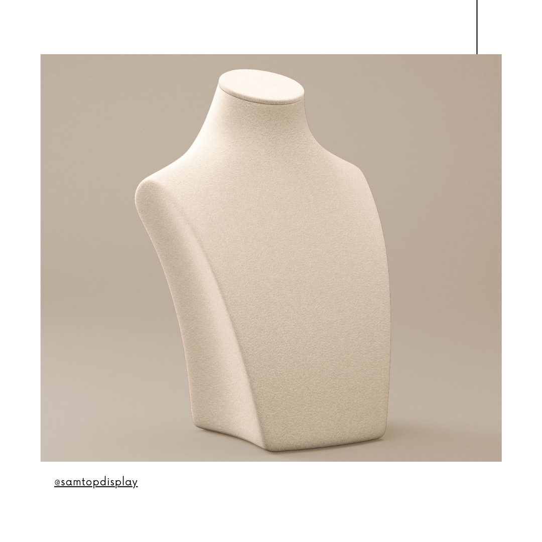
| Suede + PU Leatherette | Soft, romantic, giftable | Jewelry, holiday kits |
| Textured Wood + Velvet | Grounded, classic, artful | Watch glorifiers |
| Mirror Acrylic + Steel | Bold, urban, high-contrast | Eyewear, fashion |
Pro tip: limit each zone to two textures. Overdesign leads to visual fatigue and manufacturing inefficiencies.

How Does Layering Affect Light Behavior and Display Depth?
Luxury displays don’t just show — they glow. Strategic layering enhances light interaction and tactile interest.
- Top Surface: Contact zone — soft PU, suede, velvet
- Mid Accent: Glow edge — brass trim, LED channel, cut-in logo
- Base Plate: Grounded structure — MDF, acrylic, or PU-wrapped weight
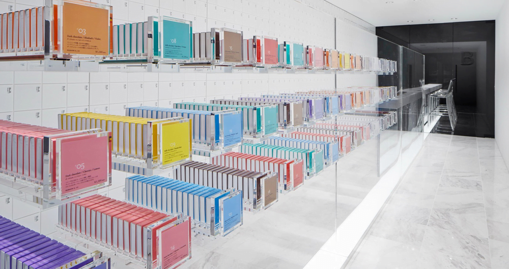
Example: For a luxury perfume brand in Seoul, we created a display with pearlized acrylic top, brushed brass base, and suede tester cradle. The soft light reflection and warm tone led to a 26% increase in shopper dwell time.
Best Practices for Premium Material Layering
| Rule | Execution Example |
|---|---|
| Match brand tone | Minimalism = matte; Glamour = shine + texture |
| Function + Emotion | Brass for risers; suede for comfort surface |
| Optimize for lighting | Use frosted acrylic to diffuse spotlight LEDs |
| Ensure structural fit | Pin or glue layered edges with invisible joinery |
Luxury isn’t loud — it’s engineered silence.
Use Case Guide by Category
| Product Type | Material Combo | Why It Works |
|---|---|---|
| Perfume | Frosted acrylic + gold metal | Light diffusion + romance |
| Watches | PU + stainless steel | Technical + tactile |
| Jewelry | Champagne suede + mirror acrylic | Soft + brilliant |
| Skincare | Pearl ABS + grey PU | Calm, modern, clean |
| Eyewear | Matte acrylic + chrome | Contemporary + minimal |
FAQ
Q: Can sustainable materials still feel premium?
Yes — use recycled suede, FSC wood, bio-acrylic. Today’s luxury is equal parts beautiful and responsible.
Q: What makes a pairing “look expensive”?
Refined finishes, invisible transitions, and material consistency. Less gloss mismatch, more tonal depth.
Q: Most common mistake in display builds?
Mixing too many textures, gloss inconsistency, or poor edge treatment — all erode perceived quality.
Conclusion: Material Pairing Is Luxury’s Quiet Language
✔️ Combine materials to reflect your brand’s emotional identity
✔️ Use layering and contrast to build light flow and tactile interest
✔️ Avoid over-decoration; let surface quality and finish do the talking
✔️ A luxurious display doesn’t shout — it whispers precision
At Samtop, we prototype, test, and produce high-end POP systems that speak in material fluency. Whether you’re building for global rollouts or limited-edition displays, we bring structure, emotion, and supply chain clarity into one aligned result.
📩 Need Help Planning Material Combinations?
We offer:
🧱 Moodboards + finish simulations for retail categories
📦 Material sourcing and durability testing
🧰 Engineering for glue, bracket, or magnetic joinery
🌍 Rollout-optimized kits for travel retail, VIP events, and boutique networks
📧 [email protected]
🌐 www.samtop.com