
Maximizing Visual Impact When Every Centimeter Counts
By Yan Luo | Samtop Display
The most effective way to optimize display layout in small retail spaces is to use vertical hierarchy, integrated lighting, modular components, and flat-pack structures. These techniques maximize visibility, reduce clutter, and elevate hero SKUs — even in less than 1 square meter.
Small-format retail is booming — pharmacies, micro kiosks, travel retail counters, department-store gondolas, and pop-ups. But the challenge remains the same:
How do you create high-impact retail visibility in spaces under 1 m²?
Most brands waste the limited footprint:
– Displays sprawl horizontally
– Hero SKUs get buried
– Lighting is weak or absent
– SKU density overwhelms shoppers
– Installers don’t follow layout logic
At Samtop, we engineer compact, vertical, and modular display layouts that create maximum brand impact with minimal space — built for real stores, fast installs, and global rollouts.
Small Space ≠ Small Brand Impact
| Challenge | Strategic Solution |
|---|---|
| Tight footprint | Use vertical layering, not horizontal spread |
| Low visibility | Add lighting, contrast, or reflective surfaces |
| Too many SKUs | Apply visual hierarchy + structured tiering |
| Fast traffic flow | Design for <3-second recognition |
| No storage | Integrate hidden drawers or fold-flat parts |
In small spaces, every visual decision is amplified.
🟦 5 Proven Layout Strategies for High-Impact Small Spaces
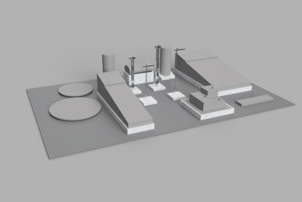
1️⃣ Vertical Hierarchy (The #1 strategy for micro displays)
Vertical zoning uses height—not width—to create premium brand presence.
Layout logic:
-
Top tier: Hero product, campaign SKU, or newest launch
-
Middle tier: Testers, mirrors, claim zones
-
Bottom tier: Stock, refills, or pricing prompts
📦 Example:
A 30cm-wide × 60cm-high glorifier with 3 tiers and a slim header.
Why it works:
Retail sightlines travel up before out — height naturally captures attention.
2️⃣ Integrated Lighting (The strongest visual amplifier)
In small displays, lighting often matters more than structure.
Lighting types:
| Lighting Type | Best Use Case |
|---|---|
| Halo LED | Highlights hero SKUs |
| Under-tray LED | Adds depth to testers |
| Backlit acrylic | Enhances claims & messaging |
| Edge-lit PET | Lightweight, premium glow |
📦 Example:
Backlit tester tray with frosted acrylic to soften glare.
Why it works:
Lighting creates contrast and makes hero SKUs visible from 3–5 meters away.
3️⃣ Multi-Functional Props (One piece, multiple jobs)
Small spaces demand multifunctional design.
Examples:
-
A tester tray that also serves as a mirror stand
-
A riser that includes hidden storage
-
A plinth that becomes a CTA / branding zone
-
A header that doubles as a lighting fixture
📦 Example:
Drawer-style MDF base with a sliding top for concealed stock storage.
Why it works:
Each centimeter performs two or three functions.
4️⃣ Modular Kits for Tiered Store Formats
One design should scale across:
-
Flagship stores (L size)
-
Standard boutiques (M size)
-
Pharmacies/kiosks (S size)
Keep consistent:
-
Color palette
-
Materials
-
Lighting
-
Branding
📦 Example:
Same PET sleeve wrap, adjustable base sizes for each store version.
