
Why Material Texture Shapes How Customers Emotionally Read a Brand
By Yan Luo | Samtop Display
In luxury visual merchandising, tactile perception in display design is often overlooked — yet it defines how customers emotionally respond before they ever touch a product. Hard materials define and elevate. Smart display design uses both — to create emotional clarity and lasting sensory impression.
In most retail displays, material is chosen for budget or function — not emotional impact.
Customers don’t always touch displays — but they feel them emotionally. A “cold” setup may repel. A “too soft” scene may feel unserious. The balance is key.
At Samtop, we design with tactile psychology — combining soft and hard materials to speak visually and emotionally, before a word is read or a product is touched.
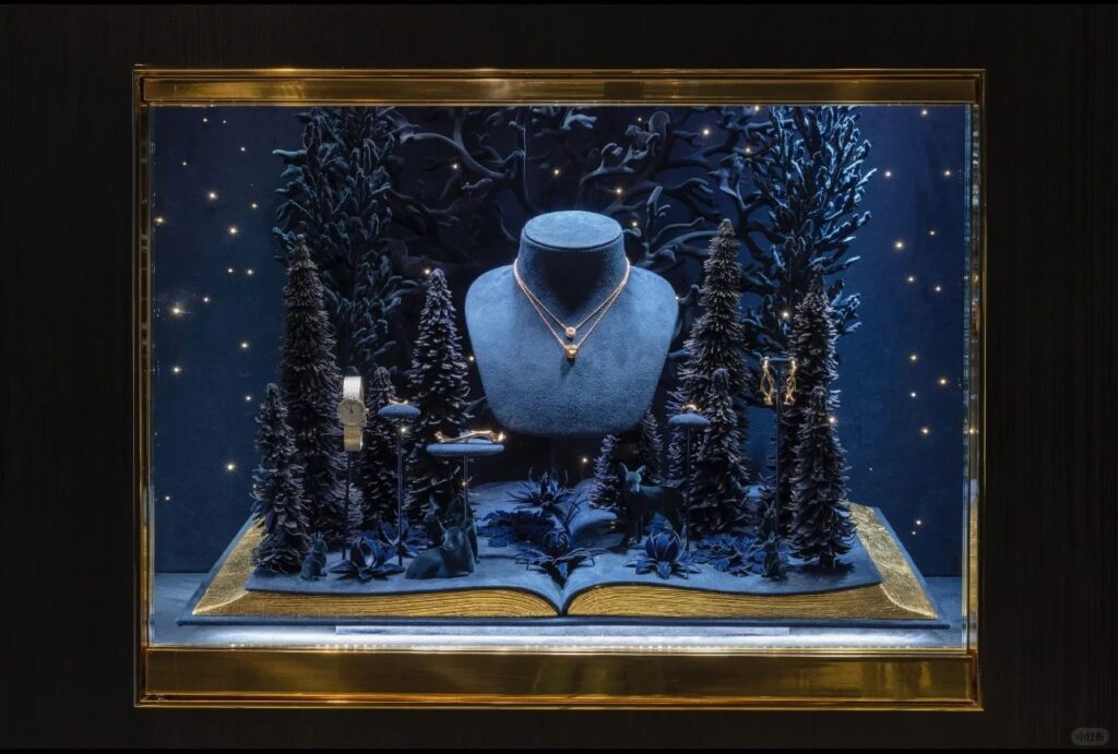
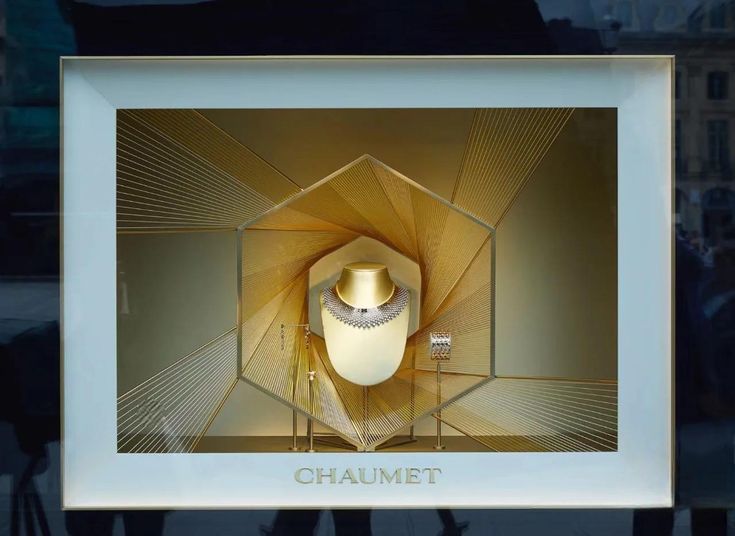
🧠 Emotional Texture: What Soft & Hard Surfaces Say
| Texture Type | Evokes | Examples |
|---|---|---|
| 🧸 Soft | Comfort, intimacy, invitation | Velvet, suede, boucle, linen, soft foam |
| 🪨 Hard | Precision, prestige, permanence | Lacquer, polished metal, glass, concrete, resin |
💡 Key Insight: Texture is felt visually. Customers project emotional value onto materials — even without touching them.
🪶 Soft-Hard Pairing Table
| Soft Element | Hard Element | Emotional Message |
|---|---|---|
| Velvet riser | Polished brass plate | Warm luxury with structural definition |
| Linen wall wrap | Glass bottles | Natural craft meets clarity |
| Foam curve form | Concrete cube | Play meets permanence |
| Suede insert tray | Steel edge trim | Jewelry intimacy meets precision |
| Felt mat | Lacquered shelf | Calm below contrast |
🔍 Real Case: Tactile Display for Fragrance Discovery
🟨 Client: French niche fragrance maison
🟨 Goal: Design a discovery box presentation that felt both intimate and refined
🟩 Samtop Solution:
- Base: matte white lacquered MDF — clean, quiet structure
- Test tray: hand-cut beige felt liner — invites interaction
- Product cavities: soft foam with velvet lamination
- Dividers: brushed pale gold aluminum — premium touch
- Header: linen-wrapped panel with blind-debossed logo
✅ Result:
- 32% rise in tester use in first week
- Customer described display as “inviting” and “emotionally elevated”
- Brand adopted soft/hard combo into global seasonal packaging
👥 Ideal for These Display Scenarios
✅ Fragrance & skincare discovery displays
✅ Jewelry risers and luxe counter moments
✅ Clean beauty brands looking to humanize tech feel
✅ Heritage fashion and lifestyle capsule setups
✅ Premium tech blending softness into sharp form
📐 Samtop’s Process for Tactile Display Design
1️⃣ Assess brand tone, product material, and campaign mood
2️⃣ Create tactile contrast matrix (soft ↔ hard, warm ↔ cool)
3️⃣ Prototype combinations of finish and feel
4️⃣ Engineer touch zones without sacrificing durability
5️⃣ Deliver sample boards for stakeholder alignment
🎁 Bonus: Samtop offers seasonal texture conversion kits — so displays evolve by feel, not just color.
💬 FAQ: Texture in Visual Merchandising
Q: Is softness always feminine?
A: Not at all. Felt, raw linen, suede — all evoke emotion, not gender. They soften, not stereotype.
