How to Use Structure, Light, and Material to Direct Customer Attention in Retail
Table of Contents
By Yan Luo | Samtop Display
Visual hierarchy isn’t about adding more — it’s about controlling what speaks first. By leveraging structure, light, material, and space, retail displays guide the customer’s eye, focus attention on key SKUs, and elevate brand presence — even in small formats.
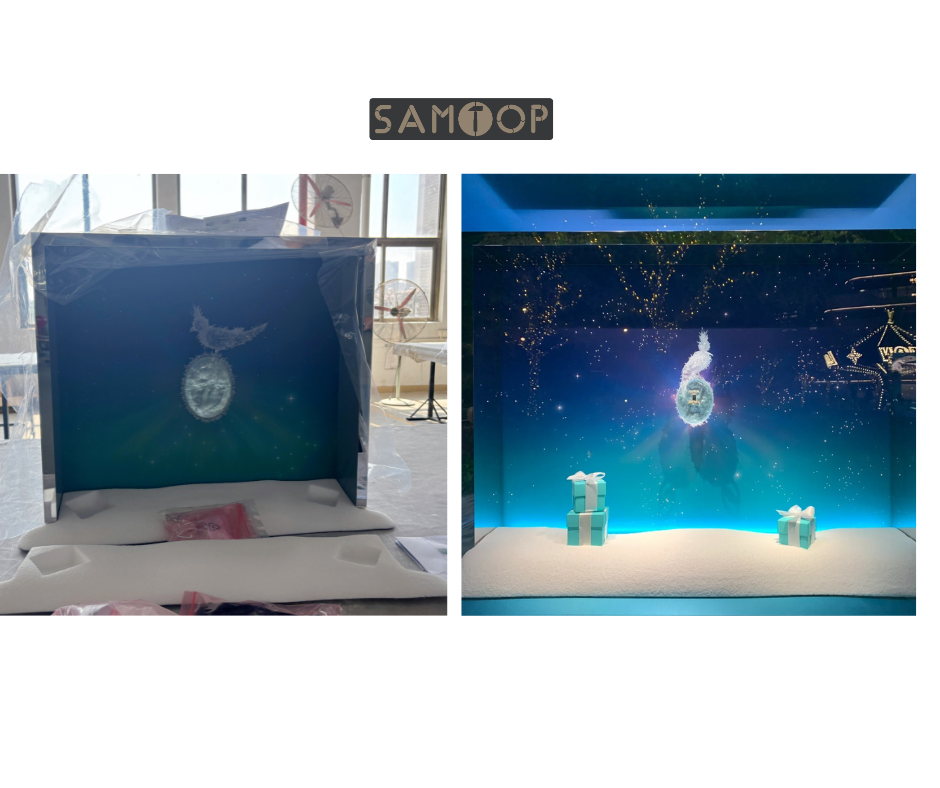
Retail displays with no clear visual flow often confuse shoppers, hide hero products, or dilute storytelling.
Without intentional hierarchy, even the best products get lost. Customers don’t scan logically — they respond emotionally, based on layout and light.
At Samtop, we design displays that lead the eye: from attraction to focus, from curiosity to conversion — through height, spacing, finish, and illumination.
🧠 What Is Visual Hierarchy?
Visual hierarchy defines which product or brand element gets noticed first — and which one earns dwell time.
It’s the “reading path” your layout creates. Great displays guide the eye using:
- 📏 Height variation
- 💡 Directional light (uplight, spotlight, backlight)
- 🎨 Material contrast (matte vs. gloss, soft vs. reflective)
- 🧊 Negative space to frame the hero
- 🧾 Layered messaging
- 🎯 Foreground/midground/background depth
💡 Key Insight: Hierarchy isn’t always size — it’s priority, told through form.
📐 Hierarchy Techniques & Display Application
| Technique | Effect | Where to Apply |
|---|---|---|
| Height Contrast | Tallest product = perceived importance | Center plinth or raised glorifier |
| Light Focal Point | Lighted area draws instant attention | Spot or underlight hero SKU |
| Material Emphasis | Gloss vs. matte = visual texture tension | Contrast riser material vs. backdrop |
| Negative Space | “Air” around product isolates the eye | Remove clutter around key SKUs |
| Messaging Layer | Brand story + claim behind hero item | Text directly on backdrop or riser front |
| Depth Staging | Foreground = hero; back = support/story | Step risers, angled layout, mirror illusion |
🔍 Real Case: 3-Step Visual Focus System for Skincare Launch
🟨 Client: French dermocosmetic brand
🟨 Challenge:
- Hero SKU = central serum
- Needed modular display for counter and window
- Wanted “flow” without symmetry
🟩 Samtop Solution:
- Tiered velvet risers (central hero at +4cm)
- Soft warm uplight beneath center SKU only
- Support products angled in at -2cm height delta
- Foil-stamped benefit story on suede backboard
- Floating mirror logo panel to reflect hero glow
✅ Result:
- 72% of photos posted showed center SKU in focus
- Staff reported storytelling path: 1 → 2 → 3 felt intuitive
- Display reused in Fall campaign with new brand tone layer
🧩 Who Needs Visual Hierarchy Strategy?
✅ Brands with tiered product ranges (e.g., hero + refill)
✅ Retail designers balancing many SKUs
✅ Global VM teams deploying one design across formats
✅ Store planners optimizing small-footprint zones
✅ Launch campaigns needing “focus first” storytelling
💬 FAQ: Visual Hierarchy in Display Design
Q: Does visual hierarchy always mean tallest = most important?
A: No. Light, angle, material, and space can also create emphasis. Hierarchy is multidimensional.
Q: Can we do this in a small display?
A: Absolutely. Even 3cm of height difference or a soft spotlight adds hierarchy.
Q: What if my SKUs are all the same shape/size?
A: Use angled layout, material contrast (e.g., velvet vs. gloss), or lighting to break the uniformity.
Q: How do I test visual hierarchy before rollout?
A: We recommend real-scale mockups or 3D foamcore prototyping — especially for window displays and flagship zones.
🎯 Conclusion: Control the Eye, Control the Story
Hierarchy is not what’s loudest — it’s what’s felt first.
✔️ Use structure, spacing, and light as invisible guides
✔️ Make the product feel elevated — without clutter
✔️ Tell your story through placement, not just words
✔️ Let one glance create one feeling — and one conversion
📩 Want Help Guiding the Eye in Your Display?
Let’s build a display that doesn’t just hold product — it leads the shopper, emotionally and visually, to the right moment.
👉 Email: [email protected]
🌍 Visit: www.samtop.com

