
How Hue and Texture Temperature Guide Emotional Response
By Yan Luo | Samtop Display
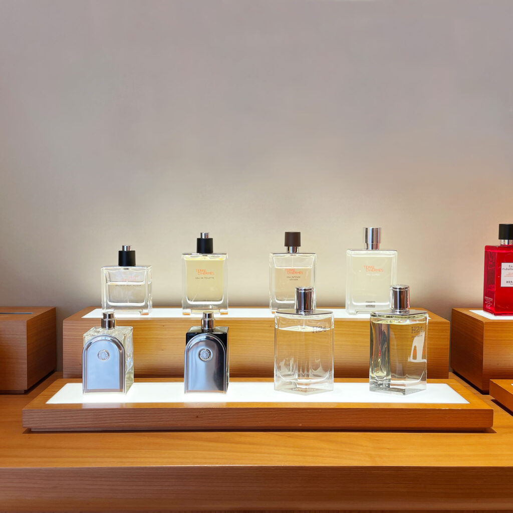
In luxury retail, warm vs cool finishes do more than color the surface — they define the emotional tone of the entire customer experience. Cool finishes suggest clarity, modernity, and performance. In retail display, temperature is more than color — it’s emotional atmosphere, shaped through texture, hue, and light.
Most brands focus on product or structure — but forget how finish temperature makes customers feel instantly.
A “cold” luxury display can feel sterile. A “warm” seasonal launch can feel off-tone if mistimed. Your materials talk before your message.
At Samtop, we design with warmth and coolness as emotional layers, using textures, tones, and light to trigger the right retail reaction — from holiday intimacy to clinical precision.
🧠 Temperature = Emotional Atmosphere
| Display Temperature | Emotional Cues | Ideal Materials |
|---|---|---|
| 🔥 Warm | Nostalgic, tactile, welcoming | Brushed brass, oak veneer, linen, matte gold |
| ❄️ Cool | Clean, precise, tech-forward | Frosted acrylic, chrome, white lacquer, concrete |
💡 Key Insight: Your customer reacts before they read — temperature sets the stage.
🎨 Warm vs. Cool Finish Table
| Element | Warm Option | Cool Option |
|---|---|---|
| Logo Backing | Linen wrap, wood veneer | Matte acrylic, glass |
| Plinths / Risers | Cork, leather, terracotta | Clear acrylic, lacquered MDF |
| Backdrop Texture | Ribbed velvet, jute | Stone film, smooth PET |
| Lighting | 2700K warm LED | 5000K cool white |
| Color Accents | Coral, bronze, nude | Pearl, chrome, grey-blue |

This is why Samtop helps brands build display systems that flex across warm vs cool finishes — without structural rebuild.
🔍 Real Case: Seasonal Finish Swap for Skincare Brand
🟨 Client: Global clean skincare brand
🟨 Challenge: Update winter display into a spring campaign without structural rebuild
🟨 Needs: Convey hydration, renewal, freshness
🟩 Samtop Solution:
- Kept white oak structure
- Replaced beige linen with pale green textile
- Swapped brushed gold for frosted acrylic discs
- Adjusted lighting from 2700K → 4000K
- Added soft-gloss PET liners to brighten surface
✅ Result:
- Stores called display “cleaner” and “more refreshing”
- Products perceived as lighter and more effective
- VM teams reused core kit with quick visual transformation
👥 Ideal Use Cases for Temperature-Led Display Design
✅ Fragrance & skincare campaigns (from cozy to fresh)
✅ Fashion launches (fall → spring capsule refresh)
✅ Jewelry and watch brands exploring romance vs. minimalism
✅ Pop-ups shifting regionally or seasonally
✅ Tech or wellness brands seeking tonal precision
