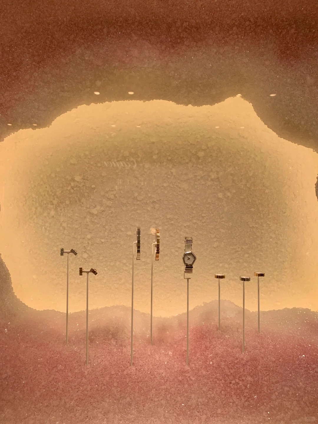
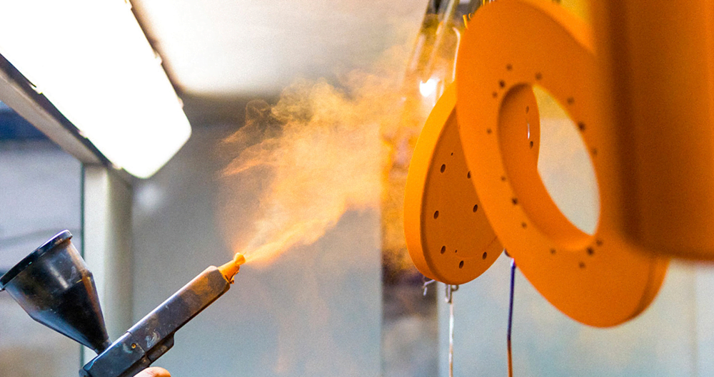
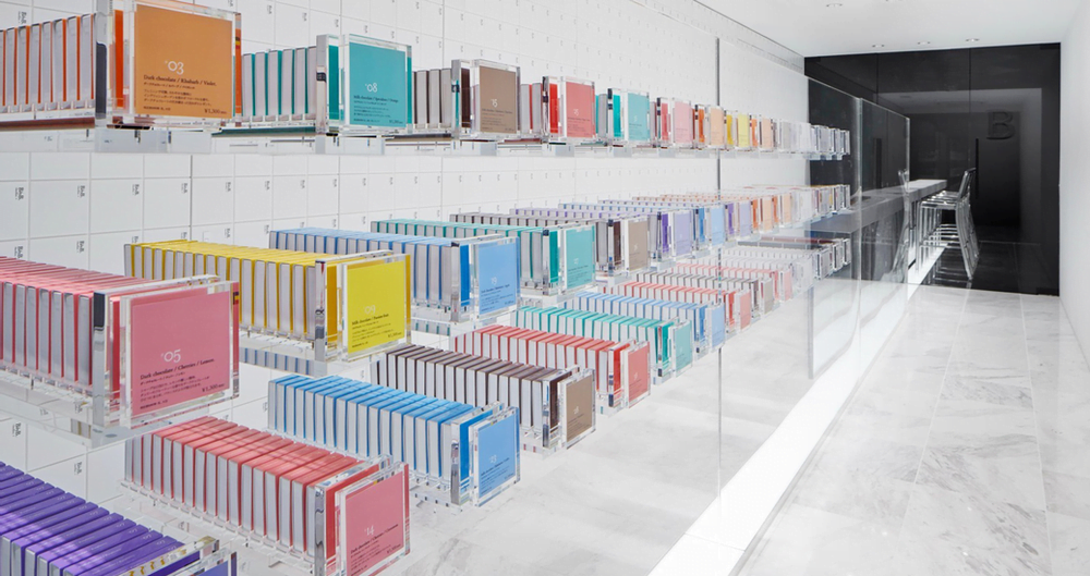
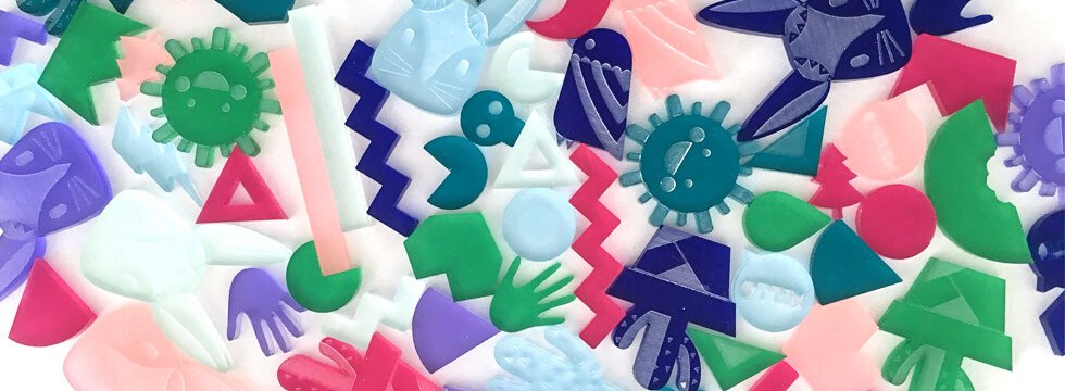
A visually effective POP display (Point of Purchase display) goes beyond just looking good. It serves as a key tool in retail marketing, designed not only to grab attention but to engage customers, showcase product value, and encourage action. In today’s competitive retail environment, simply standing out isn’t enough — a great POP display guides customers from interest to action.
Table of Contents
How do you design a POP display that draws shoppers in, communicates the product’s unique value, and leads to a sale? This article dives into the key design principles that ensure POP displays capture attention and drive conversions.
A POP display is more than a simple product holder. It must:
- Stop shoppers mid-walk, capturing their attention instantly.
- Highlight the product’s unique value, communicating why it’s worth picking up or trying.
- Fit seamlessly into the store flow without disrupting the space.
- Reinforce the brand visually and emotionally.
- Encourage shoppers to pick up, try, or buy the product.
At Samtop, we craft POP displays that combine visual appeal, brand identity, and practical functionality, ensuring they perform in-store where it matters most.
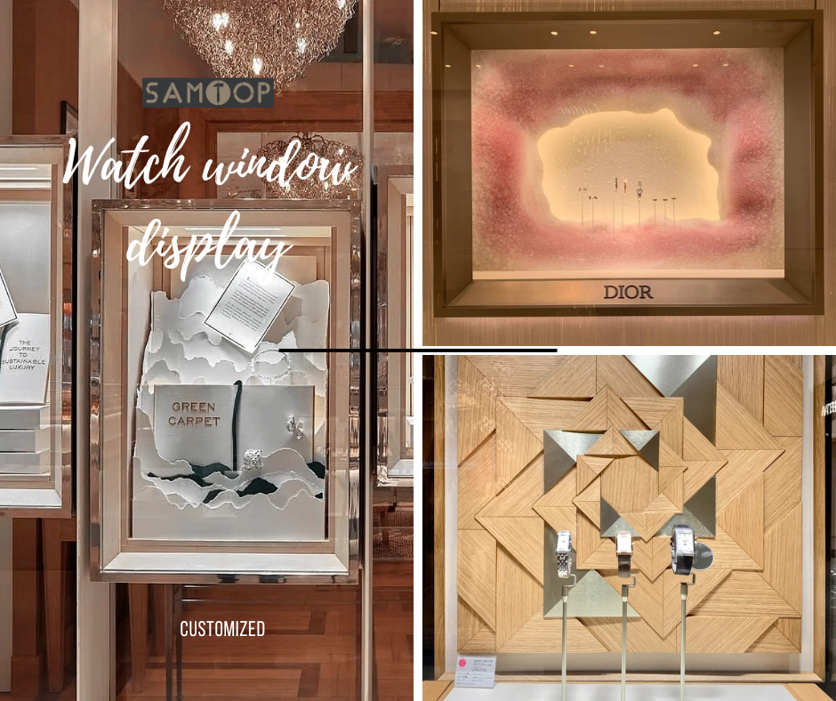
Visual Hierarchy: Guide the Eye Step by Step
Effective visual hierarchy in a POP display helps communicate your message clearly and at a glance. A well-organized display breaks its message into layers, guiding the shopper’s attention to the right places. The basic structure includes:
- Top Zone: Header, callout graphic, or QR code to capture attention from a distance (3–5 meters).
- Middle Zone: Product itself (on a riser or cradle), main message, and key visuals for immediate engagement.
- Base Zone: Logo, subline, additional products to reinforce the brand and offer cross-sell potential.
By using bold shapes and empty space, you can frame key visuals and avoid overcrowding the display. This ensures that the message remains clear and memorable.
Color & Contrast That Reflect Brand + Drive Visibility
Color is a powerful tool for guiding the shopper’s eye and enhancing visibility. Here’s how to strategically use color and contrast in your POP display:
- Use brand colors as accents: Don’t overwhelm with too much color; use it selectively for focus.
- High contrast on the key message: Light text on dark backgrounds or vice versa ensures readability.
- Category-appropriate tones: For example, beauty displays may use soft neutrals, while tech products may benefit from sleek silver/black tones.
The right contrast ensures that your message is not lost, while poor contrast can make it harder for customers to read or understand the information.
Lighting (or Light Simulation)
Lighting plays an essential role in POP display design. Even when there’s no built-in lighting, considering light behavior can elevate your design:
- Glossy vs. matte finishes: Glossy surfaces direct light bounce and create depth, while matte finishes soften reflections.
- Metallic accents: Adding metallic elements creates a premium feel.
- Built-in LED lighting: Halo, spotlight, or backlit effects can add visual interest and highlight the product.
- Shadow play in layers: Creates a 3D appeal, even with static parts, making the product feel dynamic.
Avoid placing light directly on key messages to prevent glare. A soft highlight is more readable and keeps the shopper’s focus on the product.
Shape, Structure & Silhouette
The shape and structure of your POP display will create a first impression. The form should be thoughtful and enhance the product’s value:
- Clean verticals: Ideal for premium positioning and minimalist designs.
- Curved silhouettes: Perfect for beauty, fragrance, and lifestyle products, adding a sense of elegance.
- Angled panels: Suggests youth, dynamism, and sports appeal.
- Geometric repetition: Works well for organized, tech-savvy, and information-driven products.
Make sure the silhouette of the display is unique and stands out, even when viewed from the side, helping it catch the eye from different angles.
Materials & Texture Strategy
The material and texture of your POP display can directly affect how customers perceive the product:
- Matte PU/suede: Offers a soft touch, conveying elegance and gifting appeal.
- Gloss acrylic: A clean, bold, modern choice that communicates precision.
- Wood veneer: Brings a natural, warm, and organic feel to the display.
- Brushed metal: A tech-forward, high-end material, perfect for precision products.
- Corrugate/cardboard: Lightweight, temporary, and cost-effective.
Mixing 2–3 complementary textures can increase depth without creating visual clutter, helping to highlight key aspects of the product.
Copywriting: Keep It Sharp & Actionable
Effective copywriting in a POP display delivers key messages clearly and concisely. Here’s how good copy can boost your display’s impact:
- Highlights a single benefit: “Hydration in 60 seconds”
- Creates urgency: “Limited edition – only this weekend”
- Speaks in a customer tone: “Your go-anywhere fragrance”
- Is legible at a glance: Keep it simple, using 5–7 words max per zone.
Ensure the font size is appropriate for the viewing distance, especially for displays placed in aisles or windows.
FAQ: Your POP Display Questions Answered
Q: How do I design a POP display for visual impact in a cluttered store?
- ✅ Use bold geometry, contrasting colors, and top-level messaging to ensure visibility. Testing mockups in real-world store environments can help check actual visibility and effectiveness.
Q: Do all displays need lighting to be effective?
- ✅ Not always. Smart finish/material contrast and well-thought-out silhouette layering can simulate lighting effects without using actual lights.
Q: What’s the biggest visual mistake in POP displays?
- ✅ Too much going on. Visual overload leads to confusion. Focus on a single message and one product hero to avoid cognitive fatigue.
Conclusion: Visibility Isn’t Everything — Clarity Is
A good POP display is not just about being seen — it’s about being understood and remembered. By focusing on visual hierarchy, color contrast, lighting, and materials, a POP display becomes a silent yet effective sales force. The best designs don’t just turn shelf space into a display; they transform it into brand space.
At Samtop, we combine design logic with retail realities to create visually effective POP displays that perform and engage customers.
Want Your POP Display to Stand Out on the Floor?
We offer:
- 🧠 Concept layout optimization
- 🧾 Brand visual identity adaptation into POP formats
- 🎨 Color + material swatch simulation
- 📦 Retail visibility testing mockups
