
How Materials, Finishes, and Design Details Influence Perceived Brand Value
By Yan Luo | Samtop Display
When a shopper walks past your display, they instantly judge your product by how it's presented. In premium retail, even the slightest mismatch in texture, lighting, or logo placement can cheapen the entire experience. Unfortunately, many brands still confuse “expensive” with “complicated” and “shiny” with “luxury.” The result? Displays that miss the mark—and budgets that stretch without impact.
But the good news? Premium isn’t always about cost—it’s about intentional design, finish control, and material story. And with the right system in place, it’s scalable too.
What Makes a Retail Display Feel High-End?
A premium fixture isn’t loud or flashy—it’s subtle, confident, and composed. Here's what elevates a display:
- Refined materials: brushed brass, suede, ribbed PET, matte acrylic
- Balanced structure: proportion, geometry, and visual gravity feel intentional
- Tactile finishes: soft-touch, low-gloss, or textured for interaction
- Integrated lighting: seamless LEDs with no visible wiring
- Hidden joinery: tight seams, magnetic or dowel joints—no visible screws
Explore material simulation strategies to reduce cost while retaining a luxury feel →
📍 Why You Need to Read This: More Than Just “Pretty Displays”
If you’re leading global VM or responsible for brand environments, this is for you. You’ll walk away knowing:
- How to speak “premium” through proportion and finish
- Which design myths cost more than they deliver
- How to create a scalable, premium fixture framework that adapts across store formats
🧩 The 5 Foundations of a Premium Display Fixture
| Element | Why It Matters |
|---|---|
| Material Language | Luxury is communicated through what’s touched—brushed metal > chrome, suede > velvet, matte PET > PVC |
| Proportion | Visual gravity and thickness imply intention and confidence |
| Surface Finish | Anti-fingerprint, soft-touch, or low-sheen = tactile value |
| Lighting Integration | Hidden, warm-tone LEDs show care and reduce glare |
| Joinery Detail | Clean seams, hidden fasteners, soft-close functionality |
Want more on how to specify gloss, finish, and joint tolerances? See our visual QC guide →
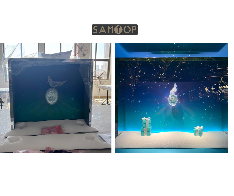
💄 Premium Looks by Category: Real Retail Examples
| Category | Premium Traits |
|---|---|
| Cosmetics | Modular risers, curved acrylic edges, soft-touch tops |
| Watches | Brushed gold plinths, velvet beds, inset logos |
| Jewelry | Suede wraps, halo light, clean bevel cuts |
| Fragrance | Frosted panels, ribbed satin PET, soft glow LED |
| Eyewear | Matte blocks, magnetic nameplates, anti-fingerprint coating |
Premium isn’t one material—it’s how everything fits together.
📐 Design Language of High-End Fixtures
| Design Element | Premium Expression |
|---|---|
| Geometry | Simplicity, symmetry, vertical balance |
| Branding | Subtle: deboss, metal inlay, light-through logo |
| Layering | Tiered platforms, gentle elevation differences |
| Material Rhythm | Matte → brushed → light = visual narrative |
| Hardware | Soft-close hinges, no visible locks, magnetic joinery |
These aren't just visual rules—they’re the unspoken cues that signal brand value.
