
How Samtop Ensures Brand Visual Consistency Across Retail Display Types
In retail displays, brand visual consistency is essential. Whether it’s a glorifier, window prop, or POP counter — customers must instantly recognize your identity. At Samtop, we ensure that consistency across all retail formats.
Need your POP, window props, and glorifiers to match your brand identity?
At Samtop, we ensure visual consistency across all retail display formats by:
- Matching logo, Pantone color, and finishes
- Centralizing material sourcing and texture spraying
- Using unified structural language across formats
- Validating with master samples and brand-approved guidelines
💡 Whether it's 1 flagship prop or 500 global displays — your visual identity stays intact.
🎯 Introduction: Why Brand Consistency Is Non-Negotiable
In retail, customers don’t just buy products — they buy a branded experience.
That experience is built through visual language:
- Signature Pantone color
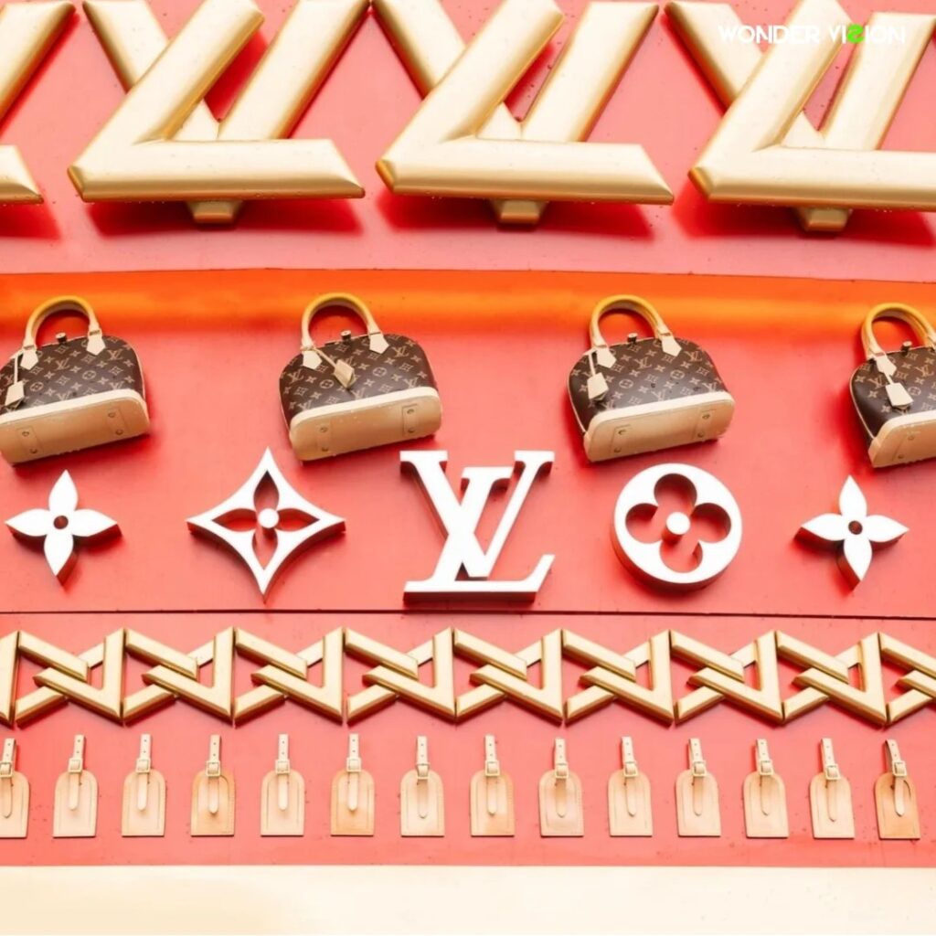
- Consistent logo placement and font
- Unified finishes across materials
- Structure that reflects product values
- Harmonized lighting tone
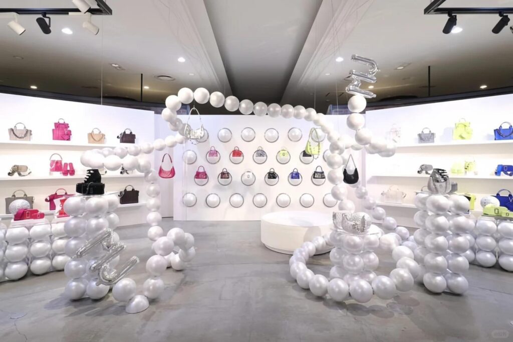
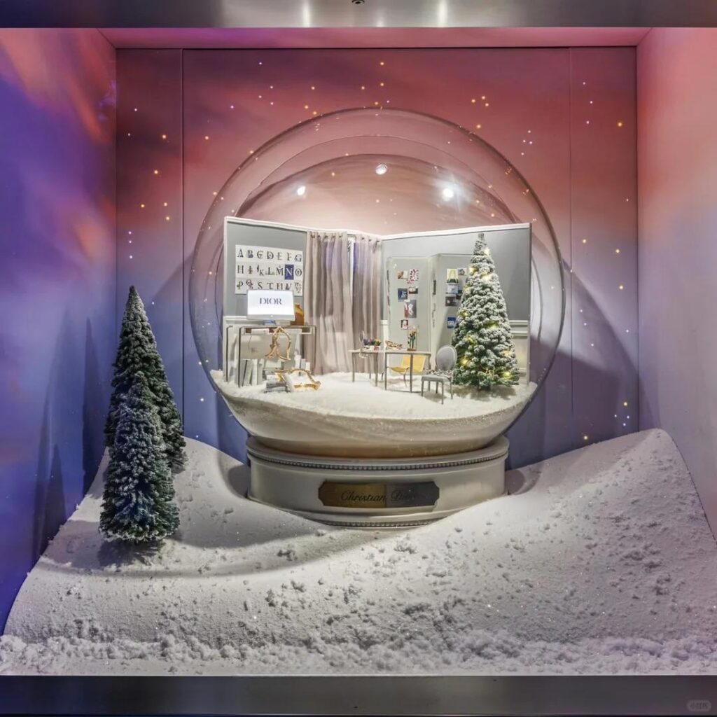
Whether it’s a holiday window sculpture, a countertop glorifier, or a travel retail gondola, your brand should always feel instantly recognizable.
At Samtop, we make sure that happens — in every market, across every display type, and through every rollout.
✅ Yes — We Match Your Brand’s Visual Language Across Display Formats
We don’t just make displays. We create brand-true display systems.
| Display Type | Brand Visual Integration |
|---|---|
| Perfume Glorifiers | LED-lit base, etched logo zones |
| Window Display Props | Oversized shapes + Pantone paint |
| POP Counters | Trays shaped to match product packaging |
| Travel Retail Fixtures | Compact structure, same finish |
| Promotional Risers | Unified font and print texture |
| Gondolas | Aligned structure tone + branding |
| Holiday Props | Consistent color and typography |
🎯 One partner. Multiple formats. One cohesive brand identity.
🧩 How We Translate Brand Assets into Physical Displays
| Brand Element | Samtop Implementation |
|---|---|
| ✅ Vector Logo | Applied with UV print, screen print, or laser engraving |
| ✅ Pantone Colors | Color-matched on MDF, acrylic, foam, fabric & resin |
| ✅ Typography | Recreated through print, cut metal, or LED font |
| ✅ Finish References | Matte, gloss, mirror, velvet replicated via texture spray |
| ✅ Product Packaging | Integrated into trays, risers, or base forms |
| ✅ Regional Visual Rules | Multilingual swaps and localized adjustments that maintain visual consistency |
💡 We act like an extension of your in-house visual merchandising team.
Why Brand Visual Consistency Matters
| Risk | Samtop Solution |
|---|---|
| Displays look mismatched | Centralized visual system with unified standards |
| Local vendors can’t match finishes | In-house spray booths with approved color panels |
| Logo size or placement varies | Locked specs using golden master samples |
| Overseas QC misses small errors | Final review includes photo, video, and checklist |
🎯 🎯 Visual consistency is operational as much as it is aesthetic — it protects your brand integrity globally.
📦📦 Case Study: Unified Visual Execution Across 5 Display Types
Client: Global luxury skincare brand
Project Scope:
- LED-lit fragrance glorifier
- Window holiday prop (mirror snowflake)
- Promotional riser for shopping malls
- Duty-Free gondola
- Sample tray for retail stores
Samtop Delivered:
- Matched marble-texture spray across resin and MDF
- Uniform logo placement and font style
- Identical LED color temperature across all displays
- One golden master set used for all global approvals
🎯 Result: Seamless, consistent brand presence in 5 countries, across 3 display formats — with zero deviation..
🛠️ Our Process for Visual Consistency
- Collect brand elements (logo, color, finish refs)
- Build a “Display Visual Language System”
- Apply across glorifiers, props, POP units, gondolas
- Sample approval: spray, print, structure
- Produce under one team, one system, one QC rule
- Pack & ship with per-store labeling + visuals
📷 Our QC includes: photos, video reviews, and signed checklists before dispatch.
💬 Already Working with an Agency or Holding Brand Guidelines?
Perfect — we can:
