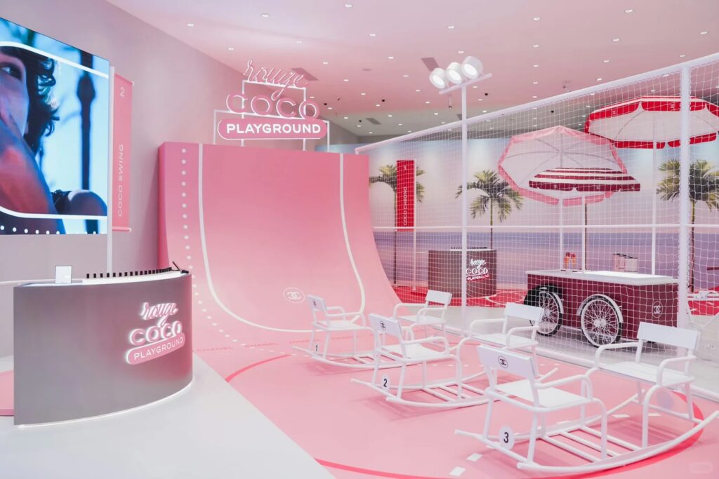
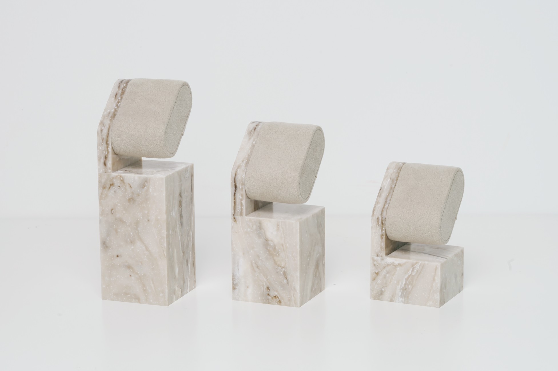
When your fixture involves metal frames, acrylic risers, printed backers, and wood veneer trays — even the same color code can result in five different shades. A mismatch in gloss, texture, or substrate finish can break the illusion of a luxury brand.
Visual inconsistency across vendors and materials is one of the most common — and most visible — problems in multi-material POP production. Without a cross-supplier color control system, even Pantone or RAL references can lead to poor in-store execution.
The solution? Combine color codes with physical master swatches, gloss control, real-material matching, and QC tools at every stage.
✅ Quick Summary: How to Manage Color Matching Across Suppliers

To ensure color consistency in multi-supplier fixture production:
- Use Pantone/RAL codes + gloss level + finish texture
- Create a master swatch kit for all materials (paint, acrylic, print, laminate)
- Approve colors during sampling in both D65 daylight and warm light
- Enforce quality control with gloss meters and side-by-side comparisons
- Include swatch photos on crate labels and install guides
Color matching is not just a code — it’s a full visibility system.
Why This Matters for Brands and Rollout Teams
When customers see your display, they don’t know if the acrylic came from Supplier A and the frame from Supplier B. They judge the brand by whether everything looks cohesive. Your project’s perceived value depends on these subtleties.
Let’s break down where color matching goes wrong — and how to avoid costly reworks.
Why Color Matching Fails (Even With Pantone)
| Material | Risk of Shift | Reason |
|---|---|---|
| Painted MDF | High | Pigment absorption + gloss distortion |
| Powder-Coated Metal | Medium | Heat bake alters color; metallic base reflects |
| Acrylic Panels | Medium-High | Transparency + gloss change perception |
| Digital Prints | High | CMYK doesn’t map directly to Pantone |
| Laminate Sheets | Medium | Factory variance between batches |
Even Pantone 430C will look warmer on acrylic and cooler on powder-coated metal. Color ≠ Code. You must simulate actual visual outcome under display lighting.
What You Need: The Minimum Tools for Color Consistency
- ✅ Master Swatch Board with labeled samples on all materials
- ✅ Pantone/RAL Reference + Lab values (Lab*) if possible
- ✅ Gloss % standardization: define matte (≤10%), satin (30–60%), gloss (≥70%)
- ✅ QC lightbox (D65 + warm)
- ✅ Gloss meter or visual reference cards
- ✅ Side-by-side testing protocol for all pre-mass samples
See how we engineer color controls into multi-supplier projects
Build a Master Color Kit for Sampling and Production
Every project should begin with a physical master kit that includes:
- MDF + metal swatch sprayed and labeled
- Acrylic in frosted + gloss variation
- UV print or offset output on actual substrate
- PVC laminate with texture and supplier code
- Finish label: color code, gloss %, date, supplier
Send this kit to every factory, including sub-vendors (graphics, lightbox, foam, signage). Recheck against it at sampling and mass production.


