Are Your Mother’s Day Displays Sending the Right Emotional Signals?
Discover how to apply Mother’s Day color psychology in retail displays. Samtop helps brands design paper-based VM props with emotional, brand-aligned palettes.
When the Color Feels Off, the Moment Feels Off
A mismatched palette can confuse tone, clash with brand identity, and reduce gifting impulse. Too bright feels cheap. Too cold feels sterile. Too bland feels forgettable. But get it right, and color becomes your most persuasive storyteller.


Use Strategic Color Palettes to Spark Emotion, Pause Time, and Inspire Action
At Samtop, we help brands apply color psychology to every element of their Mother’s Day visual merchandising—from flowers and signage to lighting and display base—so your customers don’t just see your brand. They feel it.
✅ Why Color Choice Is Your Most Powerful Silent Salesperson
- Color creates emotional atmosphere faster than copy or shape
- Warm palettes = longer dwell time and higher gift conversion
- Strategic hues guide shopper mood, memory, and action
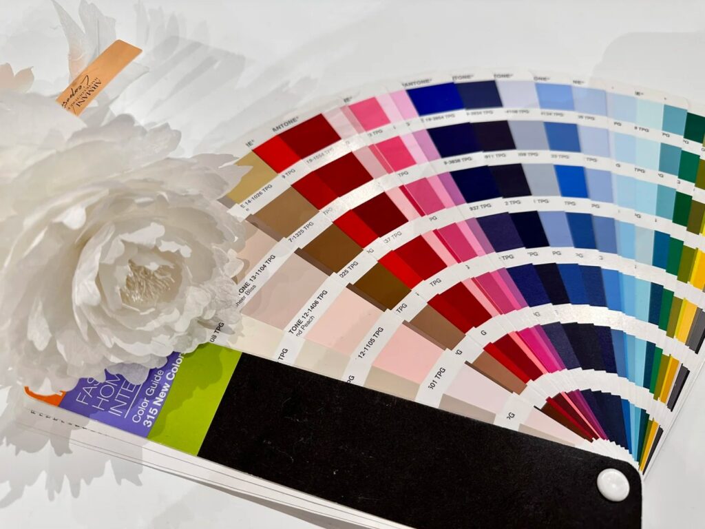
- Paper-based displays allow precise Pantone application across props
💡 When emotion is the message, color is the medium.
🧠 1. What Color Means in Mother’s Day Visual Merchandising Psychology
| Color | Emotion Evoked |
|---|---|
| 🌸 Pink | Love, femininity, sweetness |
| 🌿 Sage/Green | Calm, nature, growth |
| 💜 Lavender | Nostalgia, memory, grace |
| ✨ Champagne/Gold | Elegance, premium value |
| 🤍 White/Ivory | Gratitude, soft luxury, purity |
📈 Warm-toned and pastel schemes perform best for emotional campaigns like Mother’s Day.
🌷 2. Color Palettes for Different Brand Types
| Brand Type | Palette Name | Colors | Emotional Message |
|---|---|---|---|
| Luxury / Jewelry | Golden Petal | Champagne · Ivory · Blush · Rose Gold | Sophistication, timeless love |
| Minimalist Modern | Lavender Calm | Soft lilac · Dusty beige · Sage · White | Tranquility, gentle gratitude |
| Beauty / Gifting | Peach Bloom | Coral · Apricot · Cream · Pale yellow | Joyful, warm-hearted, feel-good gifting |
| Bold Fashion | Orchid Energy | Plum · Hot pink · Rose red · Gold | Bold love, statement moms, passion |
📌 Tip: Pair 2 main colors + 1 foil accent (e.g. soft lilac + ivory + gold foil text) for balance and depth.
🎯 3. Where to Place Color in Your Display
| Element | Color Strategy |
|---|---|
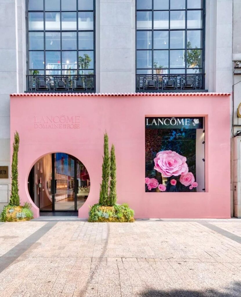
| Window Backdrop | Use a gradient (e.g. blush to peach) to create soft emotional flow |
| Floral Props | Align flower types with brand tone (e.g. champagne roses = elegance) |
| Signage & Typography | Dark foil or plum text on soft base (e.g. cream or lilac) |
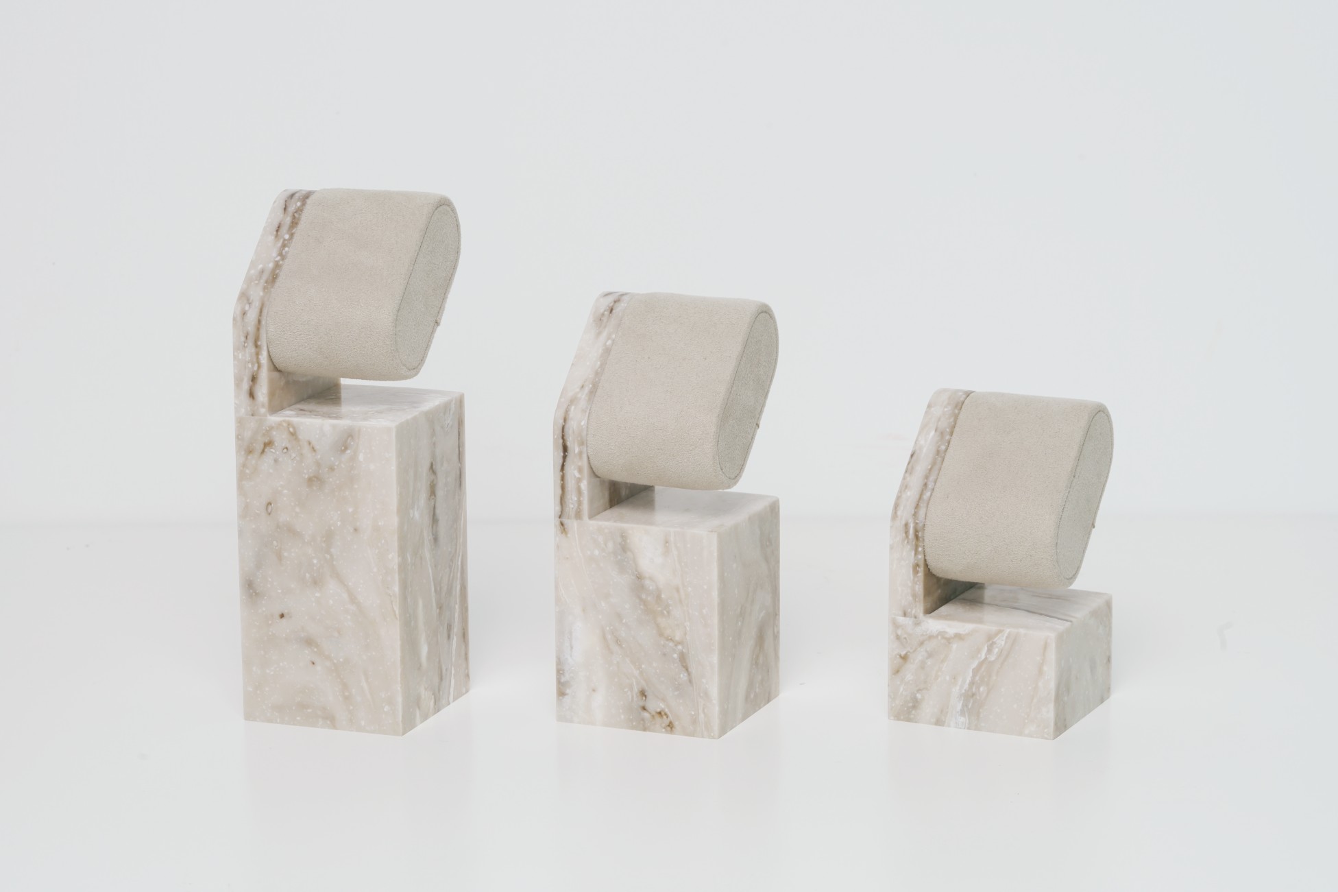
| Podium / Gift Area | Neutral wrap + floral top or product color pop |
| Lighting | Warm white or blush pink LEDs (avoid blue light unless lavender) |
💡 Don’t overcrowd. Let colors breathe for maximum emotional impact.
🧴 4. Color Pairing Examples by Product Type
| Product | Suggested Palette | Why It Works |
|---|---|---|
| Perfume / Skincare | Soft pink + silver + ivory | Light, fresh, feminine, and instantly giftable |
| Jewelry / Watches | Rose gold + cream + peony red | Luxury + emotion = gifting prestige |
| Gift Sets / Candles | Lilac + beige + handwritten font | Cozy, nurturing, intentional |
| Fashion Accessories | Coral + pearl + soft yellow | Trendy, vibrant, highly shareable for Instagram moms |
📌 Use color-coordinated paper wraps to bridge between display and product box.
✍️ 5. Emotional Messaging by Color
| Message | Suggested Palette |
|---|---|
| “Thank you for your warmth” | Blush · Cream · Light rose |
| “For the woman who made you strong” | Plum · Mauve · Gold |
| “A gentle love that lasts forever” | Ivory · Peach · Sage |
| “To Mom, with grace” | Lavender · White · Champagne |
📌 Foil stamping + short phrases = big visual impact.
♻️ 6. Color Matching for Sustainable Materials
| Material | Best Color Applications |
|---|---|
| Kraft Paper | Dusty pink, Olive, Burgundy |
| Recycled Cardstock | Muted pastels + matte ink |
| Seed Paper | Coral, Ivory, Rose Gold Print |
💡 Avoid neon or saturated inks on textured papers—they tend to bleed or look uneven.


