
How Color Drives Emotion, Perception, and Consumer Action in Retail Spaces
Color psychology in retail display is more than decoration — it’s a subconscious signal. The right hues trigger emotion, influence perception, and guide shopper behavior in just seconds.
You’ve selected beautiful materials and a stunning structure — but something still feels off. The display doesn’t fully reflect your product’s emotional tone.
That’s because color speaks first. It sets the mood before words or logos. And the wrong tone can make a premium product feel sterile, or a playful campaign feel dull.
At Samtop, we help brands and VM teams choose colors for props and fixtures that go beyond matching the brand palette — they match the desired feeling, context, and customer action.
🧠 Why Color Psychology Matters in Display Design
⏱ 1. First Impressions Form in Seconds
Consumers make snap judgments — and color accounts for 60% of first impressions.
🎭 2. Color Triggers Emotion
Each hue activates an emotional response:
- 🟦 Blue: Trust, calm, tech, premium
- 🟥 Red: Energy, urgency, power
- ⚫ Black: Elegance, exclusivity, boldness
- 🌸 Pink: Softness, indulgence, care
- 🌿 Green: Freshness, nature, wellness
- 🟨 Yellow: Optimism, energy, attention
🎨 3. Color Shapes Brand Perception
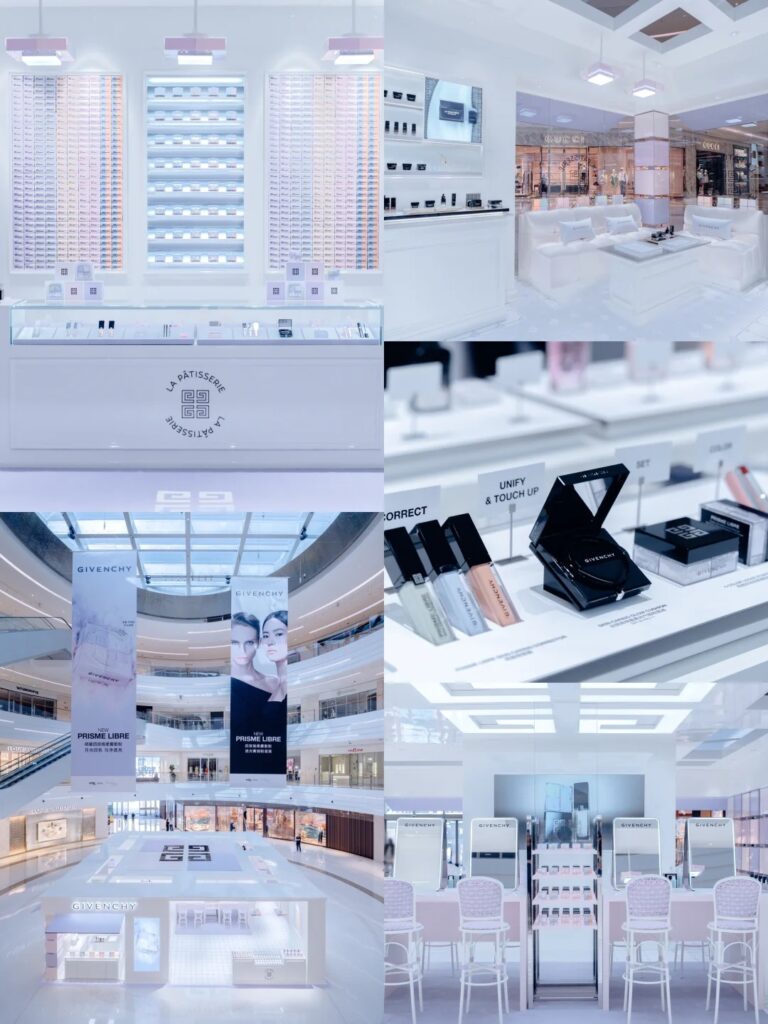
Matching your logo isn’t enough. If your display feels “clinical” when it should feel “nourishing,” the shopper disconnects. Color needs to be emotionally aligned.
This project demonstrated how color psychology in retail display directly affects emotional impact and dwell time.
👀 4. Color Can Guide Consumer Action
Strategic contrast and accents can:
- Focus attention on your hero SKU
- Invite touch or interaction
- Segment categories or collections
🛠️ Strategic Color Use Cases in Display Props
| Display Type | Strategic Color Use | Intended Effect |
|---|---|---|
| 🪟 Window Façade | Bold hues with high contrast | Grab attention at 3 meters distance |
| 🧱 Glorifier Base | Neutral tones + lighted edges | Frame the product, reduce visual noise |
| 🎁 Holiday Prop | Rich golds, reds, and silvers | Create festive urgency and emotion |
| 🧴 Skincare Tester | Warm ivory or champagne + matte finish | Signal softness, elegance, purity |
| 💻 Tech Gadget POP | Black base + neon/red accents | Communicate innovation and power |
🔍 Real Case: Color Shift That Increased Engagement
🟨 Client: Japanese luxury skincare brand
🟨 Original Design: Gloss white tray + clear acrylic riser
🟨 Challenge: Felt cold, too pharmaceutical
🟩 Samtop Solution:
- Replaced white with matte warm ivory PU spray
- Added rose gold edge accents
- Delivered two spray-coated samples for final visual review
- Rendered in 3 lighting contexts across store formats
✅ Result:
- Stakeholder approval doubled in speed
- Described as “soft, premium, and feminine”
- +19% dwell time in 40 installed stores during spring season
👁️🗨️ Tips for Choosing Display Colors That Work
1. Know Your Brand’s Emotional Center
Start from your brand moodboard: playful, grounded, sensual, bold?
2. Think in Lighting Temperatures
Colors look very different under cold vs. warm retail lighting. Always simulate store lighting in mockups.
3. Mock Up the Environment
A great display color might clash with a marble floor or high-gloss wall. Always test in context.
