Visual Priority: How to Build Hero SKU Display Hierarchy for Retail Displays

Bob Chow Bob
Share:

Article Overview

Creating a strong hero SKU display hierarchy is one of […]

Creating a strong hero SKU display hierarchy is one of the most effective ways to increase product visibility and in-store conversion. By structuring POP displays using elevation, lighting, centering, and spacing, you guide shoppers’ eyes directly toward the products that matter most — your heroes. When the hierarchy is clear, customers instantly know where to focus and which item to interact with first.

This guide explains how to build a high-performing hero SKU display hierarchy that strengthens brand storytelling and dramatically improves retail engagement.

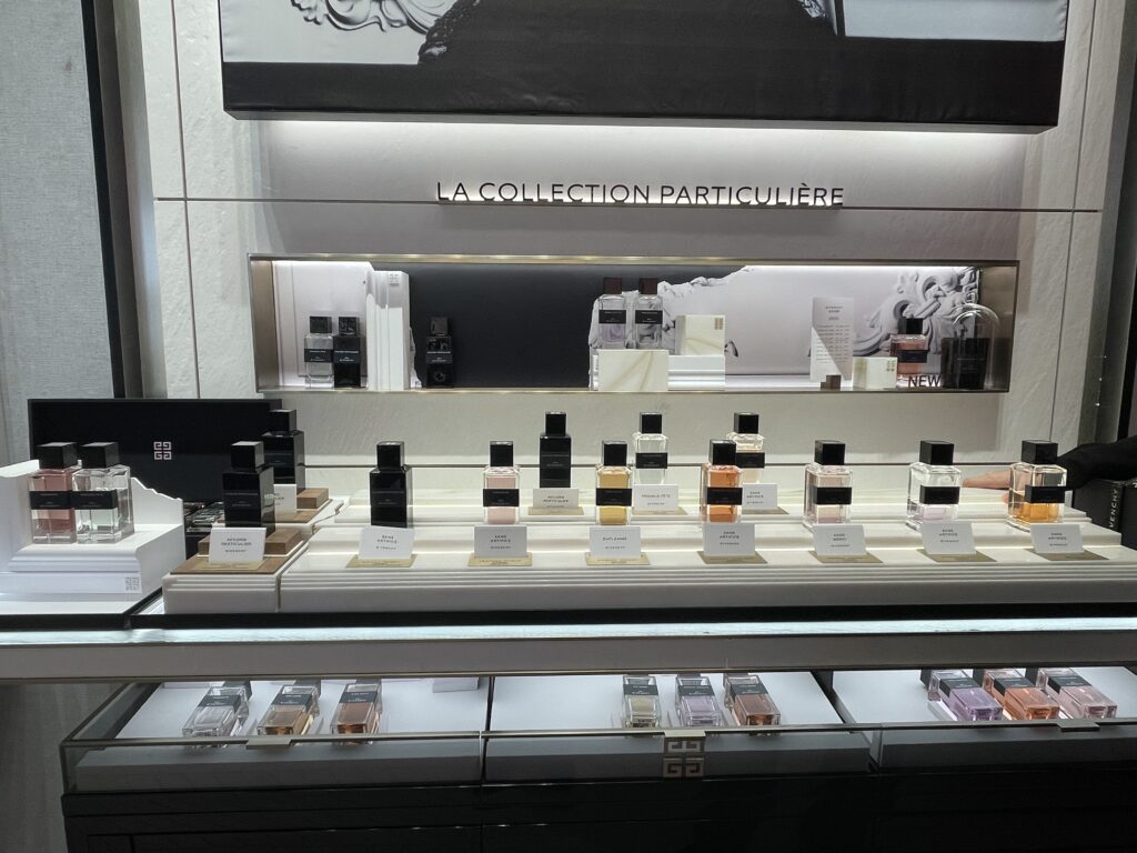
To create an effective hero SKU display hierarchy, elevate the hero product by 2–4 cm, center it at eye level (125–135 cm), frame it with subtle lighting, and clear surrounding space to reduce visual noise. Add short labels (“NEW,” “#1”) and provide a dedicated tester area to increase interaction and conversion.

Why Hero SKU Display Hierarchy Drives Retail Sales

A strong hero SKU display hierarchy answers three shopper questions in under 3 seconds:

  • Which product is the hero?

  • What action should I take? (Try, test, pick up)

  • Why is this product special?

In stores, customers scan before they read. Hierarchy creates recognition, intention, and momentum — all essential for conversion.


🎯 6 Proven Strategies to Build an Effective Hero SKU Display Hierarchy

These tactics are engineered for cosmetics, fragrance, watch, and lifestyle brands.


1️⃣ Elevate the Hero (Micro-Elevation = Maximum Priority)

A small height difference instantly creates dominance.

How to apply it:

  • Raise the hero 2–4 cm above other SKUs

  • Use glossy plinths, matte risers, or LED-base platforms

  • Contrast materials: matte surface for supporting SKUs, gloss or metal for hero

📌 Even a small elevation helps the brain identify “this is the important one.”


2️⃣ Place the Hero at the Center

Hero products earn the best real estate: the eye-line center zone.

Best placement:

  • 125–135 cm for counter displays

  • Slightly off-center for windows (creates editorial tension)

  • Middle of a 3-SKU lineup

📌 Center placement is the most intuitive form of display hierarchy.


 3️⃣ Frame the Hero With Light, Structure, or Texture

Use subtle contrast, not excess brightness.

Ideas:

  • Soft LED glow

  • Backlit acrylic arc

  • Gloss finish only under the hero

  • Metal trim around the hero riser

📌 Light doesn’t need to be loud — contrast is what makes a hero SKU pop.


4️⃣ Use Typography, Claims & Color Cues

Copy acts as visual anchoring.

Add:

  • “NEW,” “HERO,” “#1,” “BESTSELLER”

  • Claims: “24H Glow,” “Ultra Lift,” “5x Hydration”

  • Color blocking behind the hero SKU only

📌 Keep messages under 5 words.

Visual Merchandising Solutions

Transform your retail space with custom POP displays, window decorations, and luxury merchandising solutions. Get expert consultation and premium manufacturing services.

✓ 20+ Years Experience • ✓ Global Shipping • ✓ Custom Manufacturing
Visual Merchandising Solutions

5️⃣ Create a Dedicated Hero Tester Moment

This is critical for beauty and fragrance categories.

Tactics:

  • Unique tray texture (velvet, PU, soft-touch)

  • Mirror alignment for try-on

  • Isolated tester pad for hygiene and clarity

📌 Try-on zones dramatically increase interaction and sales.


 6️⃣ Give the Hero Breathing Room

Visual silence enhances focus.

Use:

  • White space around the hero

  • Lower risers for supporting SKUs

  • Symmetrical but less dominant side products

📌 Great hierarchy = minimal clutter + clear focus.


Real Example: Structuring a Hero SKU for a Fragrance Launch

Brand: Boutique fragrance label
Challenge: Hero SKU blended into the trio and was ignored

Samtop Solution:

  • Elevated hero by 3 cm using glossy plinth

  • Added ring-lit LED under hero only

  • Introduced acrylic “NEW SCENT” tag

  • Lower, matte trays for supporting SKUs

Results:

  • Hero SKU sales ↑ 41%

  • Sell-through ratio improved to 3:1

  • Same display replicated across four markets

Hierarchy = conversion.


FAQ: Hero SKU Display Hierarchy

Q: What if I have more than one hero?

Use 3-tier logic: Hero → Support → Discovery.

Q: Should windows follow the same hierarchy?

Yes. Light, scale, placement, and narrative must signal the hero first.

Q: How do retailers understand this?

Provide visual logic maps in your VM rollout kits.


 ✅ Conclusion: Lead the Eye, Win the Sale

✔ A hero SKU display hierarchy is the fastest way to improve product focus
✔ Use elevation, light, spacing, and texture to guide attention
✔ Make the hero unmistakable within 1–3 seconds
✔ Apply hierarchy consistently across windows, counters, and testers

If your display doesn’t point shoppers to the hero SKU — it’s not doing its job.

📩 Want Help Structuring Hero-First Displays?

At Samtop, we:

  • Design modular layouts built around hero SKUs
  • Prototype elevation, lighting, and tester zones
  • Include install logic in rollout kits for global teams
  • Build hierarchy into both floor and counter units

📧 Email: yan@samtop.com
🌍 Website: www.samtop.com

POPAI — Global Association for Marketing at Retail


Bob

About Bob

Hi, I’m Bob, the funder of SamTop.com, Our company makes visual merchandising props, retail display stands and window display decoration for many years now, and the purpose of this article is to share with you the knowledge related to retail displays from a Chinese supplier’s perspective.

Connect: