How to Create Unified, Shoppable Displays That Celebrate Product Diversity
By Yan Luo | Samtop Display
A great product range can fall flat if the visual merchandising for product families lacks structure and clarity. At Samtop, we help brands create modular, premium displays that unify SKU ranges and elevate retail storytelling.

Your brand has a family of products — beautiful bottles, color-coded SKUs, or seasonal variants — but your display makes them look disjointed or cluttered.
If everything blends, customers get bored. If everything clashes, they get confused. And when it’s unclear how the SKUs relate, they stop exploring — or worse, don’t buy.
At Samtop, we help you find the visual rhythm — a balance between unity and variety — so your display feels clear, elevated, and shoppable.
🧠Why Visual Merchandising for Product Families Needs Strategyplay Design Needs Strategy
1. Balance of Contrast and Consistency
The goal isn’t “same-same” or “standalone” — it’s orchestrated variety. We use height, color, spacing, and materials to create a rhythm that guides the eye and invites comparison.
2. Clarity = Conversion
Displays should help customers understand the differences and relationships between SKUs — whether by scent, skin type, routine step, or mood. When the logic is visible, shoppers buy more confidently.
3. Structure = Perceived Value
When product families are beautifully grouped with matching risers, trays, or dividers, the brand feels thoughtful, curated, and premium — even with variant packaging.
🧩 Common SKU Display Challenges — and How Samtop Solves Them
| Challenge | Samtop Solution |
|---|---|
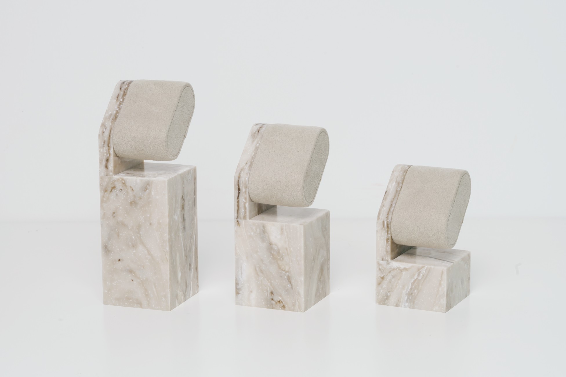
| Different bottle sizes / heights | Tiered risers, leveling pads, or symmetrical step layouts |
| Strong color differences | Neutral materials, gradient arrangement, or soft backlighting |
| SKU crowding in small areas | Modular trays, slot dividers, switchable acrylic cards |
| Inconsistent lighting | Built-in LED strips with diffusion panels |
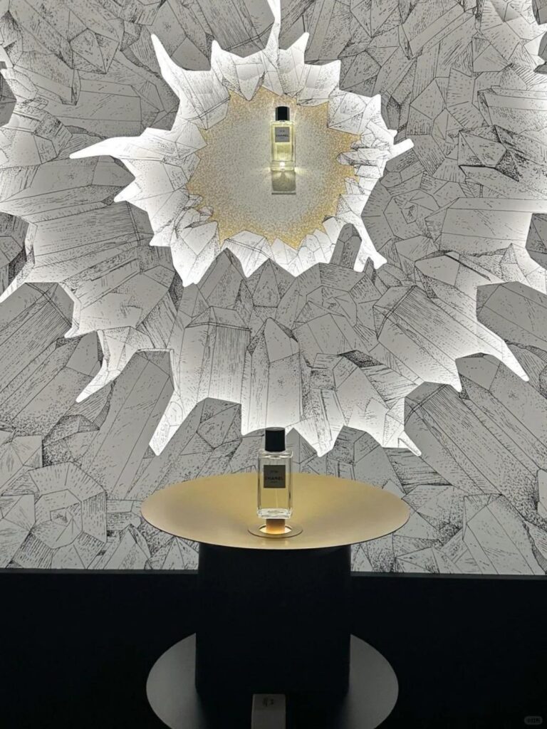
| Hero SKU needs spotlight | Elevated riser, mirror base, or LED halo behind product |
💡 Our philosophy: “Organized diversity.” Show differences — but make them feel like a family.
🔍 Real Case: Unifying a Boutique Fragrance Trio
🟨 Client: Niche perfume house with three new SKUs
🟨 SKU Traits:
- Gold, silver, and rose gold caps
- Slight height variance
- Distinct scent identities: Citrus, Musk, Floral
🟩 Samtop Solution:
- Built a soft ivory acrylic base to unify the range visually
- Introduced a 3-tier step system with printed name plaques for each SKU
- Placed the hero scent (Musk) on a mirror pedestal with subtle LED backlighting
- Used transparent dividers to separate while maintaining flow
✅ Result:


