How Fragrance Packaging Shapes the Look, Form & Feel of Visual Merchandising
By Yan Luo | Samtop Display
At Samtop, our perfume display design approach turns your fragrance packaging into an immersive brand experience — echoing every curve, tint, and texture of your bottle.


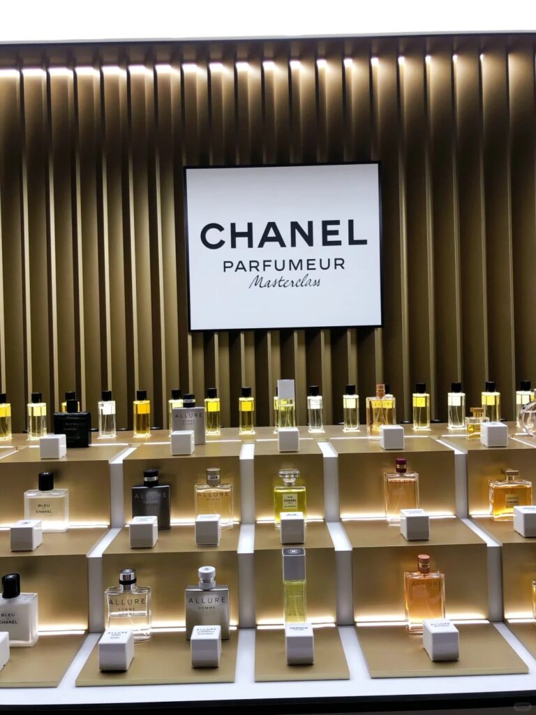
Fragrance packaging is gorgeous — sculpted, tinted, embossed. But when it reaches retail, it’s often paired with a generic tester tray that says nothing about the scent’s personality.
It’s a disconnect. Your bottle speaks volumes… yet the display is mute. You risk losing emotional impact at the most critical moment: the shopper’s first glance.
At Samtop, we translate perfume bottle design into display systems — so your in-store presence becomes a true extension of your product’s artistry and brand voice.
💎 Why Bottle Design Is the Perfect Inspiration for Perfume Display Design
1. The Bottle Is the Brand
Shape, cap, tint, label — they all convey emotion. Replicating them in display builds trust and recognition instantly.
2. It’s Already Approved by Consumers
Your fragrance bottle already resonates. Echoing it in-store reinforces what customers already love.
3. Details = Differentiation
When you extend metallic caps, engraved crests, or subtle gradients into a tester tray or riser, your brand becomes unforgettable.
Smart perfume display design builds emotional recall through form and finish.
🧪 Packaging Elements → Display Translation
| Bottle Detail | Display Translation | Application |
|---|---|---|
| 🧴 Bottle silhouette | Custom-cut riser shape or glorifier form | Tester tray, window hero |
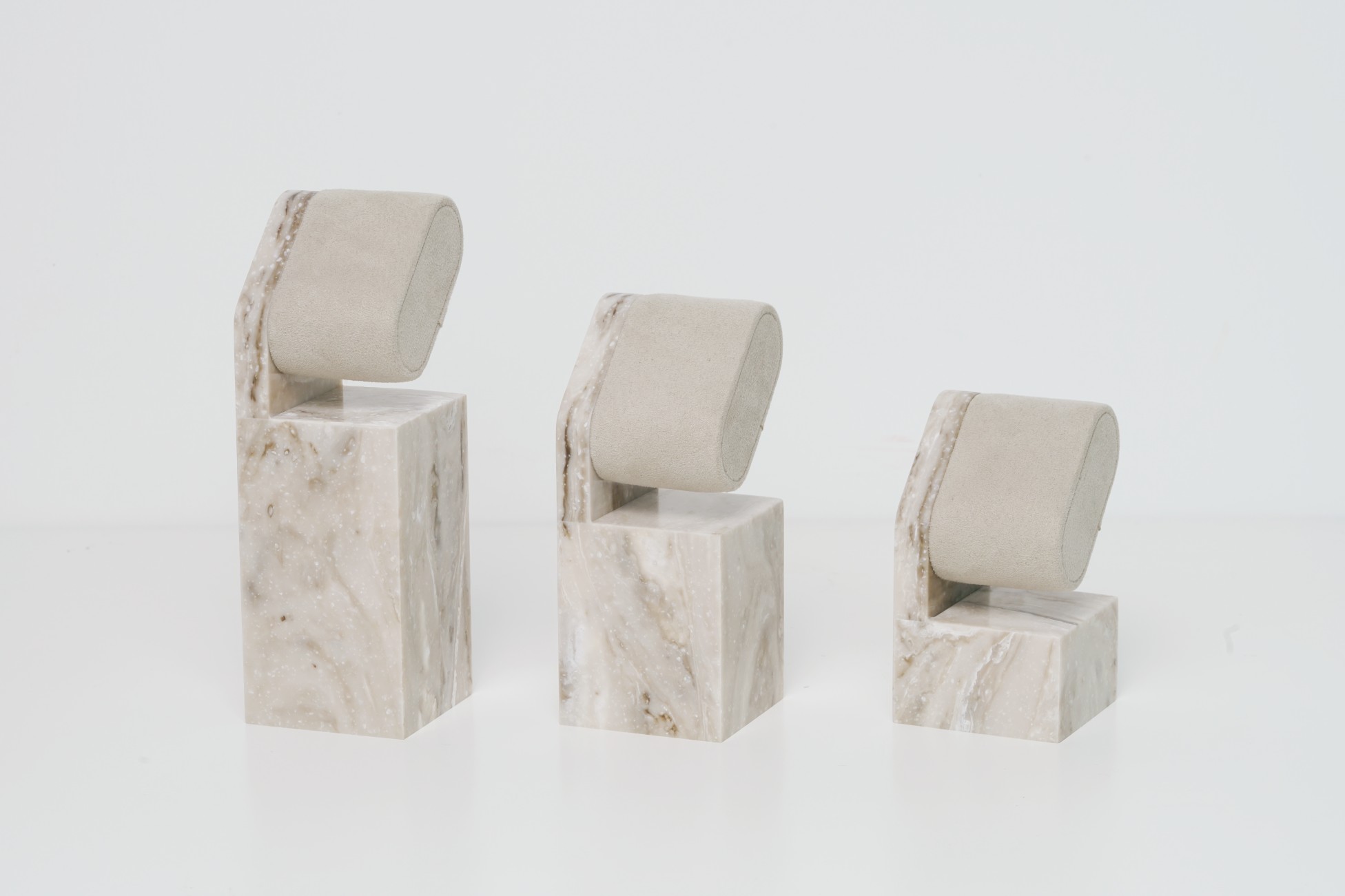
| 🧢 Cap design | Plinth, back arch, or logo pedestal | Wall shelf, gondola, tester base |
| 🖋️ Embossed logo / emblem | Laser-etched plate, raised acrylic emblem | Tray corner, background detail |
| 🌈 Tint / gradient glass | Tinted acrylic, sprayed Plexiglas | Lightbox, side panel, floating shelves |
| ✨ Finish (matte/gloss) | PU coating, wrapped vinyl, or paint spray | Riser surface, front panel |
| 🪞 Metallic accent | Mirror film, brushed metal overlay, or foil application | Cap frame, back panel, base edge |
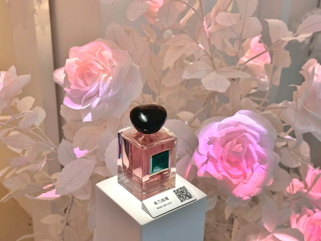
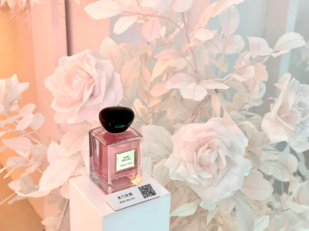
💡This fragrance display was directly inspired by the bottle’s silhouette — a signature in modern perfume display design.
🔍 Real Case: A Gold Cap That Became the Display Hero
🟨 Client: French fragrance house launching a new series
🟨 Packaging Features:
- Cylindrical gold cap with sunburst engraving
- Frosted bottle with soft pink tint
- Nude pastel sleeve with embossed logo
🟩 Samtop Display System:
- Riser shaped to match cap contour, made from brushed gold acrylic
- Logo replicated via laser-etched disc in satin metallic finish
- Gradient recreated using frosted acrylic reverse-sprayed in pink
- Structure designed to fit existing gondola units globally
✅ Result:
- Called “a physical extension of the bottle” by the brand team
- Used in 3 global flagships + duty-free test zone
- Cap motif later scaled up for window sculpture in seasonal rollout
👥 Who Should Consider Bottle-Inspired Displays?
✅ Fragrance brands with iconic bottles or LE capsule collections
✅ Beauty & skincare brands launching ampoule-based or luxury serums
✅ Creative agencies seeking cohesion between packaging & retail assets
✅ VM teams needing scalable yet stunning seasonal visual systems
✅ Global trade teams pitching bottle lines to retail partners


