
Designing Displays That Command Attention in Multi-Brand Environments
By Yan Luo | Samtop Display
In department stores, airport duty-free, and beauty halls, your brand often lives in a shared space — surrounded by competing visuals. To win attention, your store-in-store display system needs to balance brand identity, modular scalability, and spatial constraints.
At Samtop, we help brands design SiS systems that are visually distinct yet operationally practical — even within strict retail format guidelines.
In crowded multi-brand environments, like department stores or airport duty-free shops, creating a display that stands out without overpowering or clashing with surrounding brands is a challenge. Retailers have strict rules, and you're working within space limitations and shared resources.
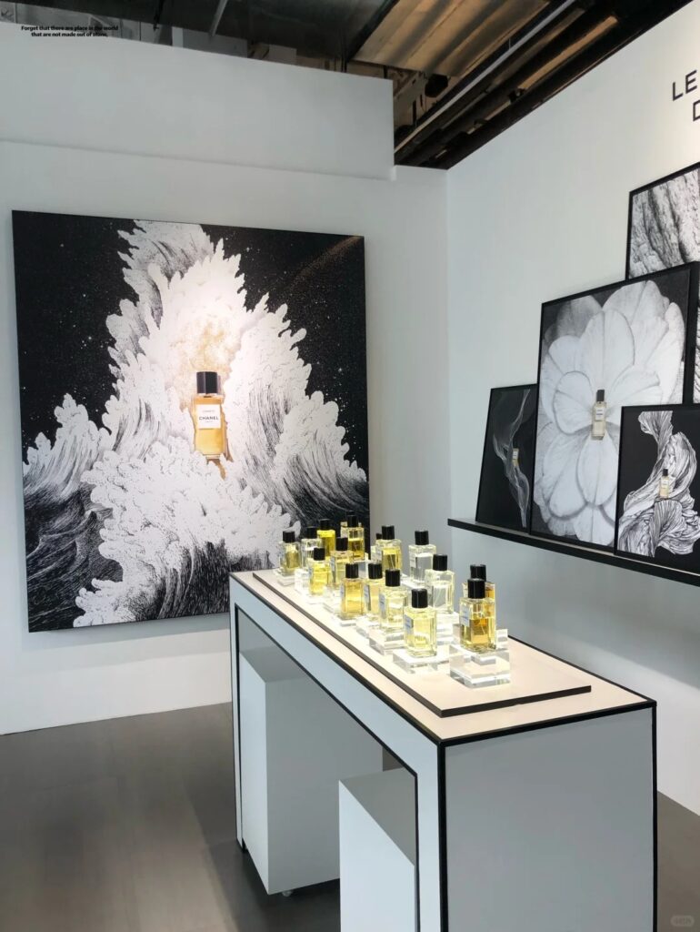
A poorly designed Store-in-Store (SiS) display can get lost among the competition. It can blend into the background if it doesn’t have the right lighting, color contrast, or interactive elements. And with retailer compliance and space constraints, the risk of missing sales opportunities or brand dilution is high.
At Samtop, we specialize in creating modular, eye-catching SiS systems that perfectly balance visibility, brand identity, and retailer requirements. By using visual contrast, integrated lighting, and premium materials, we ensure your brand commands attention in even the most shared retail spaces.
5 Principles for Store-in-Store Display System Success
1. Visual Contrast Without Visual Noise
Use clear brand color blocking, sharp lighting edges, or minimal forms with bold finishes to stand out. Avoid overly complex layering that confuses the viewer.
Example: Matte black base with brushed gold logo embossing + LED halo.
2. Integrated Lighting Zones
Own your illumination. Add soft LED under-shelving or focused uplighting around your hero SKU to make it pop against ambient lighting.
Example: IP-rated side strip light embedded into acrylic tester riser.
3. Modular but Distinct
Create scalable elements (e.g., trays, headers, risers) that can adapt to different shelf widths — while keeping your brand tone consistent.
Example: PET sleeves that adapt for 60cm / 80cm / 100cm counters.
4. Material Cues That Signal Premium
Even in a compact space, finish matters: Soft-touch acrylic, frosted PET, textured laminate — subtle but unmistakably refined.
Example: Velvet-matte PET tray insert + chrome-plated logo medallion.
5. Compact Interactivity
If allowed, include motion or touch zones: mirror, QR scan, flip cards, or sample pull-outs — to increase dwell time.
Example: Hinged "story panel" that flips to reveal formulation claims.
