
Visual texture in retail displays uses faux stone, fabric grains, and ribbed acrylic to create emotional depth without relying on heavy or fragile real materials. These textures enhance light interaction, elevate brand tone, and improve customer engagement, while remaining cost-effective and scalable across global rollouts.
1. Why Texture Is a Visual Superpower in Retail
Texture manipulates light, mood, and behavior. It changes how long a shopper looks, where they reach, and how premium a product feels.
What texture does for visual merchandising
| Function | Benefit |
|---|---|
| 👀 Eye-catching contrast | Grain and relief catch light in motion |
| 🤲 Implied tactility | Makes shoppers want to touch (increasing dwell time) |
| 🎨 Brand expression | Fabric = calm; stone = grounded; ribbed acrylic = modern |
| 📸 Better photography | Creates depth for UGC and campaign shoots |
| 🧱 Perceived weight | Looks substantive without actual mass |
📌 Texture is the fastest shortcut to expressing brand mood—without altering the display’s structure.
2. Key Visual Textures and Their Emotional Effect
Below are the most effective retail textures and what they communicate in the shopper’s mind.
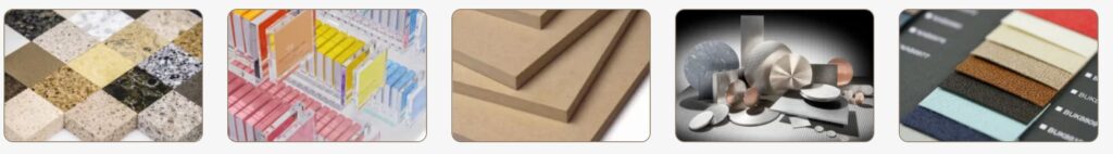
🪨 Faux Stone Laminate
Look & Feel: Matte, veined, architectural
Brand Tone: Quiet luxury, minimal, grounded
Best For: Plinths, tester blocks, panel cladding
💡 Use when you want prestige without actual stone logistics.
🧵 Fabric Grain Wrap
Look & Feel: Linen, woven, organic
Brand Tone: Wellness, softness, spa-like
Best For: Skincare bays, clean beauty, wellness shelving
💡 Provides intimacy and warmth while staying wipeable.
💧 Ribbed / Fluted Acrylic
Look & Feel: Light-bending grooves, modern rhythm
Brand Tone: Futuristic, tech-lux, fragrance-forward
Best For: Light wells, perfume risers, illuminated side panels
💡 One of the strongest textures for modern storytelling.
🔘 Brushed Metallic Film
Look & Feel: Directional sheen, jewelry-like reflections
Brand Tone: Masculinity, precision, bold
Best For: Logo blocks, cap accents, trim faces
🌫️ Frosted PET Emboss
Look & Feel: Cloud-soft, diffused
Brand Tone: Skincare, hygiene, minimal purity
Best For: Back panels, splash zones, sensory tables
3. Where to Use Texture in Retail Fixtures
Different zones benefit from different textures.
| Fixture Zone | Recommended Texture | Visual Effect |
|---|---|---|
| 💄 Tester tray | Ribbed acrylic edge | Catches shimmer, pulls eye inward |
| 🧴 Skincare bay | Linen grain laminate | Softens environment, spa-like |
| 💍 Jewelry inset | Faux stone + brushed gold | Elevates perceived value |
| 🧳 Pop-up riser | Fabric grain wrap | Light, portable, artisanal |
| 🧼 Splash panel | Embossed PET | Clean, tactile, hygienic |
📌 Use smooth + textured combinations to create “material rhythm” and avoid visual noise.
📌 Side lighting (2700–3500K) dramatically enhances grain visibility.
4. Faux vs. Real Textures: A Practical Comparison
For global rollouts, faux textures often outperform natural materials in consistency, logistics, and cost.
| Feature | Faux Textures | Real Materials |
|---|---|---|
| Visual consistency | High | Low, unique per piece |
| Shipping weight | Light | Heavy / fragile |
| Cost | Medium / low | Higher |
| Cleaning | Easy, closed grain | May stain / patina |
| LED interaction | Highly controllable | Natural, but less dramatic |
| Sustainability | Recyclable options | Depends on quarry/mill |
🎯 Use faux for scalability; real materials for flagship drama.
5. Case Study: Ribbed Acrylic Fragrance Fixture
Objective
Create a futuristic shimmer effect with strong ritual cues for fragrance testing.
Solution
-
Material: 8mm fluted clear acrylic
