In the retail industry, window displays are key elements in attracting customers into stores and encouraging them to purchase products. The use of color in window displays is particularly important. Color not only grabs the attention of customers but also communicates brand identity, creates an emotional atmosphere, and influences purchasing decisions. However, with so many possible color combinations, how should designers make the right choices? How can color be used effectively to enhance the appeal and sales potential of a window display?
This article explores the multiple roles of color in window display design and, through real-world retail display examples, explains how to use color to trigger emotional responses, strengthen brand recognition, and ultimately drive sales.
How Does Color Affect Brand Recognition?
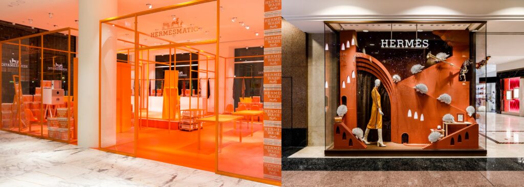
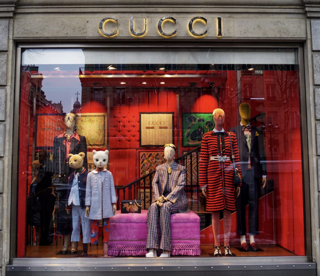
In window display design, color choices directly impact brand identity. Consistent use of brand colors strengthens recognition, making it easier for customers to identify and remember the brand. For example, Hermès' signature orange and GUCCI's iconic red have become synonymous with these brands. These colors not only convey the unique personality of the brand but also ensure that customers instantly associate these colors with the brand itself. Hermès' orange symbolizes luxury, elegance, and vibrancy, while GUCCI's red exudes boldness, innovation, and opulence.
Example:
Hermès's orange has become synonymous with the brand, and its use in both store displays and window showcases grabs attention while reinforcing the brand’s high-end, timeless image.
GUCCI, on the other hand, uses vibrant red to emphasize its bold, luxurious, and artistic brand positioning. In window displays, the color red draws attention to key products, creating a sense of urgency and desire.
How Does Color Evoke Emotional Responses from Customers?
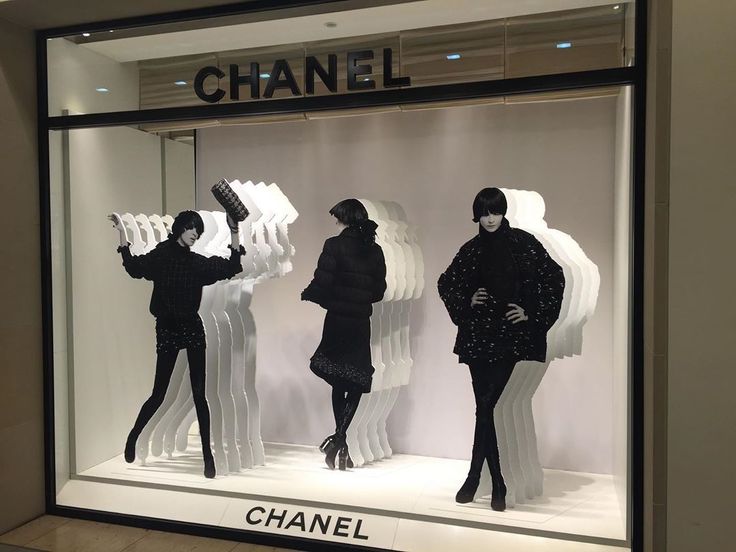
Different colors elicit different emotional responses, which is especially important in window displays. For example, red can generate excitement and urgency, while blue invokes calm and trust. In Chanel's window displays, the combination of black and white creates an aura of elegance and luxury. Black represents sophistication and timelessness, while white embodies simplicity and purity. Together, these colors amplify the brand’s high-end, refined image and resonate with customers' emotions, aligning with their aspirations for luxury and exclusivity.
Example:
Chanel uses the classic black and white combination in its window displays to create an atmosphere of elegance and exclusivity. Whether in Paris or other global locations, Chanel’s use of these colors ensures that customers experience the brand's sophisticated appeal, evoking a sense of luxury and refinement.
How Does Color Set the Mood of a Window Display?
Color can do more than just catch attention; it can also help designers create a specific atmosphere. For example, warm colors (like red and orange) evoke feelings of warmth and passion, while cool colors (like blue and green) convey tranquility and freshness. During the holiday season, designers can use these colors to reflect seasonal trends and enhance the festive mood. Tiffany & Co.'s 2024 New York Christmas window display cleverly used white snowflakes combined with Tiffany Blue to not only showcase the brand’s signature color but also capture the holiday spirit, creating an atmosphere of joy and elegance.
Example:
In Tiffany & Co.'s 2024 New York Christmas window displays, the use of white snowflakes and Tiffany Blue perfectly conveyed both the brand’s signature elegance and the festive atmosphere of the season. The colors combined to create a sense of luxury while celebrating the joyous Christmas season, inviting customers to step into a world of beauty and tradition.


