In retail stores, window displays are one of the key fa […]
In retail stores, window displays are one of the key factors in attracting customers. However, many times, merchants overlook the importance of color, which can result in ineffective window displays that fail to capture the attention of target customers and even miss numerous sales opportunities.
Although color is widely used in window display design, incorrect color combinations often lead to visual confusion or fail to communicate the brand's core message effectively.
Color is not just an element of visual design; it can also evoke emotions, guide the viewer's attention, and effectively communicate brand messaging. This article will explore the significance of color in window display design and offer practical design tips to help you enhance the appeal and sales conversion rate of your displays.
Examples of Good Color Contrast Combinations in Window Displays
Color contrast is an important element of window display design. By skillfully using contrasting colors, the visual appeal of the display can be enhanced, drawing customers' attention. Here are some common contrasting color combinations:
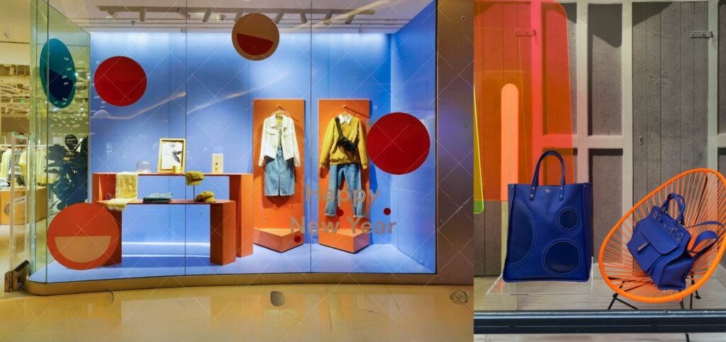
1. Blue and Orange
This combination is ideal for energetic brands or products, often used in sports and outdoor gear displays due to its eye-catching nature.
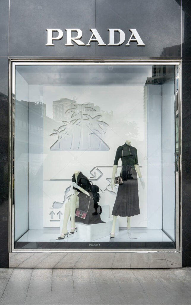
2. Black and White
Perfect for luxury brands or minimalist designs, this pairing evokes a sense of sophistication and elegance.
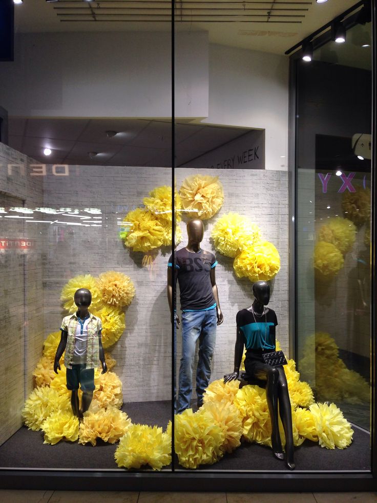
3. Charcoal and Bright Yellow
Suitable for contemporary brands, particularly in urban environments or technology-related displays.
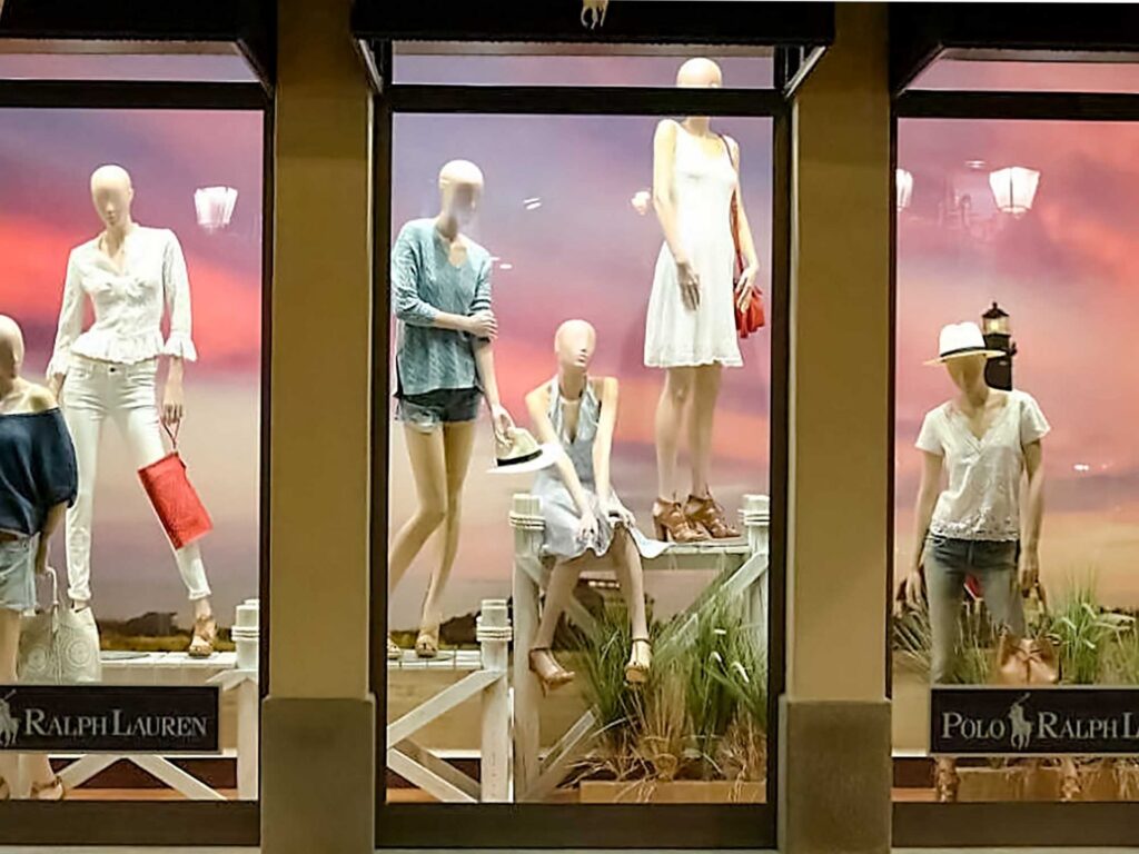
4. Turquoise and Warm Sand
Great for summer-themed displays or beachwear, this combination evokes feelings of relaxation and warmth.
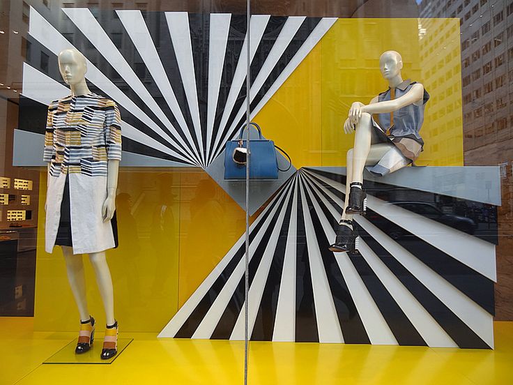
5. Red and Green
A bold contrast that provides visual stimulation, often associated with holiday themes.
6. Pink and Navy Blue
Ideal for beauty products or children’s clothing, appealing to both young and mature audiences.
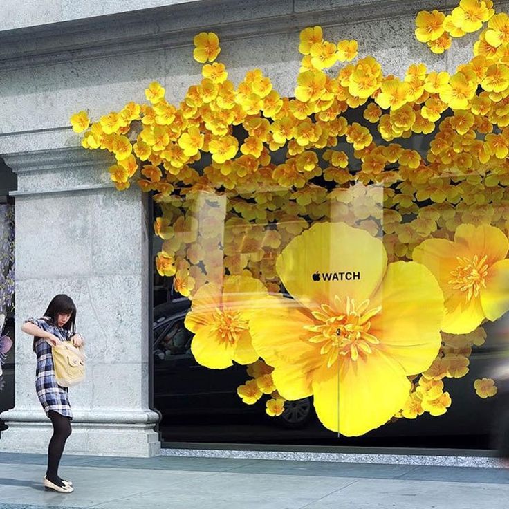
7. Purple and Yellow
8. Grey and Lemon Green
Through these color contrasts, designers can create visual focal points within the display, ensuring key products catch the customers' eye.
Popular Color Combinations in Window Displays
Color combinations in window displays change every year, but some classic and effective pairings remain consistently popular. Here are some trending color combinations for window displays in 2024, showcasing various styles and moods:
1. Prussian Blue, Orange, and Mustard Yellow
2. Periwinkle, Pink, and Lime Green
3. Canary Yellow and Pale Purple Gradient
4. Salmon Pink and Light Olive Green
5. Deep Periwinkle and Light Purple
6. Deep Navy Blue, Bright Red, and Soft Lemon Yellow
7. Disco Purple, Hot Pink, Yellow-Green, and Slime Green
8. Light Red and Yellow
These color combinations not only enhance visual appeal but also communicate the brand's values and emotions.
Bold Color Combinations in Modern Window Displays
In modern window design, more and more brands are daring to use bold color pairings to attract customers. For example:
Visual Merchandising Solutions
Transform your retail space with custom POP displays, window decorations, and luxury merchandising solutions. Get expert consultation and premium manufacturing services.
✓ 20+ Years Experience • ✓ Global Shipping • ✓ Custom Manufacturing
Deep Navy Blue and Bright Red
Electric Blue and Fluorescent Green
Disco Purple, Hot Pink, and Lemon Green
Bright Yellow and Charcoal Grey
Cherry Red and Bubblegum Pink
Turquoise and Warm Coral
Black and Neon Yellow
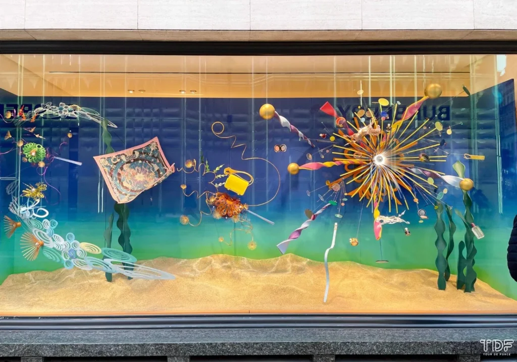
How to Incorporate Gradient Colors into Window Display Design?
Gradient colors, as a part of modern design, are increasingly being used in window displays to add depth and flow.
1. Background Gradients
2. Layered Textures
Tip: Combine gradient colors with textures or patterns to enhance depth and interest.
Application: Apply gradient colors to textured materials like fabric or wood to add dimension to the display background, making the products stand out.
3. Highlighting Products
Tip: Use gradient colors to highlight the featured product in the display.
Application: Use radial gradients to create a spotlight effect, making specific products stand out and directly attract customers' attention.
4. Gradient Typography
Tip: Apply gradient colors to text elements in the display.
Application: Using gradient colors on promotional text can increase visibility and attract attention, enhancing the communication of the message.
5. Dynamic Color Transitions
Tip: Use animated gradients or color transitions to create dynamic effects.
Application: If the display includes digital screens or LED displays, dynamic gradient colors can attract customers and extend their viewing time.
6. Complementary Color Schemes
Tip: Choose gradient colors that complement the display's products.
Application: For light-colored products, choose harmonious gradient tones, such as a soft purple transitioning to a gentle peach.
7. Seasonal Themes
Tip: Adjust gradient colors based on seasonal changes or promotional activities.
Application: In spring displays, you could use green and yellow gradients, while in autumn, you might use orange and red gradients to enhance the seasonal feel and attract customers.
The use of gradient colors adds dynamic movement and depth to window displays, enriching the visual experience and making it more engaging.
How Does Color Contrast Affect Retail Customer Behavior?
Color contrast plays an important role in visual communication. It not only enhances the aesthetic effect but also directly influences customers' purchasing decisions.
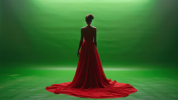
1. Using Complementary Colors
Tip: Choose colors that are opposite each other on the color wheel (e.g., red and green, blue and orange).
Application: Placing a red dress against a green background creates a high-contrast combination that draws customers’ attention.
2. Playing with Brightness and Saturation
Tip: Mix light and dark or bright and muted colors to create a sense of depth.
Application: Using bright yellow on a dark background can make the product stand out, increasing its visibility.
3. Using Bold Accent Colors to Highlight Focus
Tip: Use vibrant colors to highlight focal products, creating a visual emphasis.
Application: If the display features a blue handbag, accenting it with orange or pink can make the item stand out, enhancing the visual impact.
4. Limiting the Color Palette for Cohesion
Tip: Select a limited color palette to avoid visual chaos.
Application: Choose three colors: a primary color for the background, a contrasting color for the products, and a third color for text or signage to maintain visual unity and highlight key elements.
5. Using Lighting to Enhance Contrast
Tip: Use lighting to enhance color contrast.
Application: Bright white lighting can make colors appear more vivid, or soft blue lighting can accentuate orange or red products, making them more attractive.
6. Using Contrast Backgrounds to Highlight Text
Tip: Ensure there’s enough contrast between the text and the background to improve readability.
Application: Use a deep blue background with white text, or a bright yellow background with black text, so that customers can easily read promotional information from a distance.
7. Considering the Emotional Impact of Color
Tip: Choose colors that evoke specific emotions to communicate the brand message.
Application: Red can convey urgency and excitement, making it suitable for promotions or new product displays. Pairing it with neutral tones can prevent it from becoming overwhelming.
Successful Window Display Cases Based on Contrast
Here are some successful window display cases that effectively use color contrast:
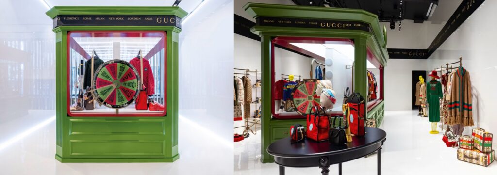
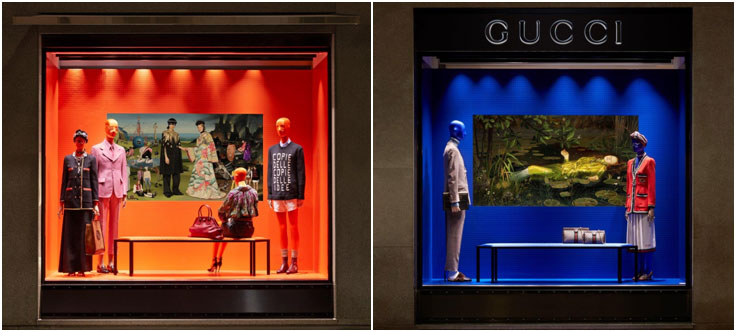
1. Gucci
By combining classic art with vibrant Gucci-designed clothing, color contrast was used to attract customers and enhance the brand's image.
2. Leaf
A Toronto pharmacy showcased upside-down skincare tubes with dried flowers spilling out, using a contrast of natural and modern elements to highlight the brand’s focus on natural ingredients.
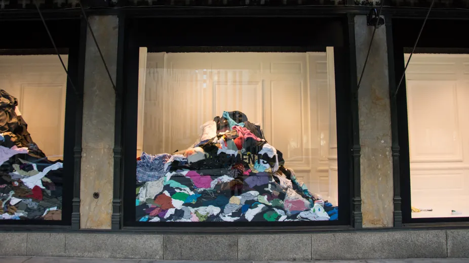
3. Saks Fifth Avenue x Vetements
By contrasting piles of old clothes with the luxury brand’s image, this display conveyed social awareness and encouraged consumer reflection.
4. Alice + Olivia
Using vibrant dessert packaging and stylish clothing, color contrast triggered nostalgia and positive emotions in customers.
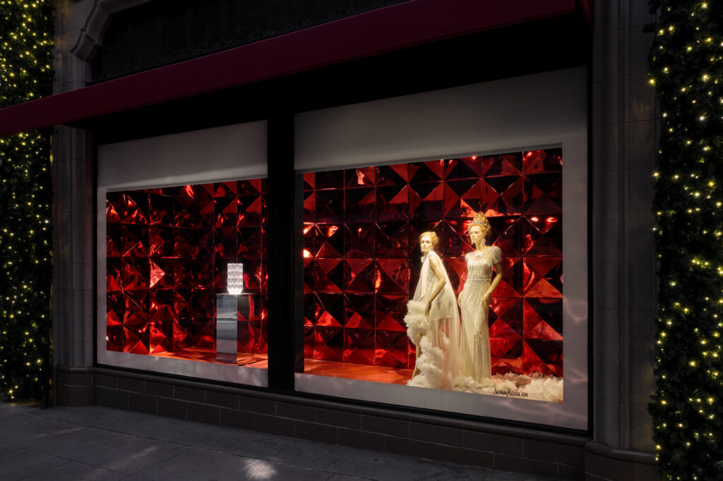
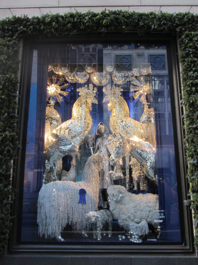
5. Bergdorf Goodman
The contrast between crystals and a dark background created a luxurious feel that attracted high-end shoppers.
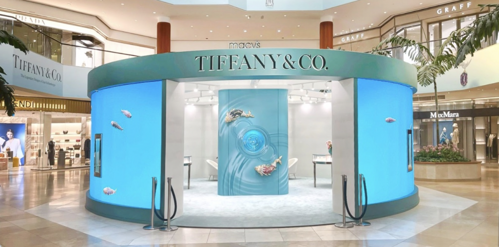
6. Tiffany & Co.
Through simple design and high-contrast displays, customers were left with a strong impression of the brand.
Color plays an undeniable role in window display design. It not only grabs customers’ attention but also helps shape the brand’s image and enhances the shopping experience. Through thoughtful color combinations and contrasts, designers can create window displays that are both visually appealing and emotionally engaging, ultimately boosting sales. For more insights on how color impacts window display design, check out our detailed discussion on What Role Does Color Play in Window Display Design? for more practical design tips and inspiration.
About Bob
Hi, I’m Bob, the funder of SamTop.com, Our company makes visual merchandising props, retail display stands and window display decoration for many years now, and the purpose of this article is to share with you the knowledge related to retail displays from a Chinese supplier’s perspective.