
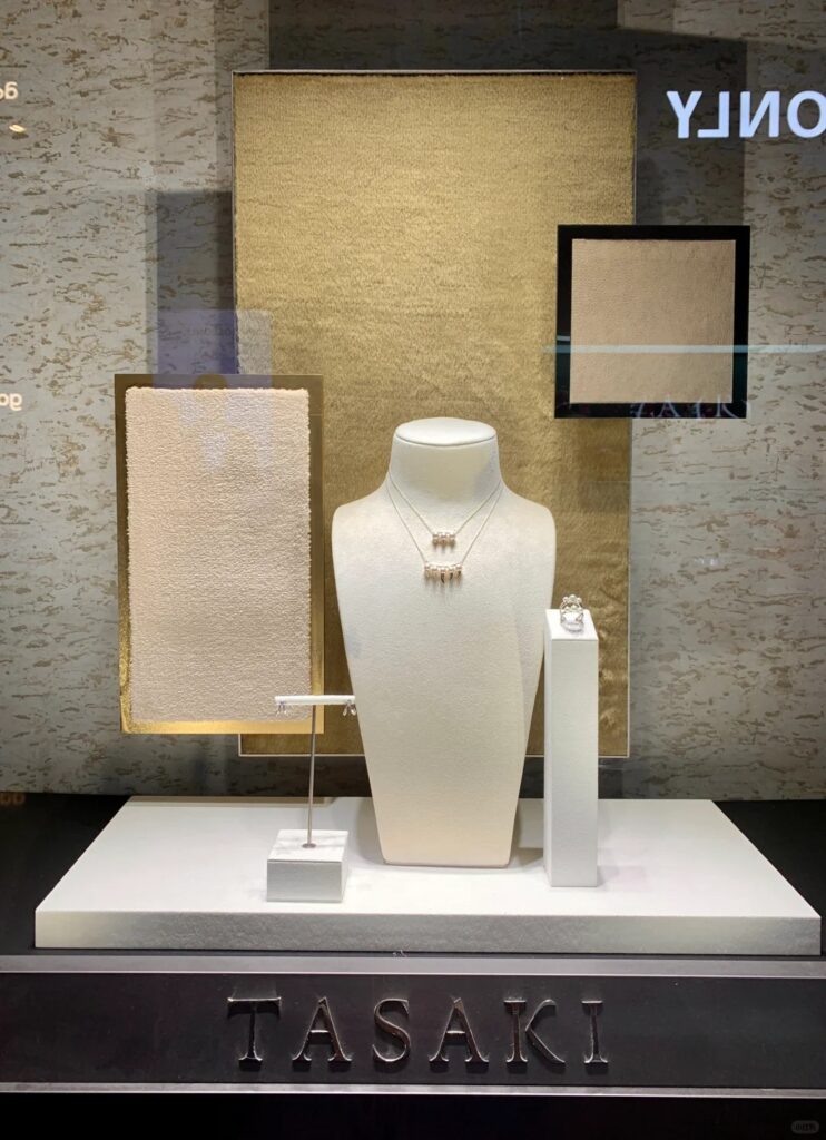
How to Use Display Tones to Support Gold, Diamond, Pearl, and Emotion
Color psychology in jewelry display isn’t just about background—it’s about emotional cues that frame jewelry. From champagne velvet for romance to onyx backdrops for prestige, Samtop designs displays where every shade tells a story.
- Match product material
- Trigger mood & storytelling
- Differentiate collection themes
- Direct customer gaze & decision
At Samtop, we craft display systems where every shade tells a story.
Why Color Is a Silent Salesperson in Jewelry VM
Color plays a pivotal role in jewelry visual merchandising (VM). It’s not just about making the products stand out—it’s about telling a story and creating a connection. The right color can create an emotional trigger, provide a visual anchor, and make a product unforgettable. It can highlight the brilliance of diamonds, create a warm romantic setting for pearls, or give gold a sense of timeless elegance.
How Color Works in Jewelry VM
- Emotional Trigger: Warm tones evoke romance, dark tones convey seriousness, and soft hues add a giftable quality.
- Product Contrast: Certain colors, like deep blues for diamonds, enhance the natural beauty and sparkle of the product.
- Memory Anchor: Colors link the display with the occasion, making it memorable.
- Visual Weight: Lighter colors like ivory bring airiness, while darker tones like onyx or navy give a sense of focus and gravitas.
- Photo Appeal: When customers share photos, the right colors make the jewelry more photogenic and shareable.
Key Insight: Customers don’t just buy metal—they buy how it made them feel.
Key Color Archetypes & Their Effects
When choosing colors for your display, it’s important to consider both the emotional signal and the ideal jewelry match. The color should complement the product, enhancing its appearance and evoking the right feelings.
| Color Tone | Emotional Signal | Best For |
|---|---|---|
| Champagne Beige | Romance, elegance, timeless | Bridal, fine gold |
| Ivory / Soft White | Clean, pure, minimal | Pearls, silver, sustainability VM |
| Dust Rose / Blush Pink | Tenderness, softness | Mother’s Day, gifting displays |
| Forest Green / Sage | Calm, trust, harmony | Nature-inspired, vintage revival |
| Navy / Midnight Blue | Prestige, clarity, focus | Diamond, white gold, high-end sets |
| Onyx Black / Graphite | Authority, luxury, contrast | Statement pieces, men’s jewelry |
| Slate Grey / Concrete | Neutral, modern, architectural | Urban, minimalist, unisex jewelry |
| Gold Foil Accents | Warmth, status, gifting cue | Quote cards, logo plaque backgrounds |
Pairing Colors with Jewelry Types
It’s essential to use the right tones to match and enhance the jewelry's material. Each type of jewelry has a natural pairing that will make it shine brighter.
| Jewelry Type | Recommended Display Tones | Why |
|---|---|---|
| Yellow Gold | Ivory, beige, champagne | Keeps warmth, elevates polish |
| White Gold / Platinum | Navy, graphite, pearl grey | Enhances brightness & sparkle |
| Diamonds | Midnight blue, onyx | Creates brilliance through contrast |
| Pearls | Sand, soft white, rose beige | Matches softness + tradition |
| Gemstone / Colored Jewelry | Neutral base + matching accent trim | Let the stone speak |
| Men’s Jewelry | Matte black, wood grain, steel grey | Masculine and minimal |
Pro Tip: Use the "tone-on-tone + one pop accent" rule—stable base tones with one or two supporting accents will guide the attention without overwhelming the senses.
How to Apply Color in Display Structures
To make sure your display is visually cohesive, use color effectively across the display structure. The right color application can help reinforce the overall message, while highlighting the jewelry.
| Display Element | Color Tip |
|---|---|
| Base Pad / Cone | Use suede or velvet in a matching/contrasting tone to set the product off beautifully. |
| Backdrop Panel | Keep neutral or monochrome to avoid distraction and let the jewelry take center stage. |
| Frame Trim / Logo Plaque | Use gold, copper, or brushed brass to add warmth and a luxury feel. |
| Light Color (Temperature) | Match the tone: 2700K–3000K for warm tones, 4000K for cool metals. |
| Prop Material | Pair color with texture: e.g., forest green linen ≠ forest green velvet. |
Example: For a Mother’s Day display, pair blush suede pads with ivory panels and a gold quote to evoke a soft, emotional VM.
Color Moodboard Examples
These moodboards demonstrate how the strategic use of color creates a distinct atmosphere that enhances your jewelry collection’s story.
