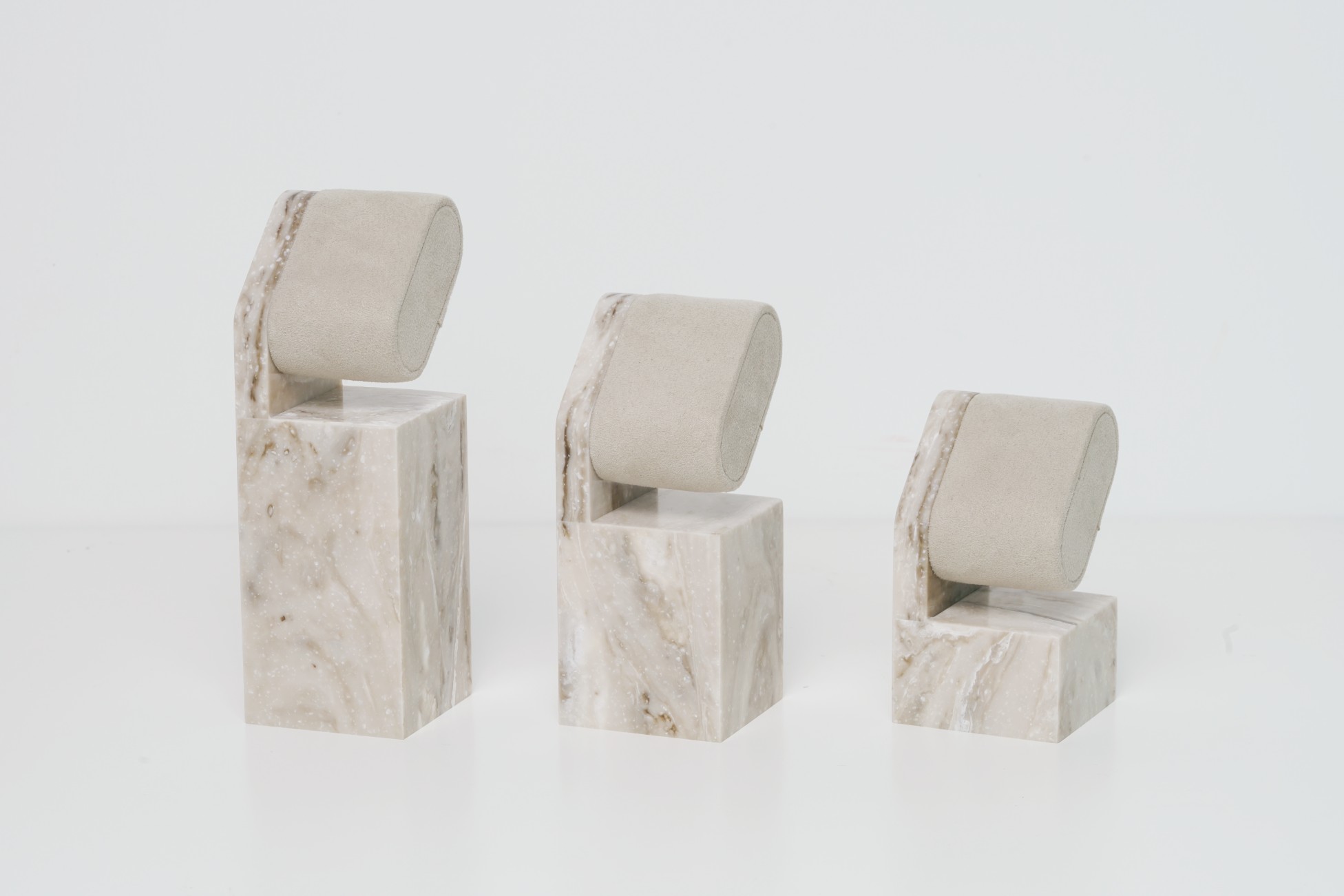
When a retail display looks luxurious, it's rarely about one material — it's about the harmony between materials. Many brands struggle to translate their premium positioning into physical form, often over-designing or missing the tactile story. The result? Displays that look busy, generic, or worse — cheap.
At Samtop, we guide premium brands in selecting and layering materials like acrylic + brass or suede + PU to signal value, balance aesthetics, and perform across global retail environments.
Smart material pairing — like frosted acrylic with brass or soft suede with structured PU — creates depth, light control, and emotional contrast that defines modern luxury in retail POP displays.
Curious how to turn your material spec sheet into a brand-defining visual experience? Let’s explore proven combinations, light behavior tips, and real category examples from global campaigns.
Why Do Material Pairings Matter So Much in POP Displays?
In luxury merchandising, visual harmony comes from tension — soft with structured, matte with gloss, natural with engineered. Each contrast adds meaning and texture.
Examples:
- Suede + Brushed Metal = Comfort meets strength (ideal for watch glorifiers)
- Frosted Acrylic + Polished Brass = Light diffusion meets shine (used in fragrance counters)
- Wood Veneer + PU = Heritage + durability (used in jewelry trays)
A successful display tells a story not through words — but through surface.
What Are the Best Material Pairings and What Do They Say?
| Combination | Message & Use Case |
|---|---|
| Acrylic + Brass | Sharp-edged luxury – ideal for fragrance or watch |
| Matte Acrylic + Brushed Aluminum | Clean, tech-forward tone – for skincare or gadgets |
| Suede + PU | Soft + giftable – perfect for holiday GWP sets |
| Wood Veneer + Velvet | Classic + artisan – preferred by fine watch brands |
| Mirror Acrylic + Powder-Coated Steel | Bold contrast – great for eyewear or fashion |
Tip: Limit to 2 materials per zone, or 3 if modular — more than that feels cluttered.
How Should You Layer Materials for Visual and Tactile Impact?
Use layering to control how shoppers interact with your display.
- Top Layer = Touchpoint (choose cleanable suede, matte PU, or textured acrylic)
- Accent Layer = Add thickness, contrast, or edge glow
- Base Layer = Heavier material to ground and stabilize
✨ Add metallic inlays, laser-etched lines, or frosted gradients between zones to enhance detail and depth.

What Rules Guide Successful Material Pairing?
| Design Rule | Execution |
|---|---|
| Match brand tone | Tech = brushed & matte, Luxury = suede + metal |
| Function-driven | Brass for structure, suede for tray top |
| Light compatibility | Frosted acrylic pairs better with LEDs |
| Durability balance | PU base under velvet = longevity + elegance |
Prototype transition points — how two materials meet is as important as the materials themselves.
Real Brand Examples of Material Pairing in Retail
- Fragrance Display for a French House: Frosted acrylic + gold brass halo = 35% increase in product trial rate in travel retail zone.
- Watch Brand (Swiss Boutique): PU base + brushed steel tray insert — elegant, lightweight, rollout-friendly.
- Jewelry Pop-up (Japan Department Store): Champagne suede with mirror acrylic = high visual pop, reduced lighting needs.
- Eyewear Launch (Concept Store): Matte acrylic with chrome rods — clean, stackable, lifestyle-forward setup.
FAQ
Q: Can sustainable materials still feel premium?
✅ Yes — recycled suede, water-based lacquered wood, and bio-acrylic are now widely accepted in luxury zones.


