
How to Align Your Perfume Display Design with Seasonal Scents
By Yan Luo | Samtop Display
Seasonal perfume launches are more impactful when their showrooms reflect the mood, tone, and emotional energy of the season. By aligning showroom elements—like color, texture, lighting, and layout—with the fragrance’s seasonal inspiration, luxury brands create immersive experiences that resonate more deeply with customers. From spring florals to winter opulence, here’s how to tailor every showroom for the perfect seasonal story.
Seasonal perfume launches often fail to make an emotional impact because the visual and spatial design doesn’t reflect the fragrance’s inspiration.
A spring scent launched in a cold, neutral showroom loses its freshness. A rich winter fragrance in a brightly lit, summery space feels disjointed.
Build showrooms that mirror the emotion of each season, with the right materials, colors, lighting, and layout — turning your fragrance into a multi-sensory experience.
🎨 Why Align Showroom Design with the Season?
| Benefit | How It Enhances Fragrance Displays |
|---|---|
| Emotional Connection | Seasonal cues help customers connect more deeply to the scent’s story |
| Stronger Brand Identity | Reinforces your brand message and aligns with consumers’ seasonal moods |
| Increased Engagement | Seasonal design feels current, sparking curiosity and interaction |
| Immersive Experience | Themed showrooms stimulate the senses through coordinated visuals, scents, and materials |
💡 Key Insight: A fragrance is invisible — your showroom must make it feel real, timely, and emotional.
Design Strategies for Seasonal Perfume Display Design
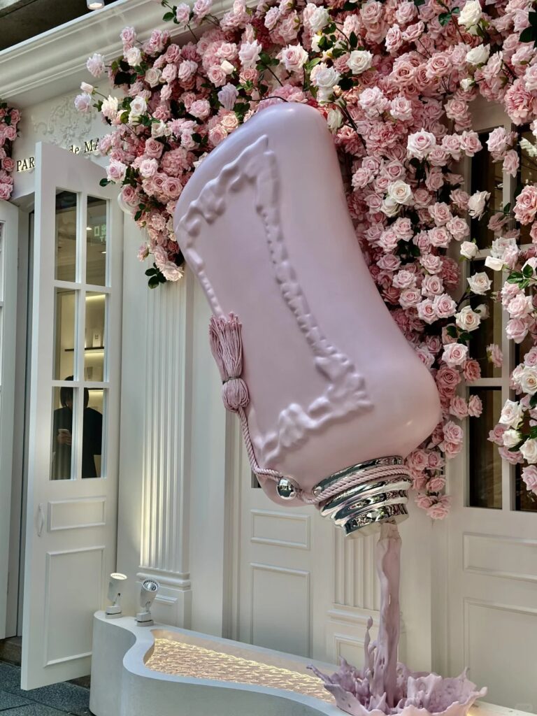
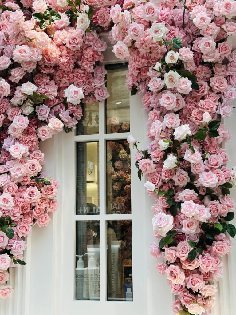
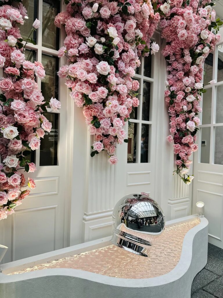
🌸 Spring: Freshness & Renewal
| Element | Strategy |
|---|---|
| Colors | Pastels — mint, blush, lavender, sky blue |
| Materials | Translucent acrylic, silk, light wood |
| Textures | Flowing fabric, soft greenery, floral graphics |
| Lighting | Bright, natural light to emphasize renewal |
💡 Add fresh flowers or light fabric drapery to suggest breezy rejuvenation.
☀️ Summer: Warmth & Energy
| Element | Strategy |
|---|---|
| Colors | Bold tones — coral, sunshine yellow, aqua |
| Materials | Glass, mirrored acrylic, rattan, woven textures |
| Textures | Glossy finishes, clear plastics, chrome |
| Lighting | Bright white or golden LEDs for a sun-drenched vibe |
💡 Reflective surfaces capture the energetic, lively essence of summer fragrances.
🍂 Fall: Comfort & Complexity
| Element | Strategy |
|---|---|
| Colors | Amber, terracotta, deep red, gold |
| Materials | Woodgrain, brass, leather accents |
| Textures | Velvet, suede, rustic stone |
| Lighting | Warm ambient lighting to simulate a golden-hour glow |
💡 Layered textures and cozy tones evoke the sensual complexity of fall scents.
❄️ Winter: Elegance & Opulence
| Element | Strategy |
|---|---|
| Colors | Burgundy, forest green, silver, midnight blue |
| Materials | Marble, velvet, crystal, polished brass |
| Textures | Shiny, reflective surfaces; cool-to-touch materials |
| Lighting | Cool, soft lights with strategic highlights |
💡 Use jewel tones and frosted finishes to evoke richness and winter mystery.
🔍 Real Case Study: Fall Launch at a Paris Boutique
🟨 Challenge:
Create a luxury showroom for an autumn-inspired fragrance without clichés, while maintaining premium brand aesthetics.
🟩 Samtop Solution:
