
How Brands Can Use Color to Stay Relevant, Emotional, and Visually Impactful This Year
By Yan Luo | Samtop Display
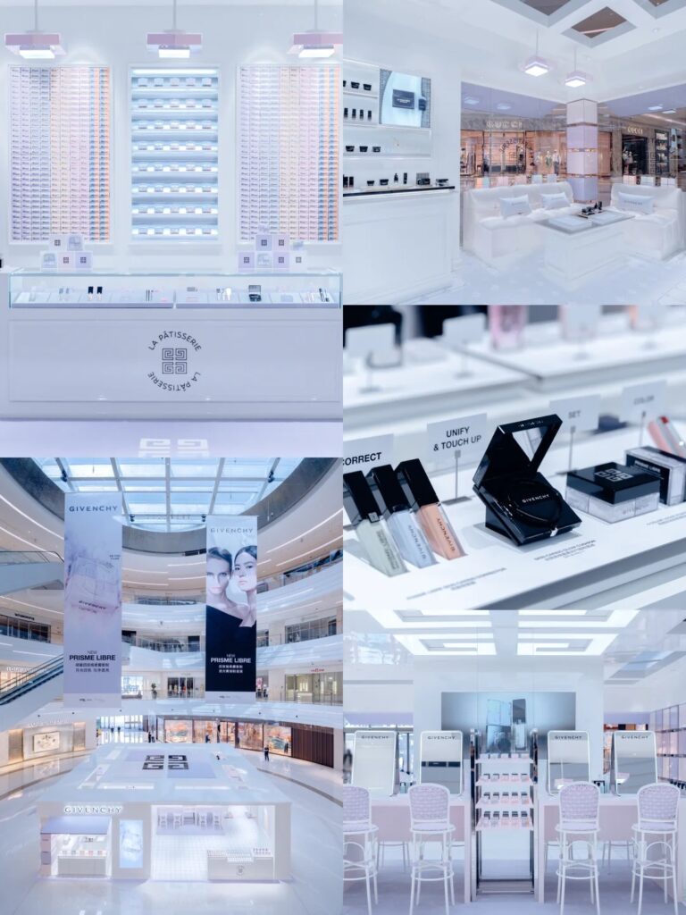
In 2025, top retail display palettes blend tech clarity with emotional depth. Visual merchandisers are embracing soft blues, grounded neutrals, luxe metallics, and nostalgic bolds to connect across digital and in-store retail.
Choosing a display color palette feels subjective, but the wrong tones can date your display, confuse the message, or disconnect from your audience.
Today’s shoppers expect both freshness and emotional consistency. Too tech, and you feel cold. Too earthy, and you might miss a trend moment.
In 2025, smart brands are using trend-informed but flexible palettes to ground displays in emotion, signal luxury, and deliver campaign versatility. At Samtop, we translate global color insights into real-world retail fixtures — from soft-touch finishes to Pantone-matched risers.
🎨 2025 Display Color Trends: Five Leading Palettes
| Trend Name | Key Tones | Used For | Emotion | Material Pairing |
|---|---|---|---|---|
| Soft Tech | Mist Grey, Seafoam Green, Pale Blue | Skincare, tech beauty, fragrance | Clean, futuristic, calm | Satin silver, translucent acrylic, LED glow |
| Neo-Neutrals | Clay Pink, Mushroom Taupe, Oat Beige | Wellness, fashion accessories, slow luxury | Grounded, natural, curated | Kraft paper, matte wrap, soft PU |
| Lustrous Metallics | Champagne Gold, Bronze, Rose Platinum | Jewelry, timepieces, luxury capsules | Prestige, elegance, holiday | Velvet, brushed metal, mirror acrylic |
| Bold Nostalgia | Mustard, Teal, Rust, Violet Plum | Gift sets, retro pop-ups, reissues | Expressive, youthful, bold | Mid-gloss lacquer, curved foam, retro forms |
| Botanic Black & Green | Sage, Charcoal, Moss, Eucalyptus | Apothecary, unisex fragrance, natural kits | Organic, mystical, soothing | Linen, stone wrap, frosted glass |
🧠 Color Application Tips by Display Goal
| Visual Goal | Recommended Tone Strategy |
|---|---|
| Emotional softness | Use dusty blush, almond, oat beige with linen or PU textures |
| Tech-driven minimalism | Stay cool (mist blue, seafoam) with reflective or clear materials |
| Timeless elegance | Pair deep neutral bases with pale gold or graphite highlights |
| High-energy campaigns | Use one saturated tone as hero (rust, teal) and balance with light/white |
| Multi-SKU balance | Anchor with mushroom or oat tones; accent by product segment (e.g. serum = sage) |
💡 Key Insight: Display tone ≠ background. It’s the mood trigger for the entire retail experience.
🔍 Real Case: Trend-Driven Display Palette in Action
🟨 Client: Global wellness brand launching Spring capsule
🟨 Objective: Refresh counter display tone for “soft science” skincare set
🟨 Challenge: Work across Japan, Germany, and Nordics with consistent visuals
🟩 Samtop Solution:
- Color palette: Seafoam Green base + Mist Grey props + Oat Beige back panel
- Materials: Soft-touch PU foam, brushed silver trim, printed linen header
- Execution: All elements shipped flat; swatch panel included for regional light testing
✅ Result:
- Visual tone rated “soothing yet technical” by in-store teams
- Customers described the display as “inviting and intelligent”
- Color palette evolved into deeper sage + grey for autumn collection
📐 How Samtop Delivers Color Strategy in Retail
1️⃣ Trend translation: We match campaign mood with global macro palettes
2️⃣ Sampling: Pantone-sprayed materials, printed swatches, and wrap mockups
3️⃣ Mockup testing: Color in shadow, daylight, spotlight conditions
4️⃣ Material matching: Match tone across PU, acrylic, velvet, paper, stone
5️⃣ Shipping protection: Color-safe packaging and gloss-control wrapping
🎁 Bonus: Every client receives a color + finish moodboard deck tailored to regional context.
